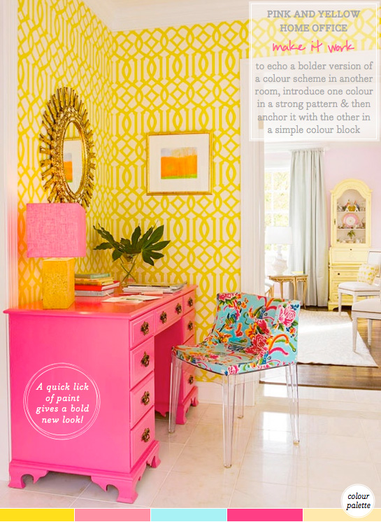
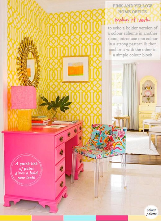
What’s your home office like? Perhaps calling it a home office is laughable because you’re currently working from a tiny corner of your studio apartment. Or, perhaps you do have a dedicated room for working in. Either way, the place we create for ourselves to work in is really important – and, ultimately, it needs to inspire us to deliver our best work and creativity. Naturally, I lean towards bright and vibrant schemes when looking for home office inspiration and I’m currently pulling my workspace together; it’s based on the same colours as this home office scheme but uses them in a very different way (more on that soon!). This energising yellow and pink home office is a clever design move because it echoes the colour scheme of the room seen through the archway beside it. The living room has been decorating with a pastel palette of candy colours such as ice cream pink and primrose yellow. However, in the foreground we see the home office, which references the colours of the main space but flips the shades to their most saturated state. This shift in shade zones this part of the space as a new area that has a different function, but it doesn’t make the open plan space feel disjointed because the colours remain from the same palette. It’s an inspiring example of how colour can be used to visually create rooms within rooms and gets a big thumbs up from Mr. B! What do you think of this palette, folks?
// Photography by BHG


15 Comments
LOVE. IT. I’m a huge fan of pink!
I definitely love lots of bits of this office, but mine needs to be a little more calming. My office is chaotic sometimes!
I’m redoing my home office – too boring – and looking for something yellow ( painting or wallpaper ) for the walls. And I’ve just found want I wanted on your post today. I LOVE the bright wallpaper! Could you pl tell me the brand?
By the way, I’m a journalist , I live between Lisbon and the USA and would be very happy to show you around ,if you come to Lisbon as mentioned recently.
Yours sincerely,
maria
@Maria – I’m not sure on the brand but will try and find out for you. Thank you for the kind Lisbon offer, I really hope to make it there soon!
Very fresh! I definitely love it! xx
So happy and bright and lovely!
Oh wow…I actually love it!!
wow, this room is just gorgeous!!!!
xo,
Sandy
Sandy a la Mode
I think that is a Kelly Werstler, imperial trellis wallpaper…. If its not it sure looks a lot like it!
love the color combo, but don’t think I can convince the hubby to go for it!
@Mimi – Thanks so much! I say: go for it! 😉
It takes some chutzpah to decorate like that, and I LOVE it!
love the colors!
This room is really stylish, like comment 1, for me my work space would be a bit calmer, but I still think this scheme really works. I like how the colours although different shades, still match the lounge and the flow between the rooms is great, the house looks really welcoming. Choosing a key piece in a feature colour can be hard and in this case I think they’ve got it spot it and the wallpaper and accessories all fit the picture perfectly. When this kind of design does go right, it really creates a strong look – and pink is my favorite colour! :O)
Can you tell me the name of this wallpaper? I love it!
This is gorgeous indeed. I didn’t thing those two bright colors would look so good next to each other but you pulled it off, nice work Will.