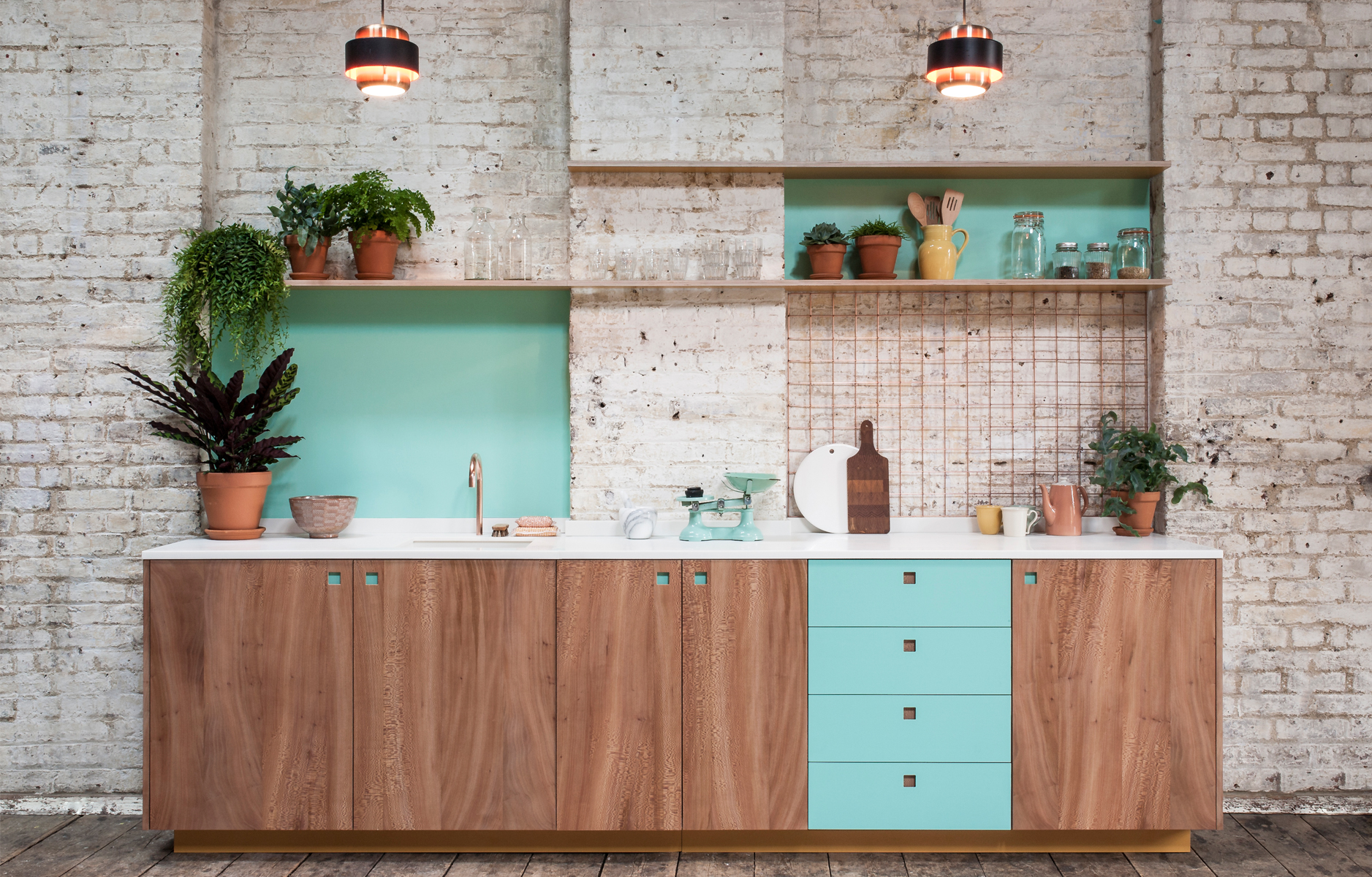
 They say that kitchens and bathrooms sell (or don’t sell!) houses, and with beauties like this from Pluck Kitchens I can understand why – it’s total aqua kitchen design inspiration. I kinda lucked out as my last flat in the UK before I moved to America had a decent sized kitchen, but the ones that preceded it, along with the ‘kitchen’ in my first NYC apartment, have all been tiny. Years and years ago I remember giggling at Carrie Bradshaw saying that she kept sweaters in her oven in an episode of Sex and the City. Well, having now lived for a year in an NYC apartment (and, I should add, with a far, far smaller kitchen than the one shown in Carrie’s apartment!), I can understand why New Yorker’s so often don’t cook in their kitchens! Anyhow, I digress because the real reason for this post is to wax lyrical about this striking aqua blue-green kitchen design. I’m obsessed! Click through after the jump to see all the beautiful details and join me in dreaming about colorful – and spacious! – kitchen designs.
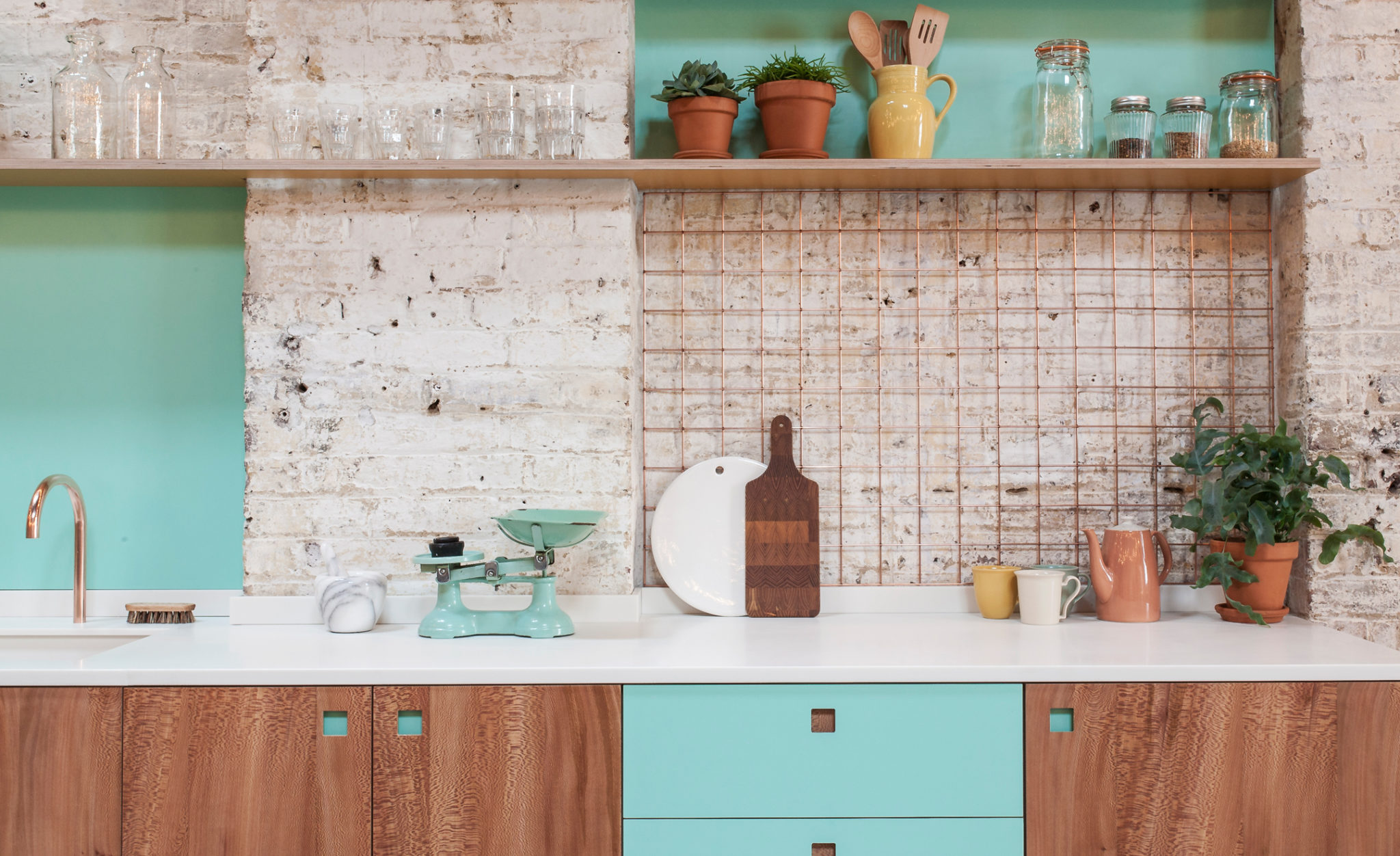
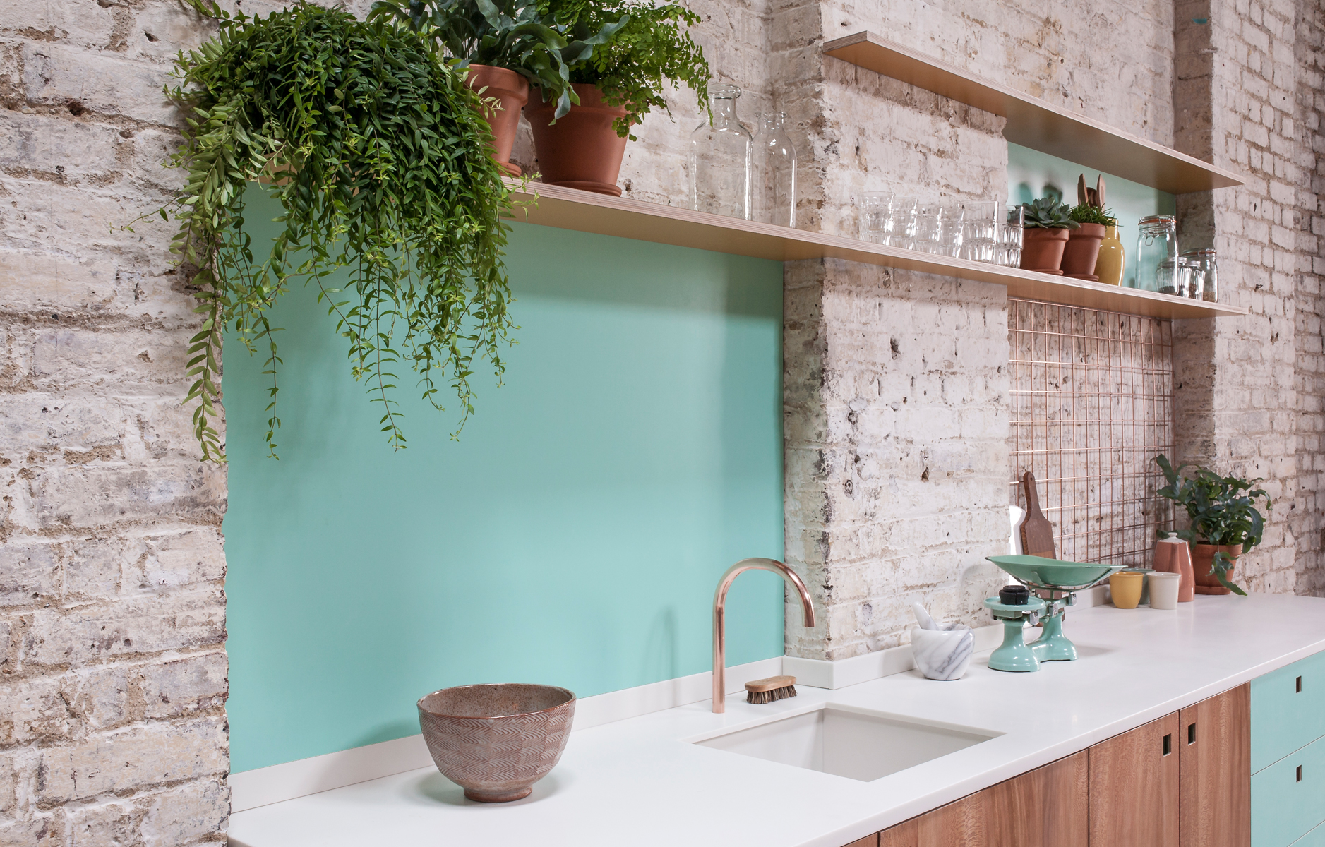 I realllllllly wanted to whitewash the exposed brick walls in #BBbrownstone but my landlord wasn’t up for it. Perhaps that’s why I’m crushing on the exposed bricks in this kitchen as hard as I am?! Either way, the whitewash exposed bricks pair beautifully with the aqua splash back, don’t you think? I love how the design sticks to one color and one shade from that color throughout. It doesn’t always work, but in this instance it really does give the space a wow-factor.
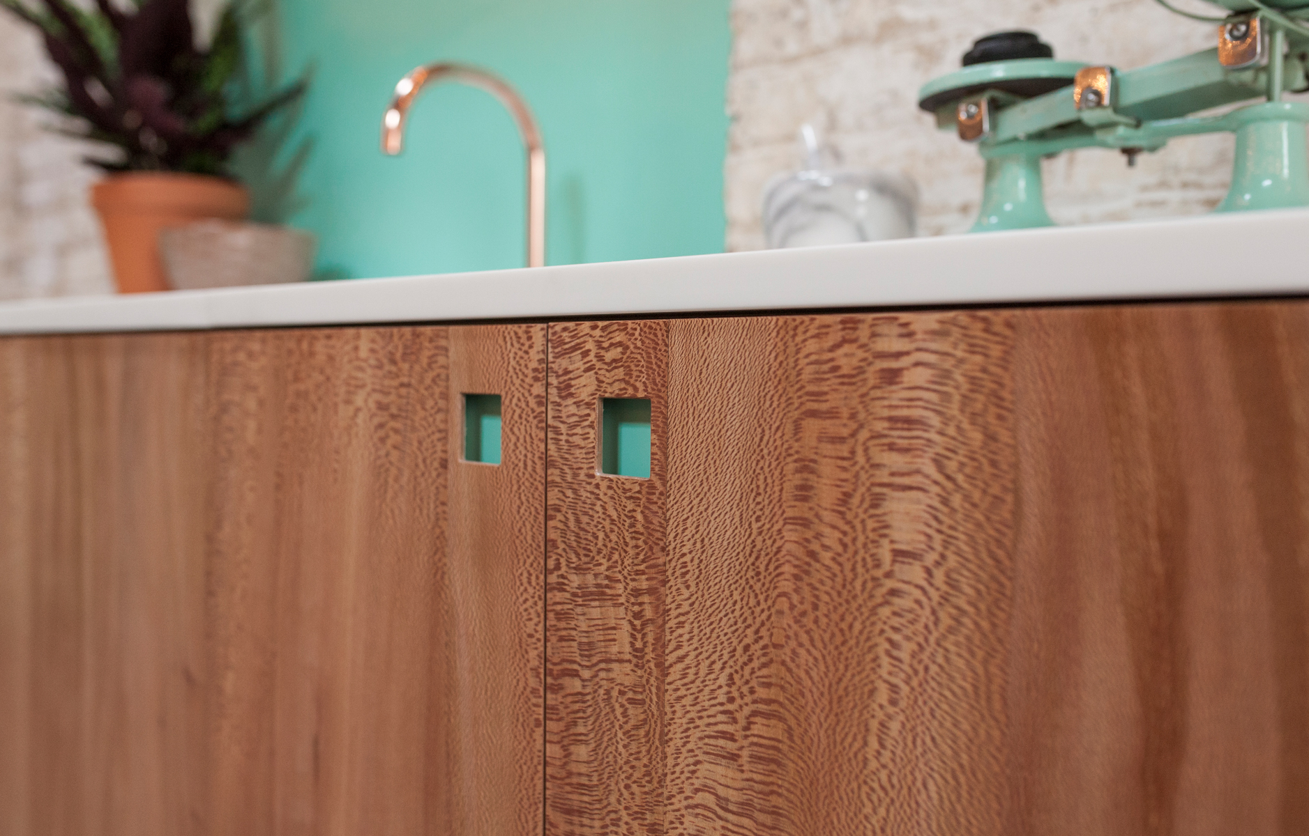
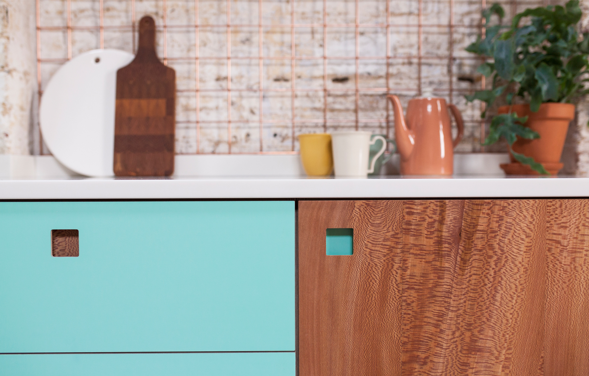 The introduction of copper accents was a smart design move because it prevents the aqua splash back and drawer fronts from feeling juvenile. Those flashes of metallic seen in the copper faucet (love!) and wall-mounted grid storage system bring sophistication and elegance to the overall kitchen design. And while the color palette may seem simple at first glance, it’s clear that attention to detail has been paid in planning this aqua colored kitchen design. This is especially clear when you look closely at the aqua and wood cabinetry: notice how the materials swap over for each drawer and door pull. It’s these subtle details that give the space a cohesive and refined feel. If you loved this aqua kitchen design inspiration post, you can get more ideas for colorful, clutter-free and modern kitchens like this over at Pluck! What’s inspired you about this aqua colored kitchen? How do you invite color into your kitchen?
 // Photography by Pluck Kitchens, used with permission




19 Comments
SO dreamy! Love it!
@Jenn – Right?! That color! Those textures! The materials! Everything is so good.
Beautiful kitchen! Looks unique and unseen. xo
@Mia – Beautiful is the right word, for sure!
So with you on the copper tap!
@Roberta – Fight ya for it! 😉
My landlord wouldn’t let us paint the walls white either, so I understand that frustration well. Great kitchen, I like the use of aqua and the open shelving for herbs and things.
@Beth – So frustrating. One day we’ll own our own places, fingers crossed!
How pretty! I love it.
Carrie
http://www.wearwherewell.com
@Carrie – A total dream kitchen! xo
thanks for the introduction to this company Will – they are gorgeous – so fresh and vibrant
definitely on the list 🙂
@Fiona – My pleasure! I’m glad you are as taken with them as I am!
Beautiful kitchen love the mix of the copper, aqua and warm wood against the exposed brickwork, plus the simple cutout handles are a cool feature 🙂
@Glyn – Agreed! Love the cutout handles!
OMG! Perfect color! And perfect kitchen
Have a great day Will!
Valentina
@Valentina – Isn’t is just the most wonderful color! I love it too! Thanks 🙂
LOVE LOVE LOVE!!!
And turquoise is my favourite colour… 🙂
@Therita – Excellent choice in favorite color! 🙂
Love this kitchen and love the burst of turquoise!