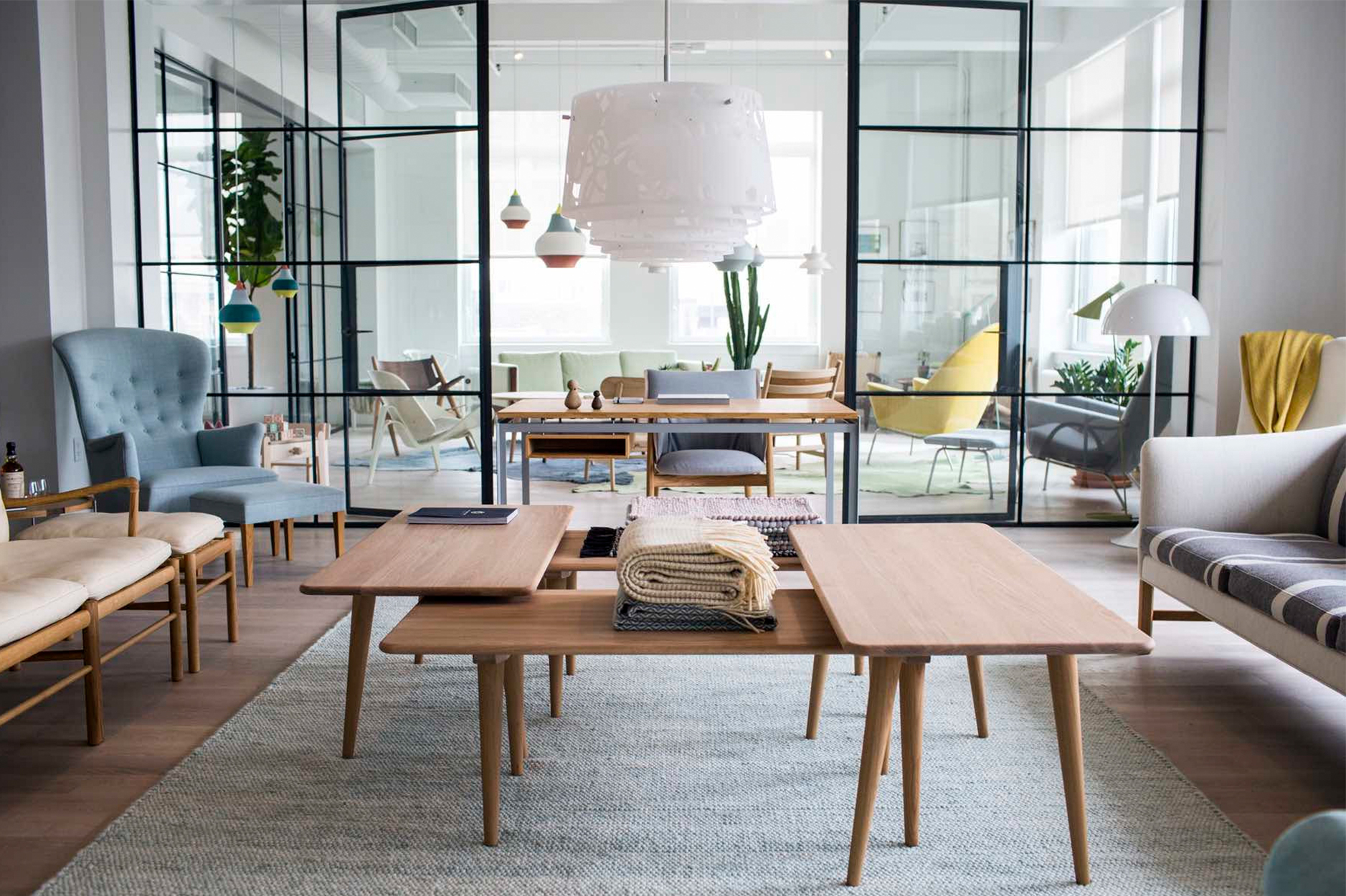
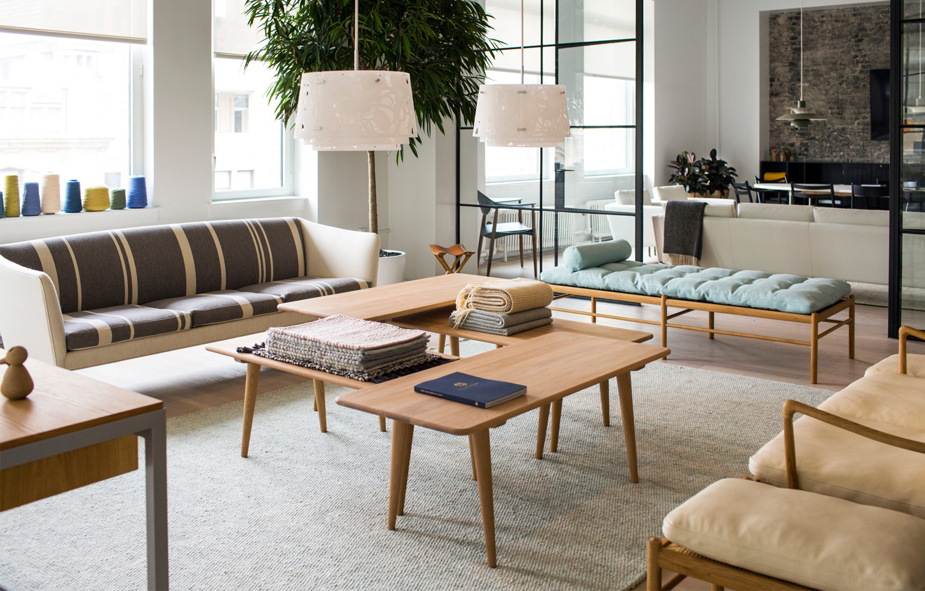
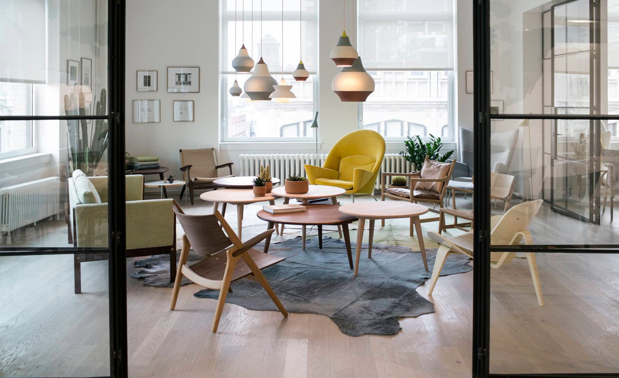
 Those stylish Danes sure know how to make me smile when it comes to design. So, naturally, I was thrilled to learn that Carl Hansen & Son have opened their second showroom right here in New York City. Following on from their SoHo space, the brand have now headed into the Flatiron district for their new Carl Hansen NYC showroom. I love that the Danish brand decided to forgo the traditional approach to a showroom, opting instead to create an inspirational, loft-like apartment rather than a traditional showroom. Stuffy showrooms begone – I’m all about more informal environments when it comes to design! After all, you want your home to feel relaxing and personal, not buttoned up and formal, right? So, in my mind, the experience of shopping and designing your space should mirror that, too. Join me in taking a tour through the ‘apartment’ after the jump!
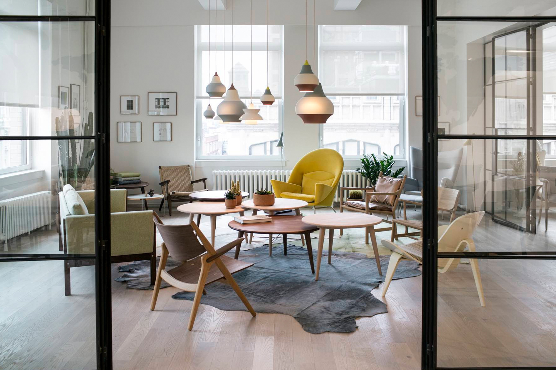 Aside from being one of Scandinavia’s best-known brands, I’ve long admired Carl Hansen because they are the company behind some of the greatest furniture classics in Danish design history. From the classic furniture craftsmanship by Hans J. Wegner to modern classics from Ole Wanscher, Frits Henningsen and Kaare Klint, right through to collaborations with contemporary designers like Japanese architect Tadao Ando. I admire their rich heritage in Danish design and how they manage to keep the brand feeling fresh and engaging with modern collaborations.
 Plus, their decision to create a more natural apartment-like showroom shows how the brand has their finger on the pulse of how customers and designers want to shop design in today’s online dominated retail environment: you need to offer people a memorable experience to encourage them to actually come to a brick and mortar store. Plus, for designers it’s a great place to bring clients so they can envisage how their pieces can work in a residential space vs. a soulless showroom.
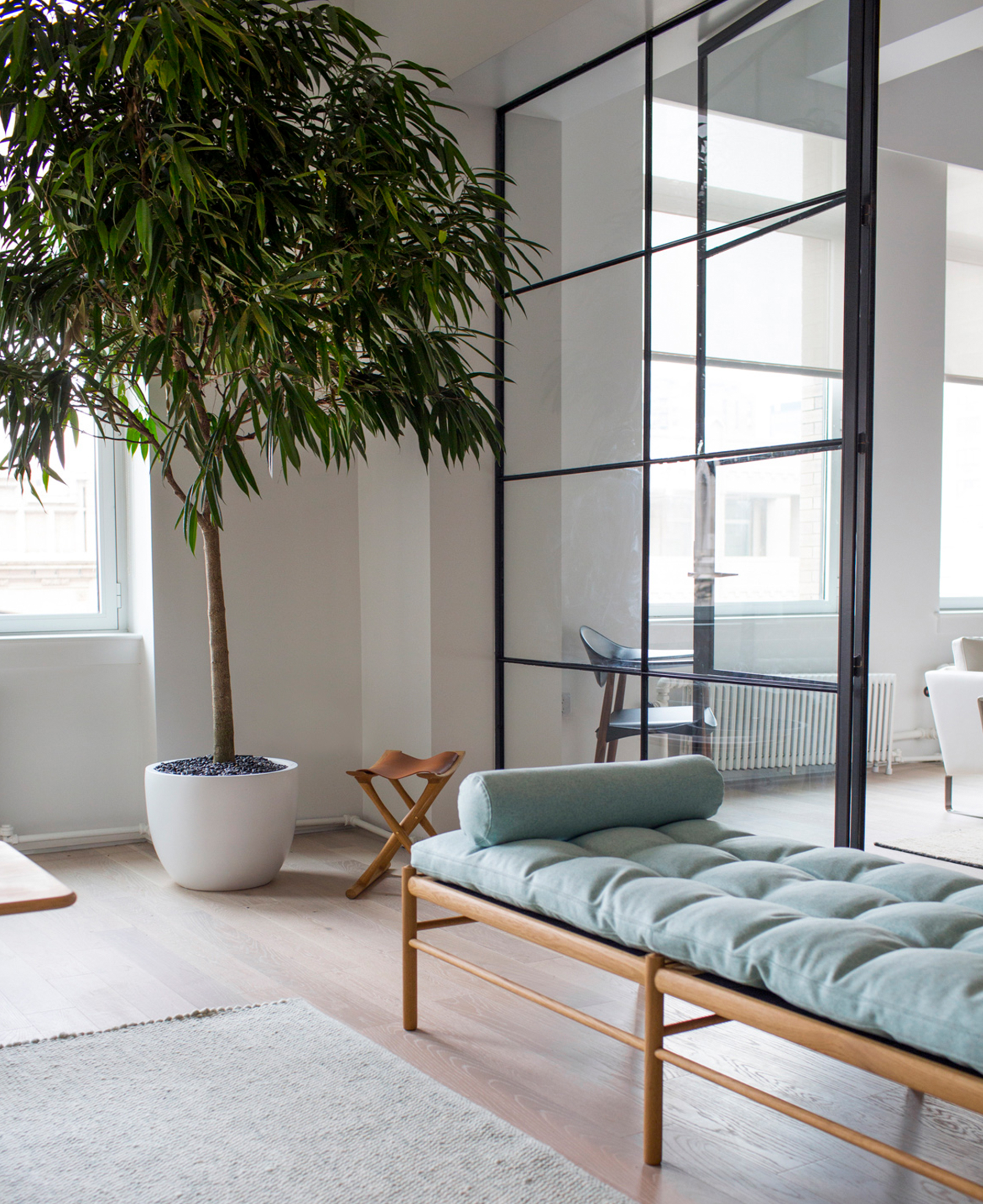
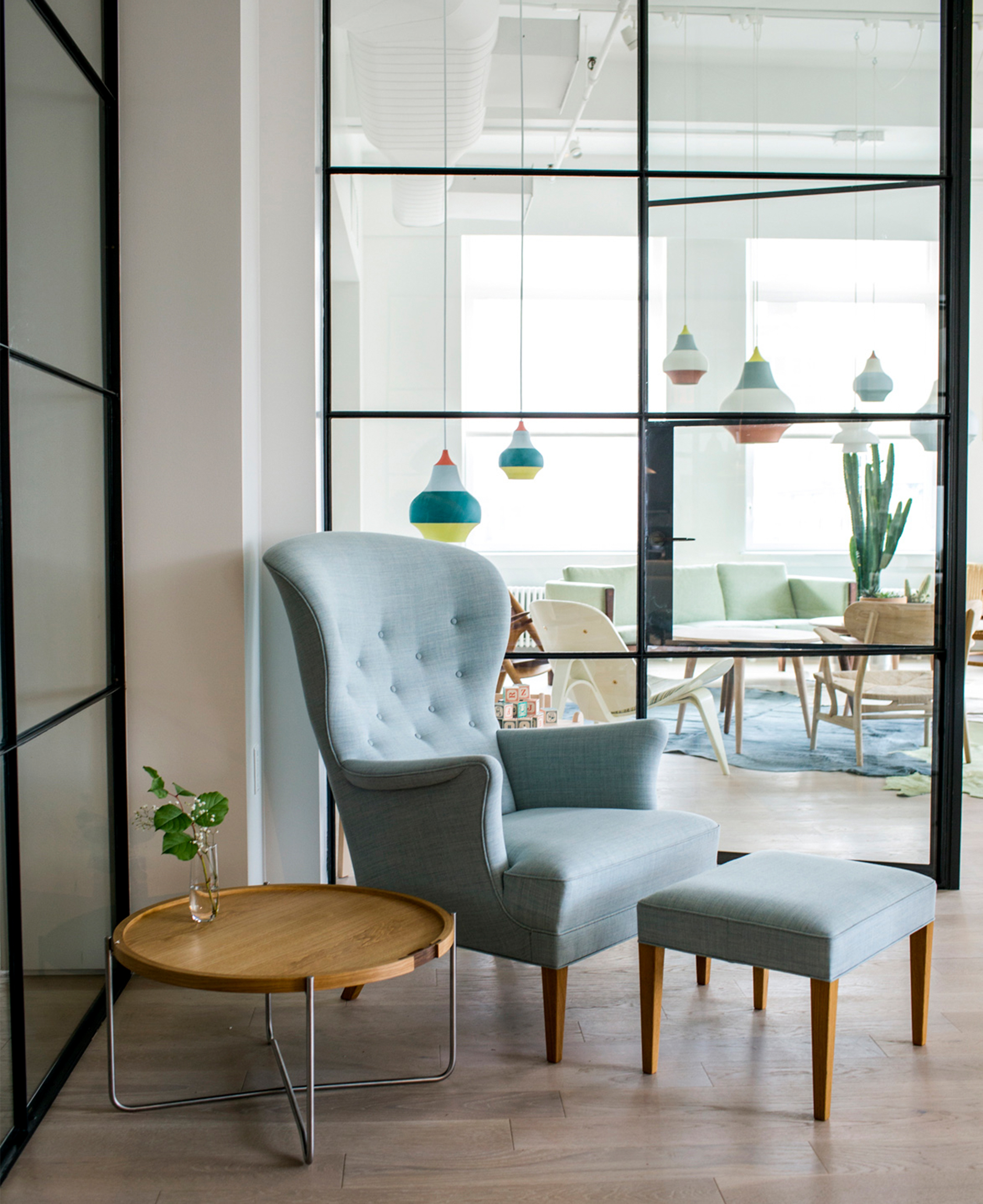 The new Carl Hansen NYC showroom space is comprised of three separate glass-enclosed concept rooms inspired by the New York loft interior, each with its own theme and colour palette. There’s a dedicated space for contract projects, a ‘spotlight’ room celebrating Carl Hansen & Son’s distinctive soft, neutral tones (that daybed? LOVE!), and the Wegner room, which pays tribute to the brand’s long-standing collaboration with Hans J. Wegner. I love that the spaces which surrounded the concept spaces are formatted as open lounge areas in order to give the showroom a relaxed, residential atmosphere. There’s even a working kitchen and dining area to host regular events for the architecture and design community – how awesome is that? Essentially, be sure to stop by and tour the new Carl Hansen NYC showroom in Flatiron next time you are in the city as it’s a design delight! What’s catching your eye?




12 Comments
Jellllllz. This looks so inspiring. Hitting it up on my next visit from LA…in the meantime I’m pinning the sh*t out of this!!! 😉
@Jessie – Yes, you must! Glad you enjoyed the tour and happy pinning! Tee tee.
I’m with you on the daybed! Thanks for the tour Will.
@Cait – Right?! So good. Now to find an apartment with space for it… haha!
Those doors! I’m dying to know who fabricated them
@Erin – Saaaaame!
This looks amazing!
@Alex & Mike – It’s SUCH a great space!
OMG WILL! Can I just move in there already? I want that mint looking chair. ugh. Actually never mind. I want it all. Make it happen. haha
-Didier
ww.didieryhc.com
@Dider – Right?! All of it is so on point!
Wow! Gorgeous! I am so in love with the colors used here! Peaceful and fun at the same time! Love it! 🙂
Those Louis Poulsen fixtures!