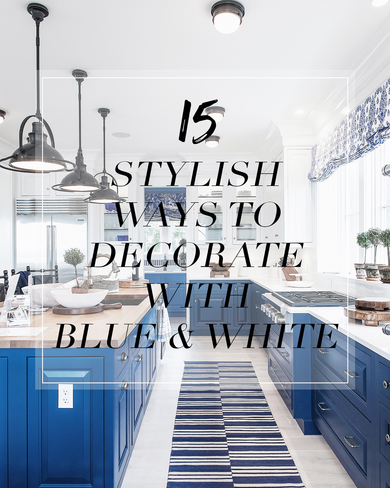
 Last night I arrived back home in NYC after a super fun weekend with my heartmate and Jackie in Rhode Island! A few months ago I was at the One Kings Lane store in Southampton and bumped into Mark Sikes while he was signing copies of his book, Beautiful. Mark was telling me how he had just arrived in town after spending a week installing his designs for the Coastal Living Idea House in Newport, Rhode Island. I remember oohing and ahhing over the sneak peeks he had shared in his Instagram Story, so when Jackie asked me a few weeks later if I’d like to head up to Rhode Island for a few days sometime during the summer I knew it was the perfect opportunity to tour the Coastal Living Idea House in person. I’m so pleased we did because it was packed full of Mark’s signature blue and white decor and I came out bursting with ideas for decorating with blue and white. I’m feeling so inspired to introduce some of his beautiful design notes into the decor of our beach house that I’m currently renovating. It’s only fair to share, right?! So, I’ve rounded up the parts of the house that inspired me the most…
1. Painted kitchen cabinetry | Instead of jumping on the white cabinetry trend, why not opt for statement-making blue cabinetry? I love how the kitchen in the Idea House managed to feel simultaneously fresh and bright thanks to the sleek white countertops (the butcher block on the island is a smart way to add warmth) and the bold blue base cabinetry. By painting the wall hung cabinetry white it helps to keep the space feeling light and bright.
Get all 14 more ideas for decorating with blue and white after the jump!
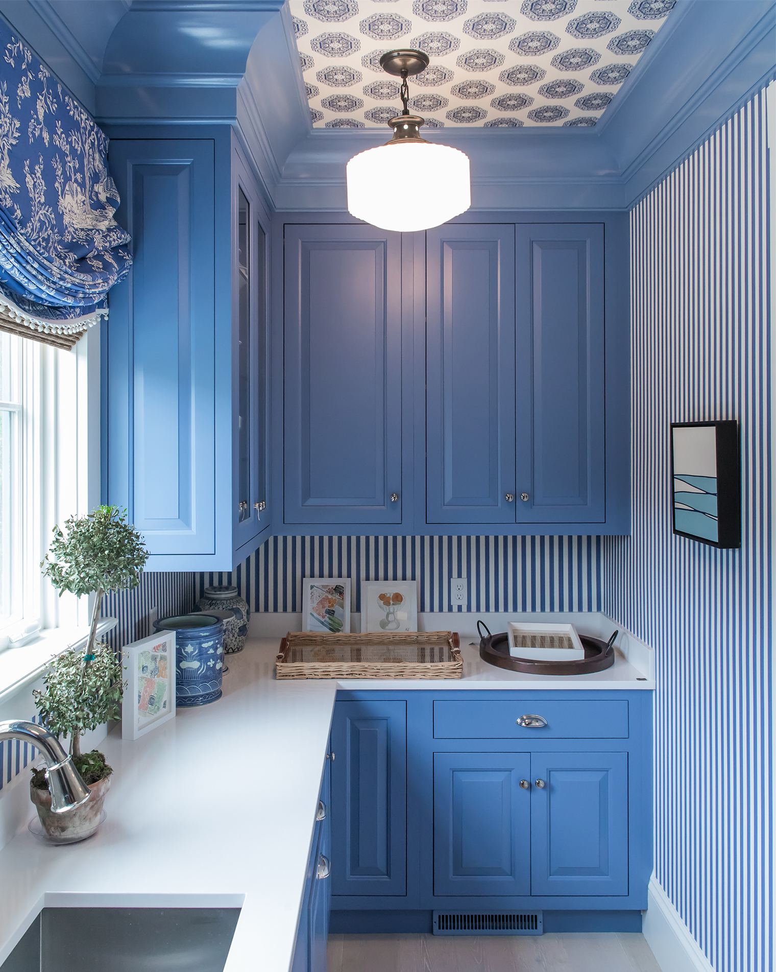 2. Use stripes to elongate a space | The narrow blue and white striped wallpaper gives the feeling of added visual height in this cozy pantry space off the kitchen. In smaller spaces it often pays to go bold and graphic with color and pattern rather than defaulting to all white everything to try and open up the space. By continuing the blue cabinetry from the main kitchen while also including the color on the wall hung cabinetry, the space feels cohesive yet distinctive.
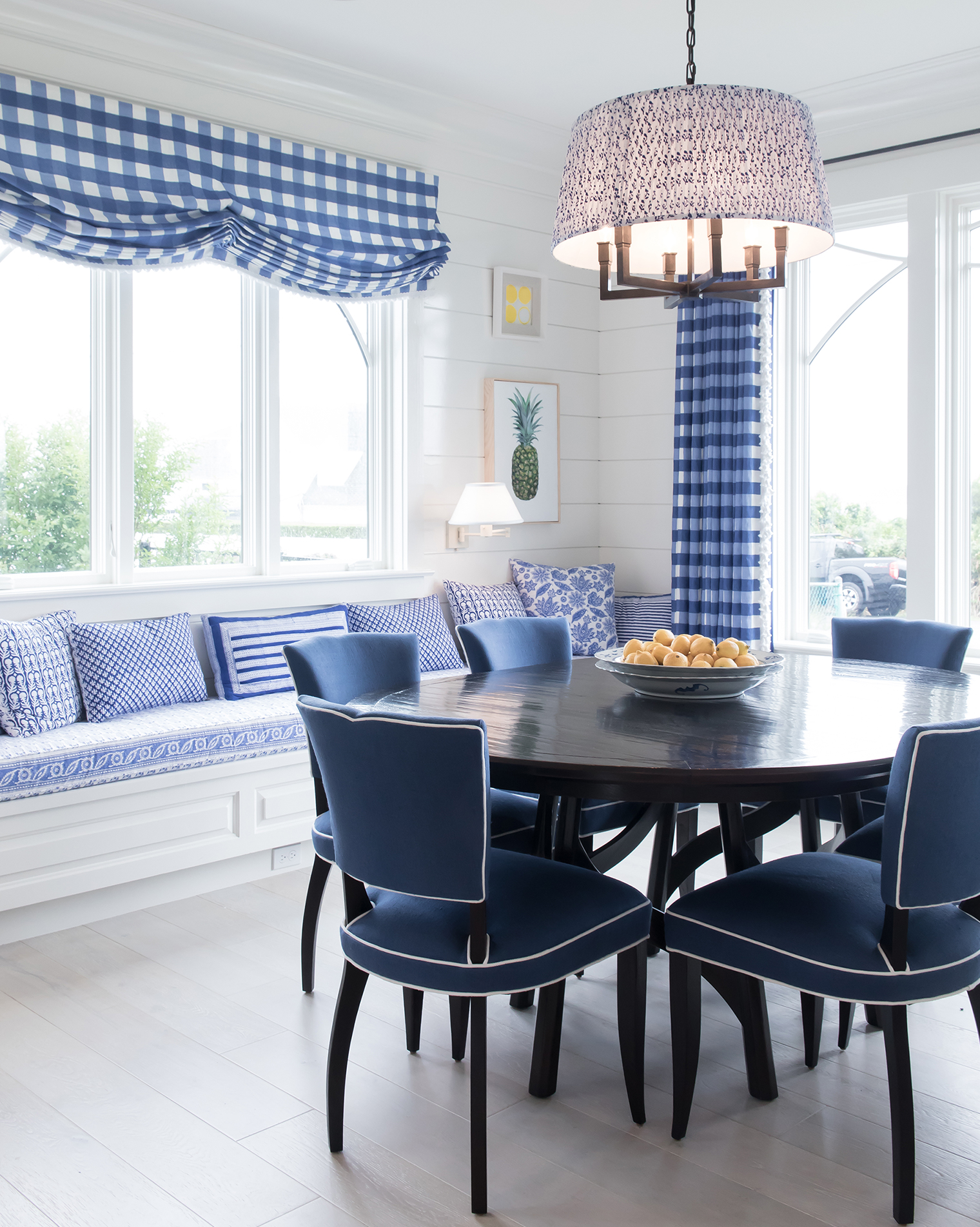 3. Mix and match prints and pattern | When mixing and matching prints and patterns it works well to pick a hero pattern that ties a red thread between your layers. Here, it’s the blue and white check fabric used to dress the windows. This helps lay the base for accent textiles in the banquette upholstery and throw pillows to be layered in without the space feeling too fussy or visually ‘messy’.
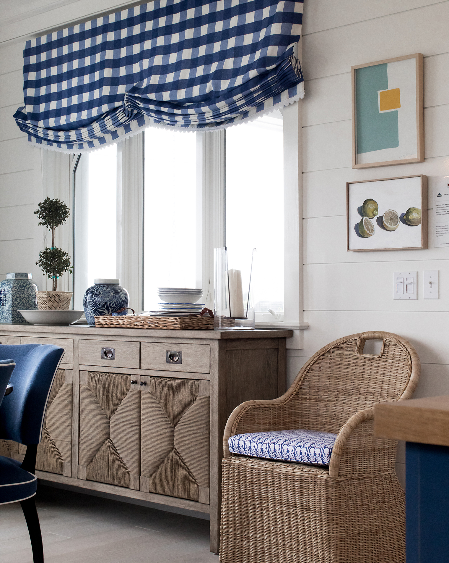 4. Add texture and warmth with furniture | When decorating with blue and white it’s important to add warmth into the space. A great way to do this is via wooden and rattan furniture, which will give the space tactility. That sideboard? LOVE!
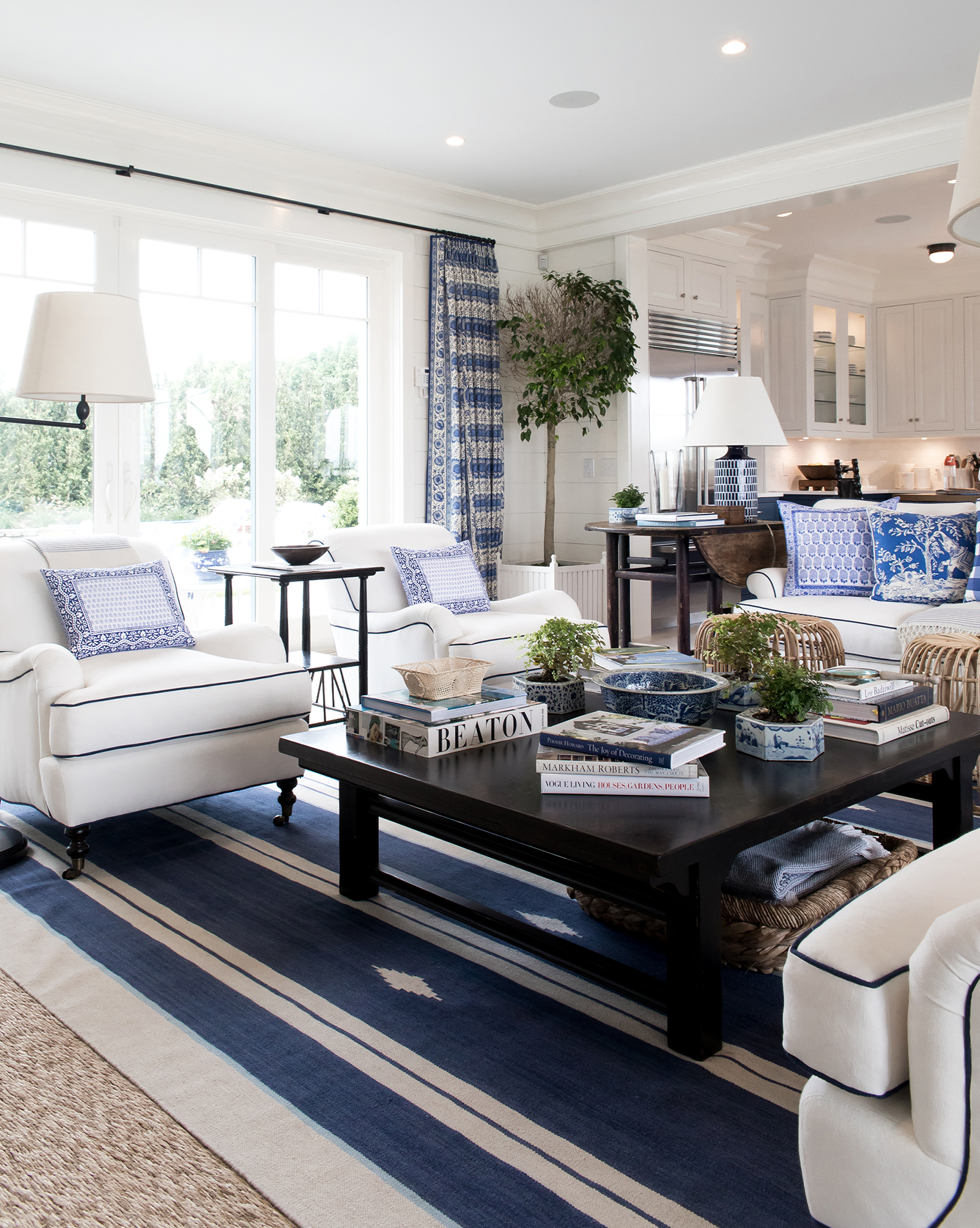 5. Co-ordinate and contrast | In a consistent blue and white scheme it’s important to play with co-ordination and contrast to keep each scheme feeling fresh. Mark did a great job with this especially in the main living room where he contrasted a navy striped rug with white armchairs. The subtle navy piping in the armchairs help to soften the contrast and co-ordiante with the rug and wider scheme.
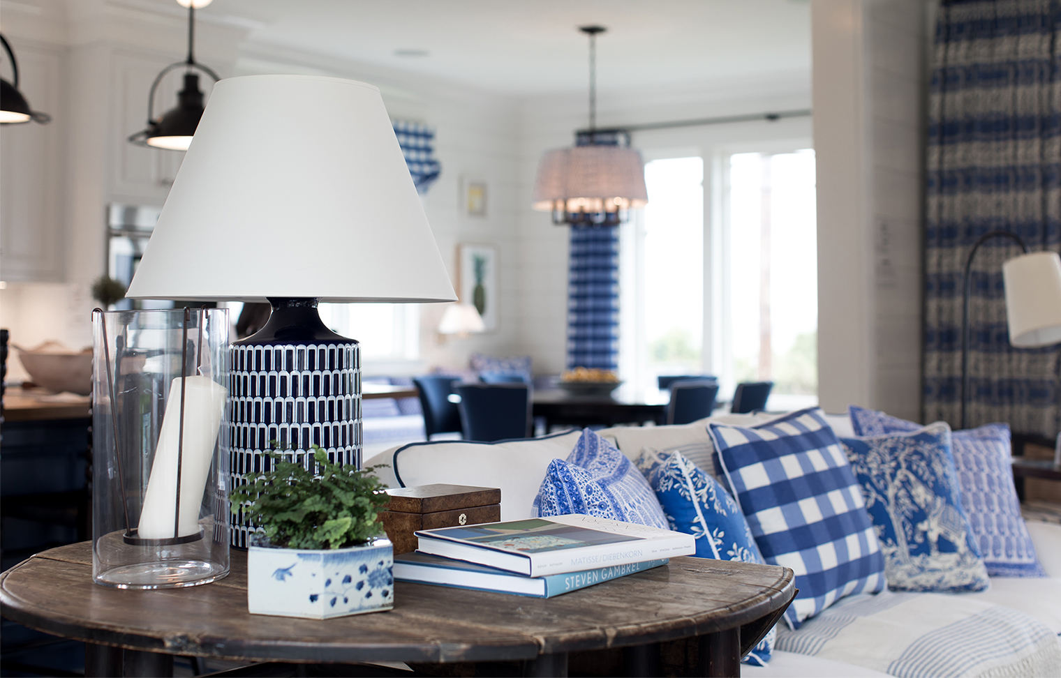 6. Add visual interest with colorful lamps | This ceramic table lamp in the living room was one of the first pieces to catch my eye, and I love how it was styled with the vintage keepsake box, delft planter and books. It reminded me how the smaller details are often those that people will notice first and remember longest from a room.
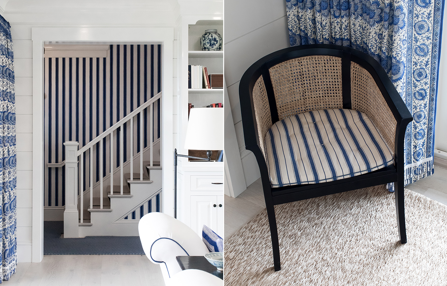 7. Add graphic pattern | Whether used large scale (stairway wallpaper) or small scale (chair pad upholstery), stripes always add a striking hit of graphic pattern that is as timeless and classic as the blue and white color palette itself.
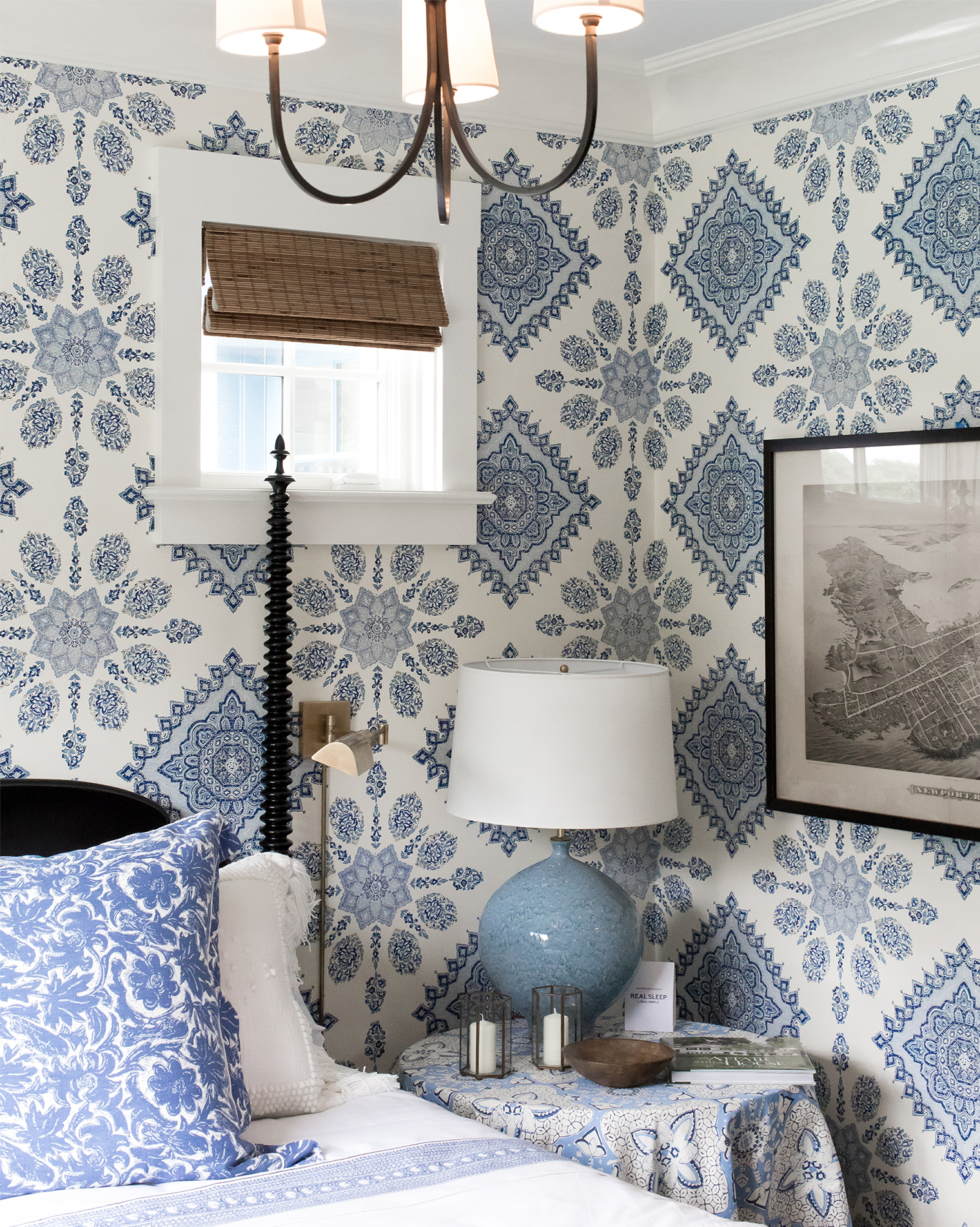 8. Introduce black accents to blue and white | I’ve always been a huge advocate for black accents in a space and especially so when it comes to layering them into blue and white schemes. Black always adds a sense of sophistication to a scheme and I love how Mark introduced it in this guest bedroom with the spindle bed frame and artwork.
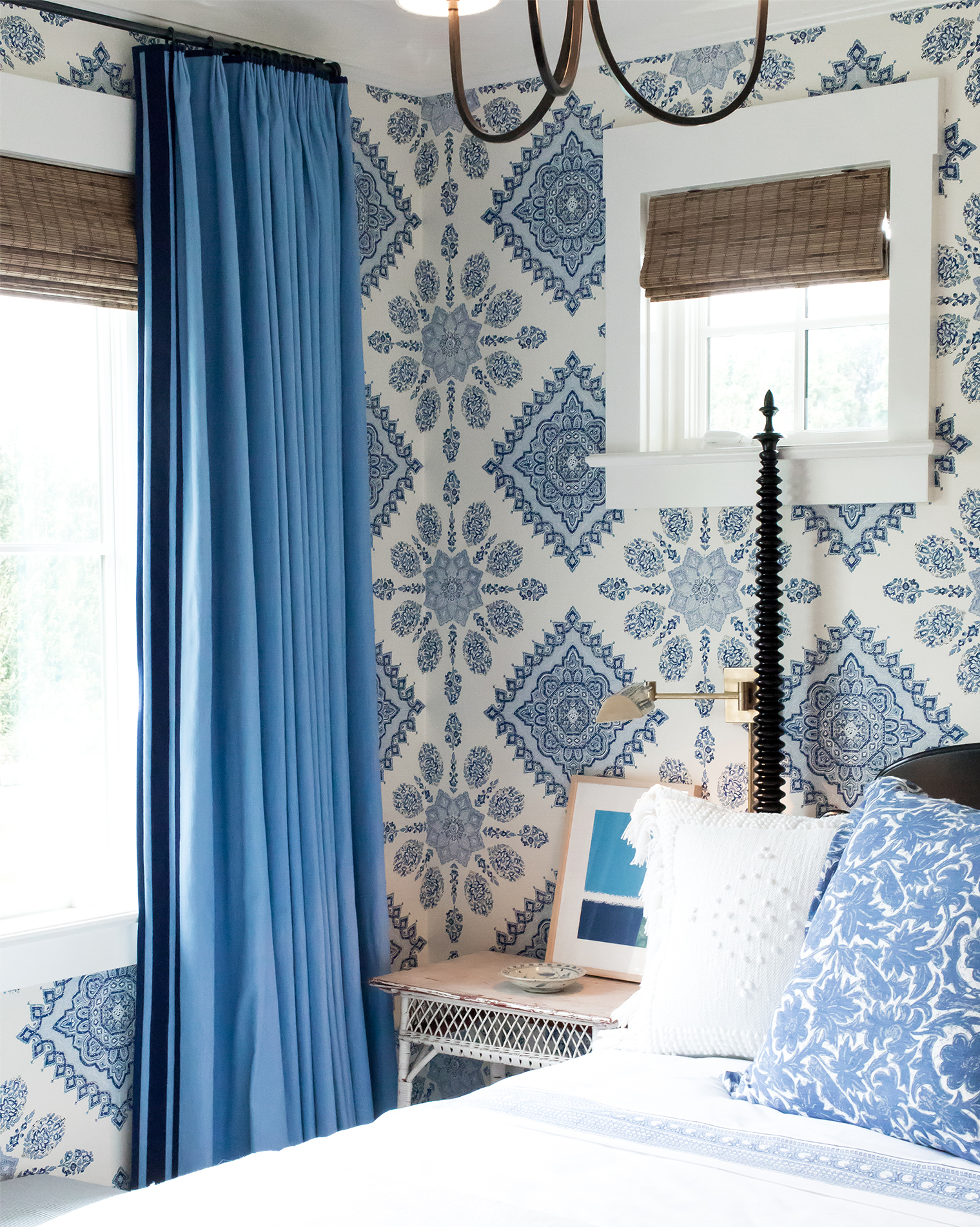 9. Play with brass | Brass is blue’s best friend. I’m talking like total BFF status, OK?! I’m planning on lots of brass in our beach house so I was relieved to see that Mark had introduced brass a lot in the Coastal Living Idea House through sconces and floor lamps. We actually bought these same scones from One Kings Lane for our master bedroom last month, so I was really happy to see them in this beautiful blue bedroom!
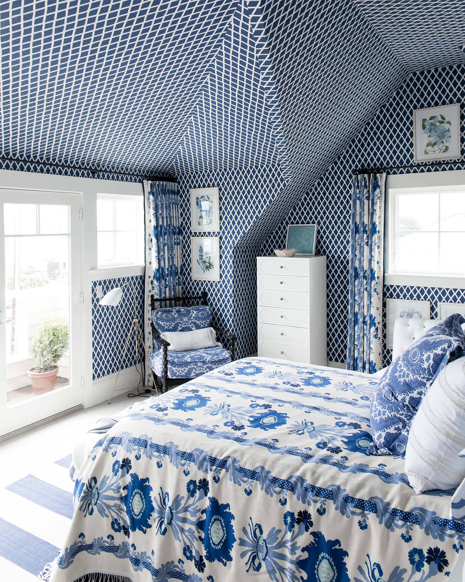 10. Pattern clash | Clashing patterns can be tricky to get right but this guest bedroom shows how it can be a design gamble that pays great dividends. The key to getting it right is to pick patterns at opposite ends of the spectrum. Here, the striking lattice wallpaper hung floor to ceiling is so different to the floral bedding that there’s enough contrast and tension between the two to make a show-stopping statement. If they were too close in style then the two patterns would just merge together and you would loose that ‘wow’ moment. It’s also important to remember that scale is just as important as the pattern and prints themselves: notice how the lattice wallpaper is small scale and the floral is large scale. This is key to a successful pattern clash scheme when decorating with blue and white!
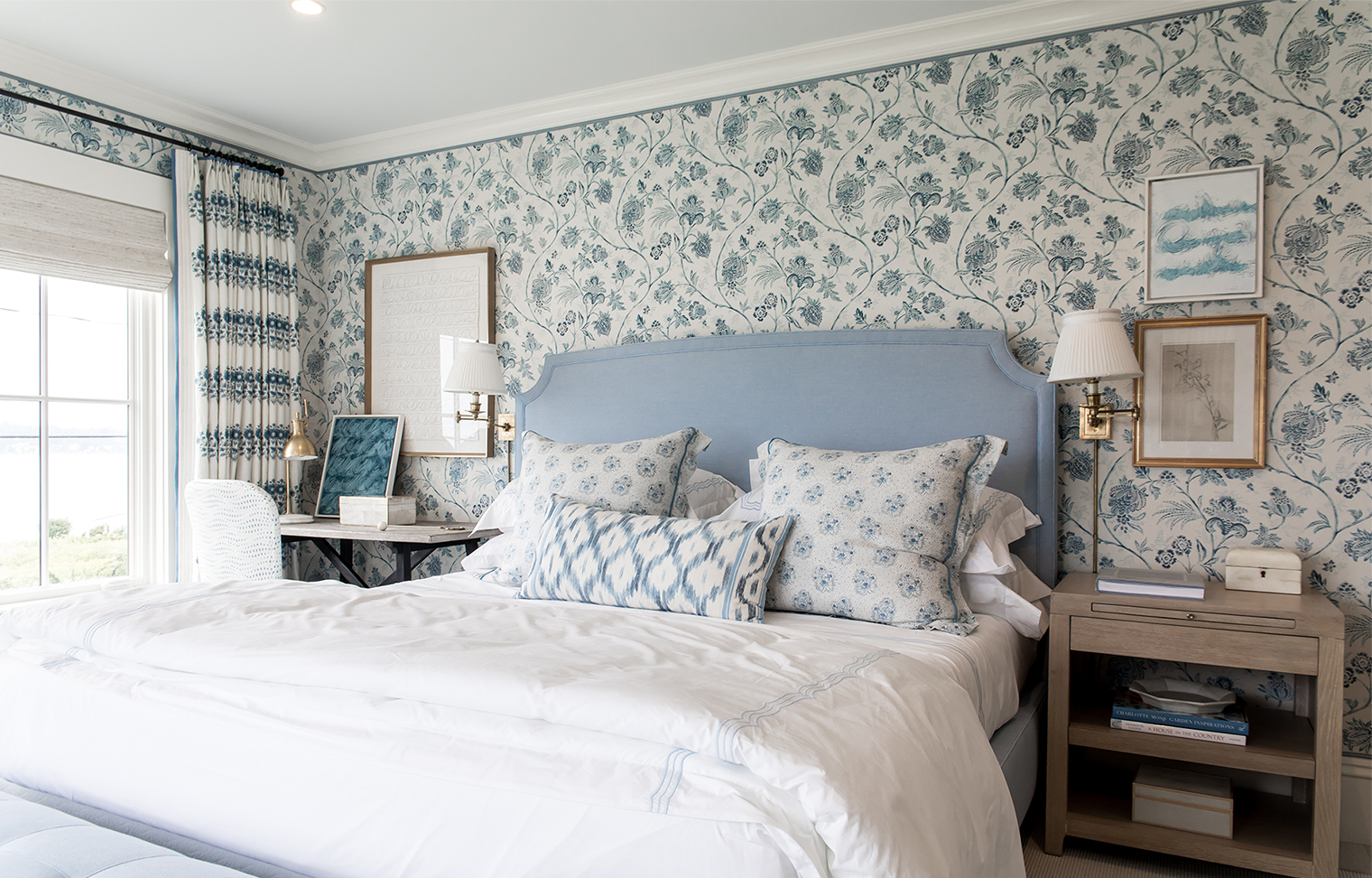 11. Create a tonal color palette | The master bedroom was my favorite example of decorating with blue and white in the Idea House. I loved how Mark created a tonal scheme with a series of softer shades of blue. The solid powder blue headboard is the perfect piece to add impact to the beautiful floral pattern of the upholstered walls. Adding notes of the same color family across the bedding and artwork creates a restful and cohesive space.
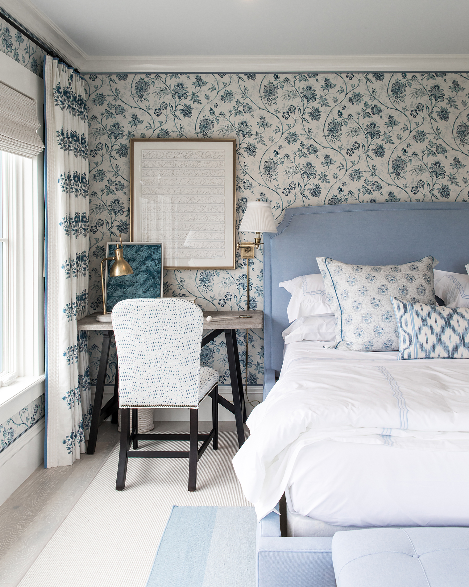 12. Create unexpected moments | Just because a color palette is tried and tested doesn’t mean it should automatically be boring or expected. This writing desk moment in the master bedroom transforms what could have easily been a straight forward nightstand situation into a charming and cozy nook that was actually one of my favorite parts of the house. The wooden desk adds texture and warmth and the black legs subtly break up the blues.
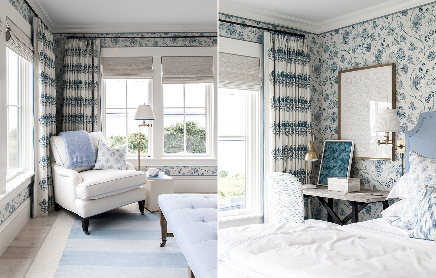 13. Decorate with florals and stripes | Mixing florals with stripes is an easy way to prevent florals from feeling too staid or traditional. While Mark’s style certainly has a traditional look and feel, especially in the master with the layering of the floral upholstered walls and drapes, a modern wide stripe blue rug laid on the floor helps to add a touch of modernity and freshness to the overall scheme.
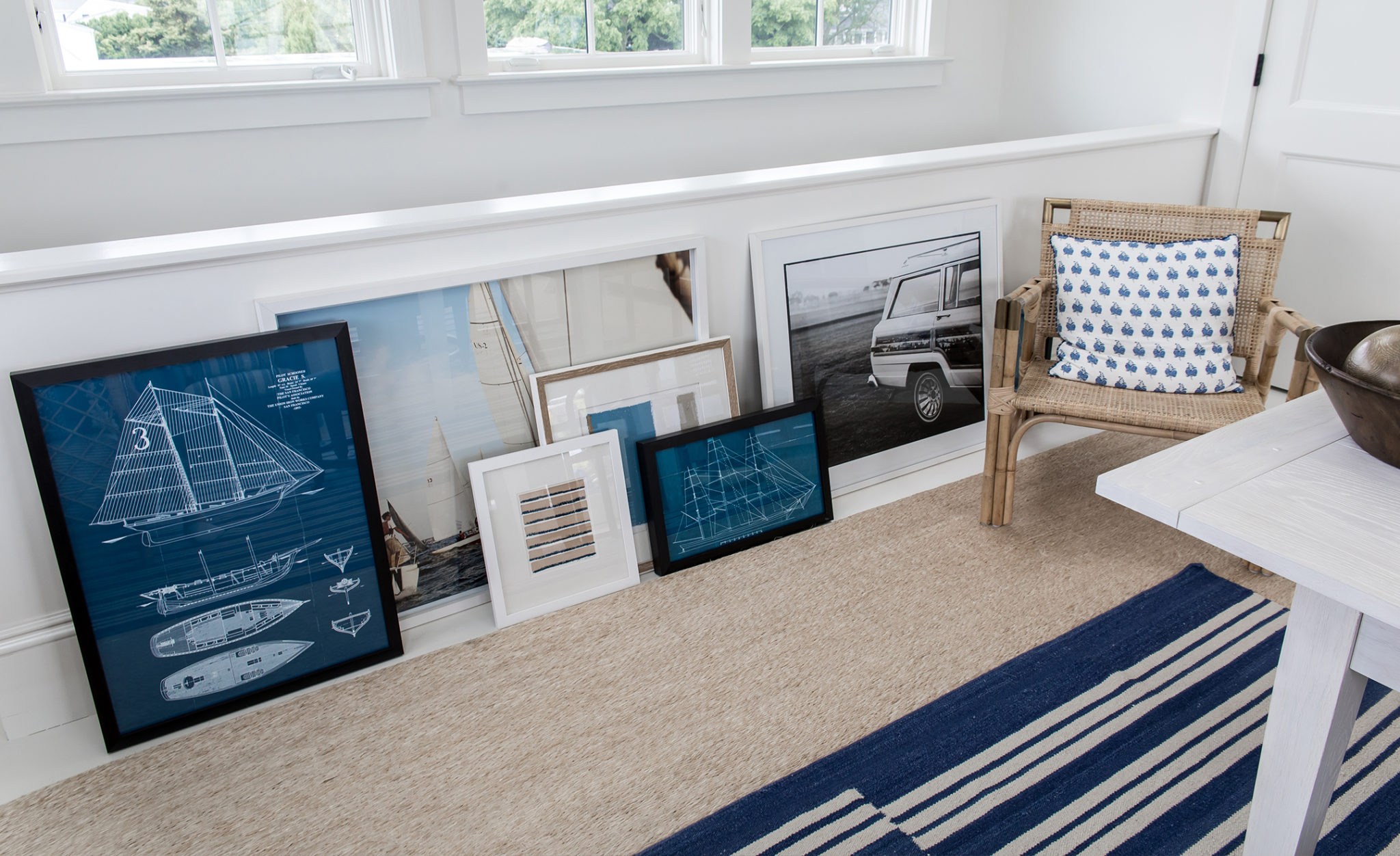
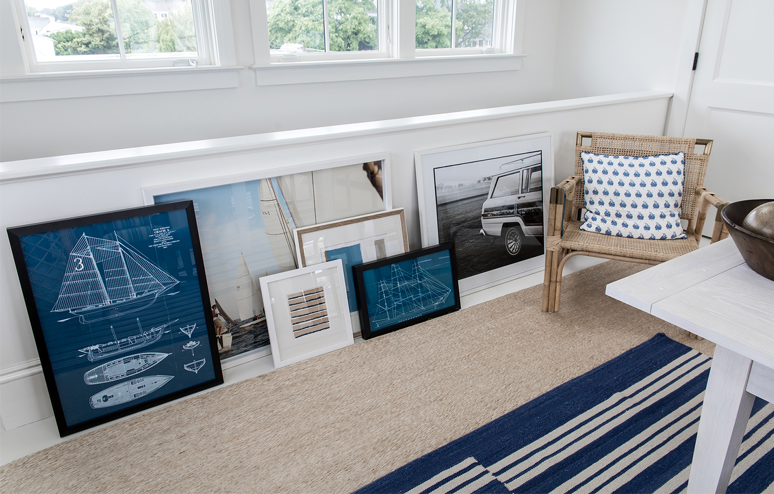 14. Group art in collections | This was one of my favorite vignette moments in the Coastal Living Idea House. I’ve always been a fan of casually placed art, especially when it’s grouped together like this. It’s a great way to give a laid-back feel to a room. Plus, if like me you have an art print addiction, it serves as further art storage and display!
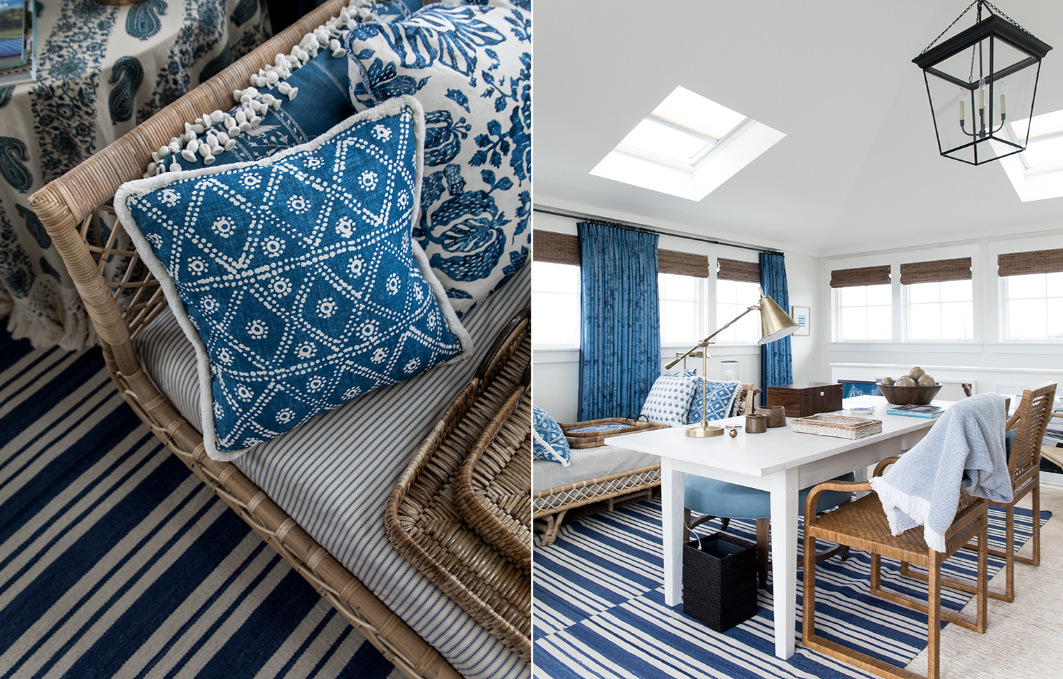 15. Introduce wicker and rattan furniture | Rattan and wicker furniture is definitely enjoying a resurgence of late and when paired with a classic blue and white color palette it instantly tells a coastal design story. So there are my favorites from the Coastal Living Idea House! Have you toured the house in person? What are your favorite design moments and ideas for decorating with blue and white from the space? // Photography by Will Taylor | Interior design by Mark Sikes



15 Comments
Absolutely love this post! These shots are so, so gorgeous and you captured a ton of great details that I didn’t even pick up on at the time. The design tips that you pointed out are also super helpful in illuminating why the whole house came together in such a wonderful way. Definitely going to incorporate some of these tips into my own decorating (but in pink and white, obvi :). Had the best time, I’m so glad we went!
@Jackie – Yay! Thank youuuuu! I loved your post as well. It’s so fun to see what catches different people’s eye from the same space. That’s what I love about decor, it’s super personal. Can we, like, go to a showhouse every weekend please? Kthxbiiiii.
Thanks for opening up the Coastal Living Idea House to us Will. What a beautiful design job by Mark and really interesting to read your take on the project. Have always used blue and white porcelain accent pieces in my home…to see the color theme carried throughout the house is just stunning. Great post…thanks again.
@Harry – Of course, it was my pleasure. Thanks for stopping by, I’m so pleased you enjoyed it. Your accent pieces sound beautiful – and timeless, too.
Will, The effort you put into your blog posts always impresses me. I don’t comment often but wanted you to know I appreciate you sharing all of this inspiration with us. I’ve been to countless showhouses over the years but this one looks unique to say the least. Great work, keep it up.
Peter.
@Peter – Oh, thank you! That’s so sweet. Yes, Mark’s designs were really something and the whole house was bursting with fresh ideas for this classic color palette. I loved it!
Swooning over the master bedroom!!!
@Kati – You and I both! 😉
Pingback: A Few Good Links - York Avenue
@Jackie – Thanks for the link up! 🙂
Gorgeous! The blue and white theme can sometimes be overdone, and a bit stark, but these are all so inviting! Something about nautical themes too, always seems so warm and welcoming. Absolutely love each and every one of these! Thanks for sharing your insight!
@Mary – I totally agree, it’s so inviting! Thanks for stopping by! 🙂
Hey Will! Question – where did you source that black and white photo of the station wagon pictured in the “group art in collections” recommendation?
Thanks!
@Chris – Hey! The space was designed by Mark Sikes for Coastal Living so I’m not sure, sorry! I love it too, though!
Surprised at how well some of these have come together. You’d think that all the different patterns and contrasts would be too much for the eye, but if just works. Great article and good advice on choosing contrasting patterns.