 As long as I can remember the kitchen has been the space that colors the memories of any given abode I’ve lived in, or spent considerable time in. Whether it was pulling my mum’s skirt to show her my drawings while she stood at the farmhouse sink of our childhood home that overlooked the apple orchard and rolling English countryside; or sitting playing card games long into the night with my dear Gran at the long, rectangular dining table that stretched down the centre of the kitchen in her thatched cottage; or the bleary-eyed mornings at university sat with my housemates around a horribly cheap glass dining table that was squashed into the corner of a tiny kitchen, digesting and piecing together the events of the previous night’s party (OK: let’s great real it was probably after Noon!); or more recently in my heart mate and I’s New York City kitchen where we sit at a small table for two eating breakfast often commenting how lucky we feel to live and work in the city we’ve always loved.
The red thread that ties all of these kitchen-based memories together? Coffee. There is always the smell and taste of coffee present in my memories of time spent in the various kitchens of the homes I’ve lived in. From the French press coffee my Gran taught me how to make long before I could even ride a bike, to the cheap and cheerful instant stir-in coffee we had at university, coffee has been the fabric of the conversations and moments I’ve had and continue to have in the kitchen. My heart mate and I bought our first Nespresso machine when we moved in together after graduating. Our route to the brand meant buying a Gaggia coffee maker first and soon realizing that although cute to look at, it was highly impractical because caused an almighty mess with each use, and took far too long for two budding professionals to wait on each time they wanted to make espresso. Needless to say, we swiftly returned it and bought home our first Nespresso machine. The rest, as they say, is history: with every move we’ve made of the years (and there’s been a lot of them!) we’ve always made sure the Nespresso machine comes with us in the car vs. the mover’s van so we know that no matter what, we’ll have coffee at the new place! So, given the importance of Nespresso to our lives over the years, I’m so delighted to be partnering with them to share the whole design story of our new beach house kitchen. After the jump, I’m going to talk you guys through the structural changes we made to the kitchen area and how we designed the kitchen to make it work for the way we live our lives. I can’t wait to show you so let’s get started!
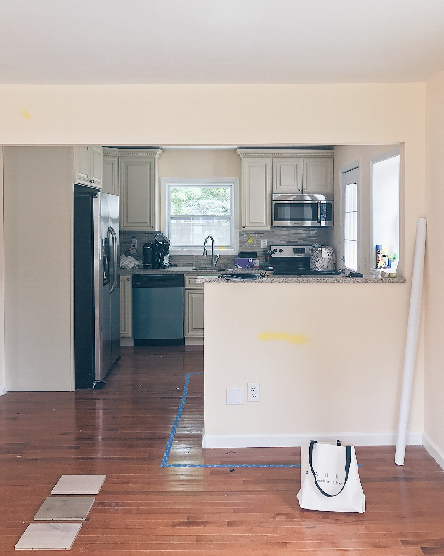
We closed on the house back in May and spent a few weeks heading out there on weekends to ‘camp’. I say camp because there was no furniture, just a mattress and, of course, a Nespresso machine! No joke, in the image you see with the slider to the right you’ll spot their new VertuoPlus machine on the countertop! And I’m glad we did because planning the interior of a kitchen and, well, a whole house, for the first time has been such a sharp learning curve. Yep, it’s definitely true when people say that everything takes twice as long and costs twice as much as you expect. Still, we feel so fortunate to be able to turn this little house into our home. So, let’s talk about how we are preparing the space structurally so we can put in our dream kitchen. We bought the house from a flipper who basically did the bare minimum to get the property habitable. The kitchen was put together with mix and match pieces from the discount isle, the faucet was loose and the countertops has been fitted so poorly you could see every join.
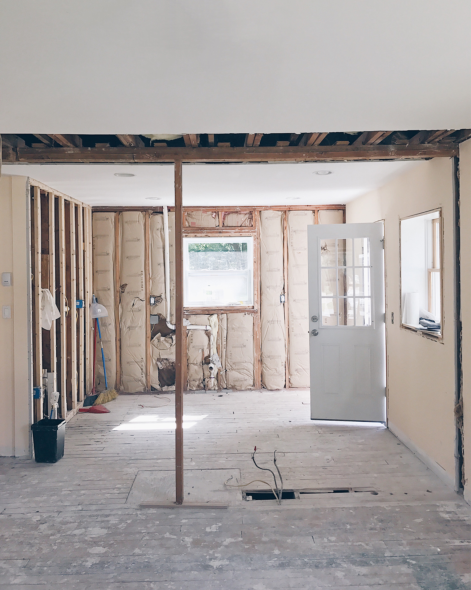
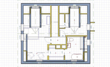
So, we decided to donate the appliances and then ripped out the cabinetry. If you pull the slider to the left on the above image you will see how we also made two structural changes: first, we worked with our contractors City & Stone to remove the weird half-height pony wall and secondly, to raise the dropped ceiling so that the space would flow consistently through from the dining room into the kitchen. This has given us a blank canvas to design a kitchen that works for how we plan to live in this house.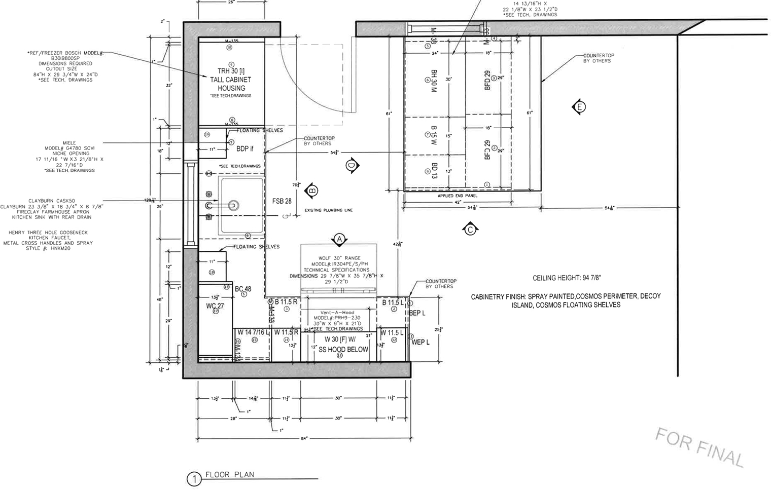 Speaking of design, I thought it would be useful to share the floor-plan (above) and elevations (below) of the new kitchen to help you visualize what the new kitchen will look like. As you can see we’re not moving the location of the kitchen. We always liked how the back door entered straight into the kitchen, as well as the large window above the sink that looked out over the back yard. Also, by not moving the plumbing it helped to save money! So what have we added? To the right of the back door you’ll see an island counter unit that comes out from the side wall. This will be situated where the pony wall used to be and it’s something we’re both really excited about. As I touched on earlier, my heart mate and I love our morning Nespresso, especially so on weekends when one of us will cook breakfast while the other sits reading the paper or looking up something fun in the city to do that day. So, when we were planning our kitchen we knew we wanted to design the the space to be sociable. I can already see us both in this kitchen, our Nespressos on the island unit and the comforting whirl of the dishwasher in the background. Ahhhh, domestic bliss!
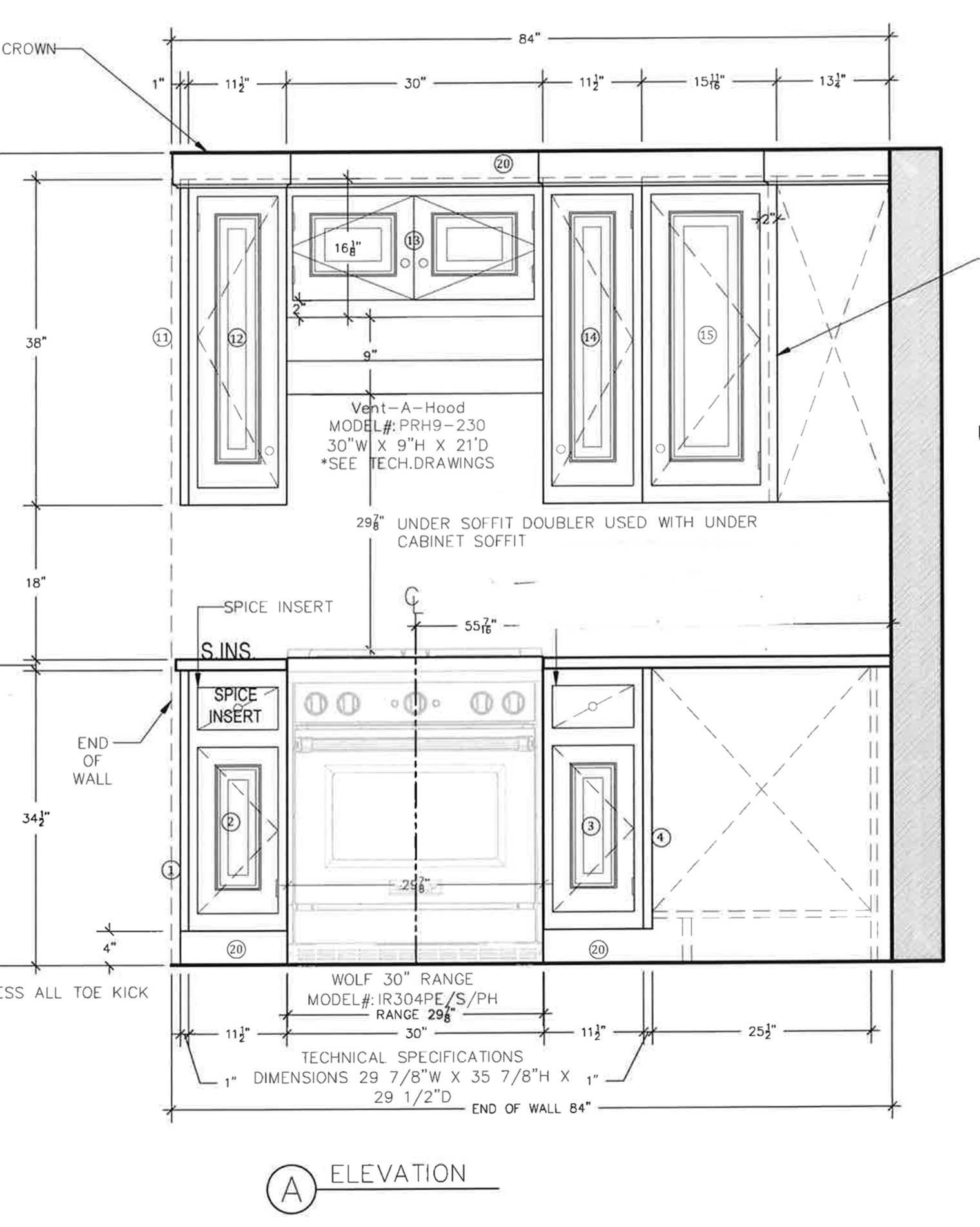 This elevation shows the view straight in front of you if you had just walked in through the back door.
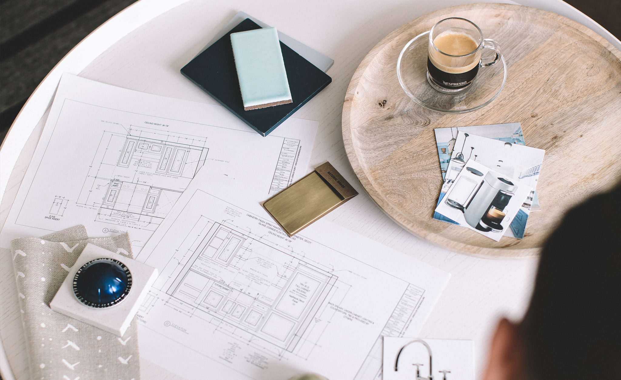
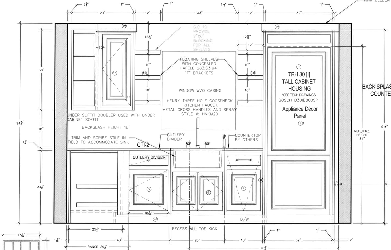 This elevation shows the kitchen from the same viewpoint in the slider earlier on in the post. You may notice that while we have kept the plumbing line in the same place, we have made some other changes. The refrigerator has replaced the stove and will be hidden behind a panel so it matches the rest of the cabinetry. The stove will be on the wall facing the back door, which means this side of the kitchen should feel much more open. Floating shelves either side of the window will also make the kitchen feel welcoming and causal, while the addition of the island counter unit means we’ll have added storage and worktop space. Plenty of space for our new VertuoLine Plus machine!
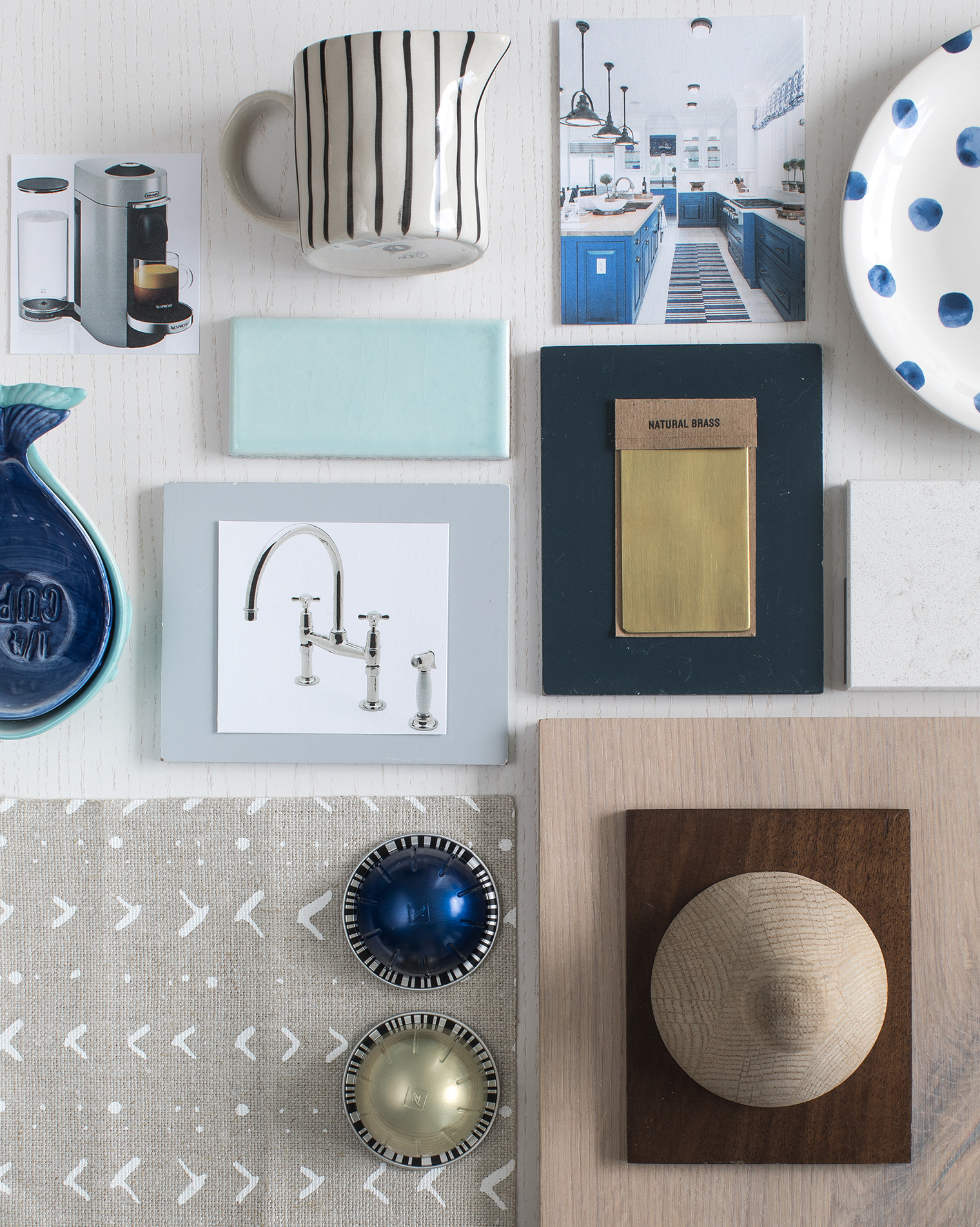
 As you guys know I’ve also been a major color lover, so it will come as no surprise that as well as Nespresso’s coffee, I’ve always been inspired by their colorful capsules! So much so I’ve been displaying my capsules in clear glass canisters for years. And I mean years: in this post from 2011 you’ll see my Nespresso capsules stored in said canisters (the same glass canisters I store them in here in NYC today!). Given the importance of coffee to my relationship with the kitchen I took this inspiration and fed it into the design for our space at the beach house. The rich blues of Diavolitto inspired the navy cabinetry color, while the smoothness of Melozio led me to introduce natural brass elements across the faucet and hardware. With tactile window treatments using Caroline Cecil Textiles fabric, fresh white countertops from Cambria, and beautifully refreshing soft mint tile from Fireclay Tile for the splash back, I’m so excited about how the kitchen is going to look when it’s finished. I’ll be back here with more kitchen updates from the beach house soon! In the meantime, you can check out this Pinterest board for more design and inspiration updates from the beach house kitchen.
 // Photography by Will Taylor | Posted in partnership with Nespresso; all views my own


25 Comments
Hi Will, I remember you doing that post on the kitchen storage unit all those years ago…..amazing how far you have come and to read about how special this house is for you both. all the best with the renovation! Nadine xx
@Nadine – Yay! We are so excited about this part of the house, it’s hopefully going to be the heart of the home! Oh, and thanks for being such a long-time reader! 🙂
Gorg moodboard!! Can’t wait to see the finished space!
@Sarah-Jane – Thanks so much for following along!
Yassssss. Nespresso is lyfe! Legit obsessed w/ it
@Dylan – I agree, I can’t start my day without it! 🙂
Loved reading about how you’ve changed the space and the sliding pictures are cool. Great idea to raise the dropped ceiling. My wife and I did something similar in our current place and it made a big difference to the room.
@Kian – Thanks for stopping by and reading the post! Isn’t it amazing how how much raising the ceiling in a room can improve it? I knew from the moment we walked in and viewed the property that if we bought it we’d have to do it – and we did! 😉
You painted such a wonderful picture of your past! You know how much I love coffee as well and my Nespresso machine has been a Godsend. I am not sure how I would be able to face the day if I didn’t have a cup of my dear Arpeggio in the morning.
I remember when I first received my machine and it came with a multicoloured pack of pods to sample and it took me a while before I could bring myself to try them out because they were so pretty together!
Thank you again for sharing and I am so excited to see what your home will end up looking like!
-Didier
http://www.didieryhc.com
@Didier – Writing the post made me realize what a huge part of my life coffee has been over the years. It’s as though it has been the foil to many of my memories in all of these different kitchens, you know? And I love that you love Nespresso as much as I do! It’s so true about their capsules, they are pretty in their own right and it’s totally why I display mine in the glass canisters. Love them!
Eee, I can’t wait to have coffee in the beach house kitchen with you boys!! I’m supping an iced Nespresso latte right now, trying to hold on to the last of the summer vibes.. xx
@Kate – Awww we can’t wait either! Enjoy the iced Nespresso, I’m just having my first cup of the day! x
Looking forward to seeing the kitchen take shape Will. It will look amazing of course. Architectural Digest Amazing! Love the moodboard. xx
@Carole – Thank you! We’re excited to see it take shape as well, especially as we imagined ourselves in this space even when we first looked around the property. x
Love the details in the floorpan (refrigerator near the door looks great) and the photo slider, how cool is that? Good luck with all the planning!
@Maureen – Thank you! I’m so glad we decided to move the refrigerator so that it’s where the stove used to be by the door. It makes so much more sense!
Pingback: Weekend Reading
@Grace – Thanks for the link love!
Pingback: 4 esempi di come si realizza una moodboard ispirazionale quando si inizia ad arredare casa
Wow! It’s really interesting . Thanks for sharing great idea.
@Thomas – Glad you found it inspiring, thanks!
Simply stunning! From the details of the pods to the hiding of major appliances to make for an even more beautiful space! Your kitchen is inspiring to our new build. Would you share the paint colors?
@Cara – Thank you! Sure: Cosmos on cabinets; Decoy on island.
Your kitchen is stunning- who makes those paint colors? I love the island paint!
@Christine – Thanks! Waterworks makes them.