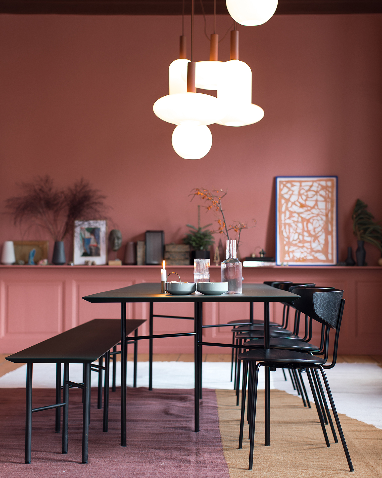
 I was so excited to photograph The Home by Ferm Living during a recent trip to Copenhagen last month. Why? Well, for starters I’ve been a fan and follower of Ferm Living for many years (exhibit A and exhibit B are two examples of many blog posts I’ve published about the brand over the years!), but also because The Home by Ferm Living isn’t open to the public so much of the spaces were new-to-me as I stepped inside! In today’s content saturated world it’s rare to find an interior as stunning as The Home by Ferm Living that hasn’t been in every magazine/book/blog/Pinterest board. I get it: I excitedly pin/share/blog my favorite spaces too but, hey, as design lovers how refreshing is it to see new-to-you spaces that you just can’t get enough of?! Such a high. OK, I’ll stop geeking out now and dive straight into my tour of this gorgeous Danish apartment.
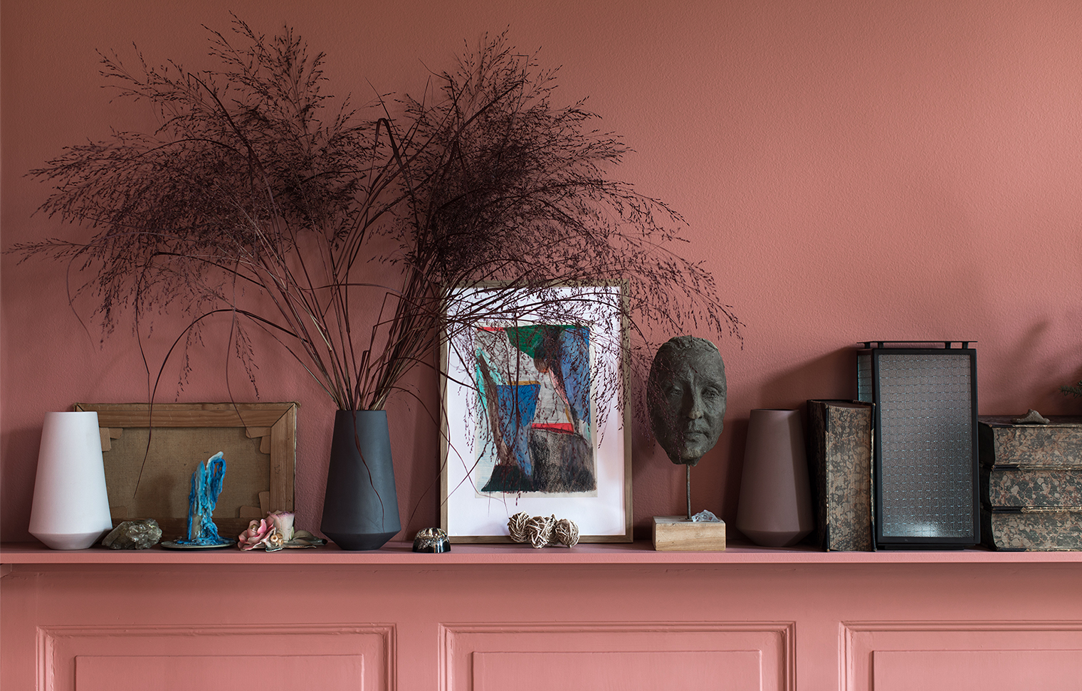
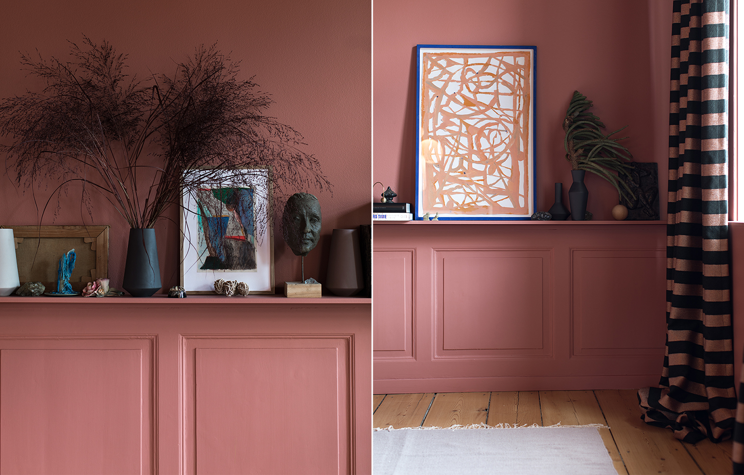 Let’s kick off in the dining room because, well, it’s stunning. As I walked through the apartment I kept saying to my husband: this is exactly how I love to see color used in the home. It’s bold but not showy; muted but not boring. This warm pastel pink felt colorful and cozy – perfect for a dining space. I loved the contrast with the brand’s black dining furniture, too. I love how Ferm Living design subtle contemporary pieces that speak to their Scandinavian design heritage with just a hint of mid-century.
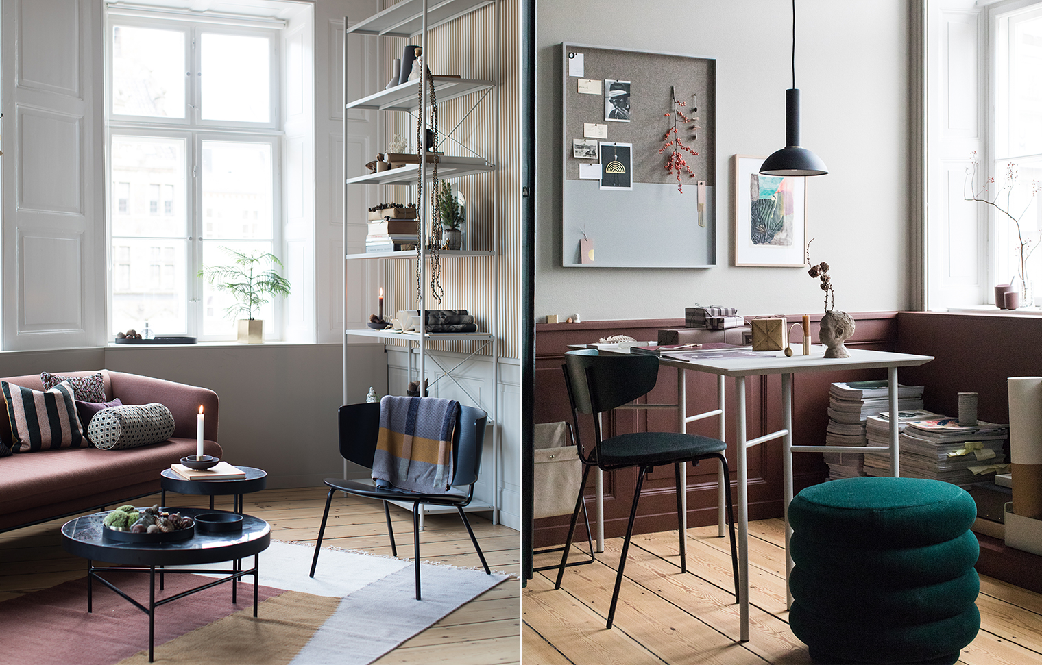
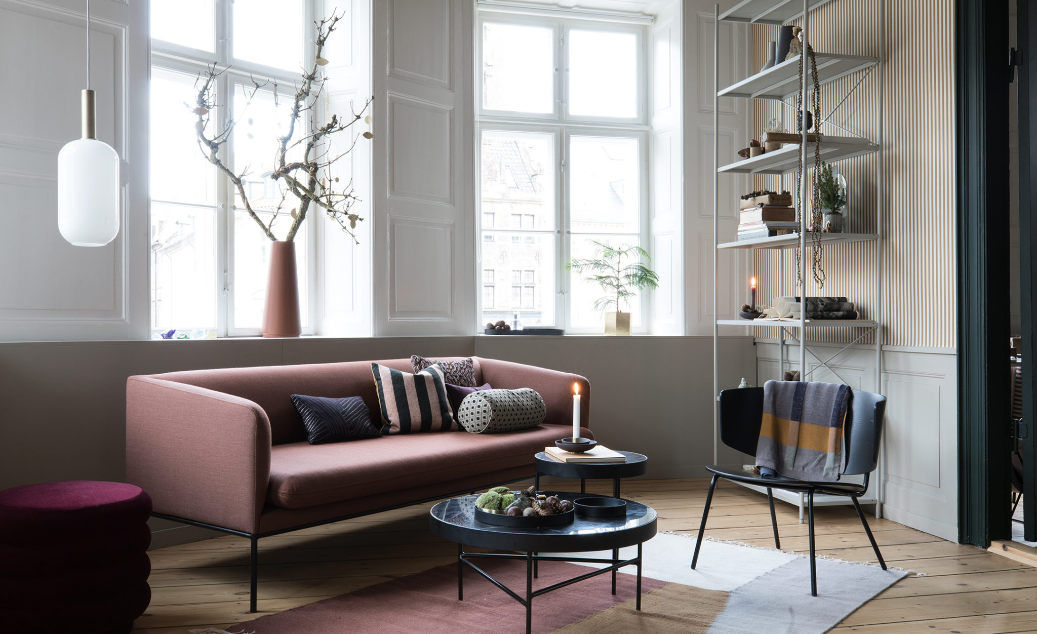
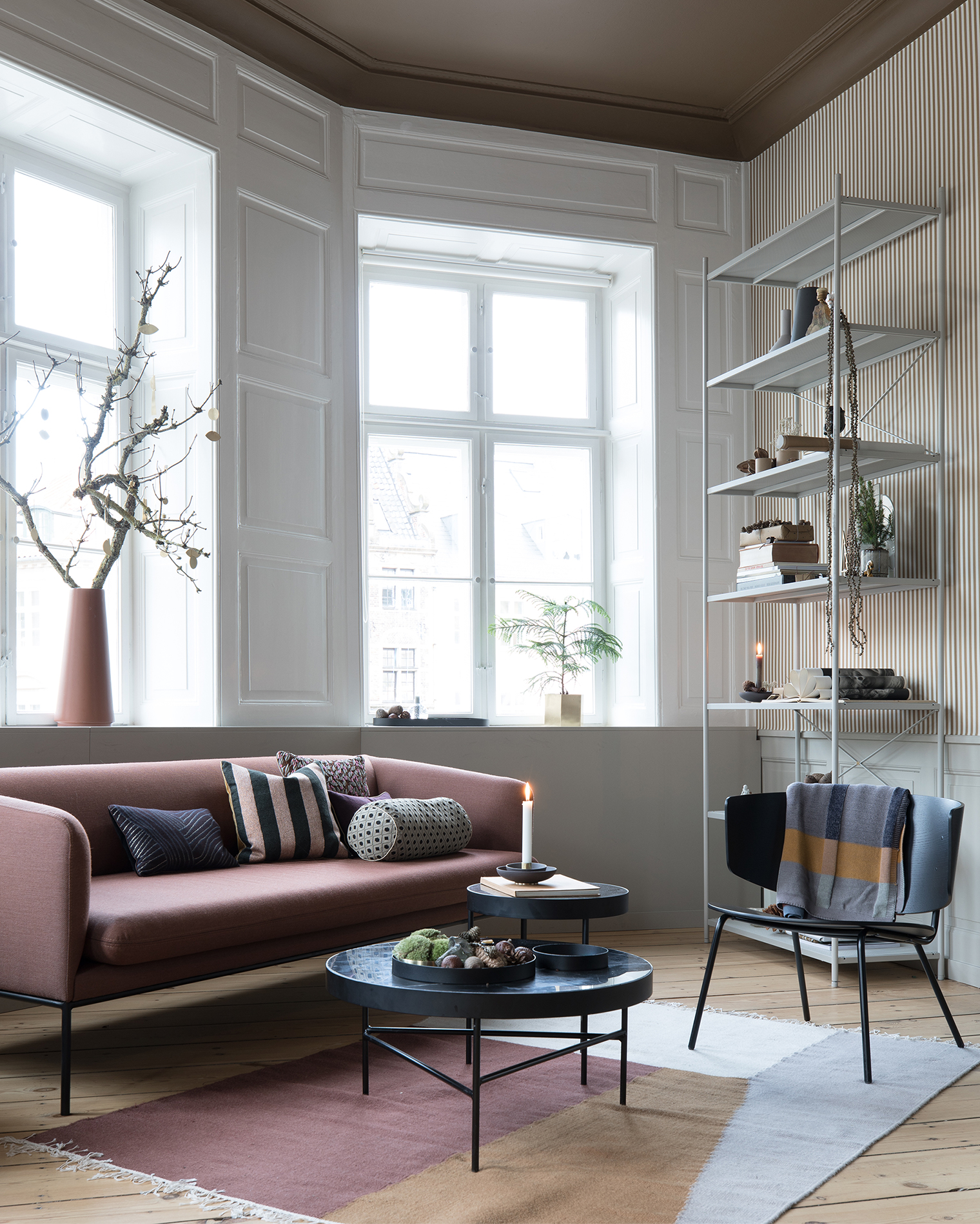 The living room is a fine example of how to make a minimal interior feel welcoming and colorful. I can’t get enough of these soft shades and clean lines. LOVE!
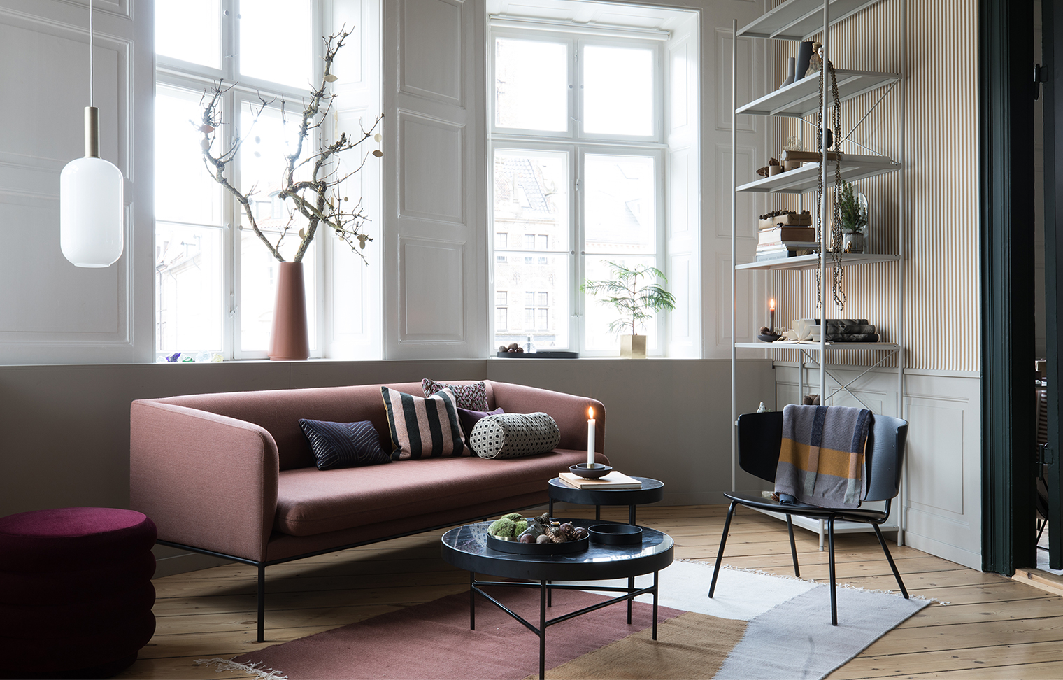 Elegance, personified? I think so.
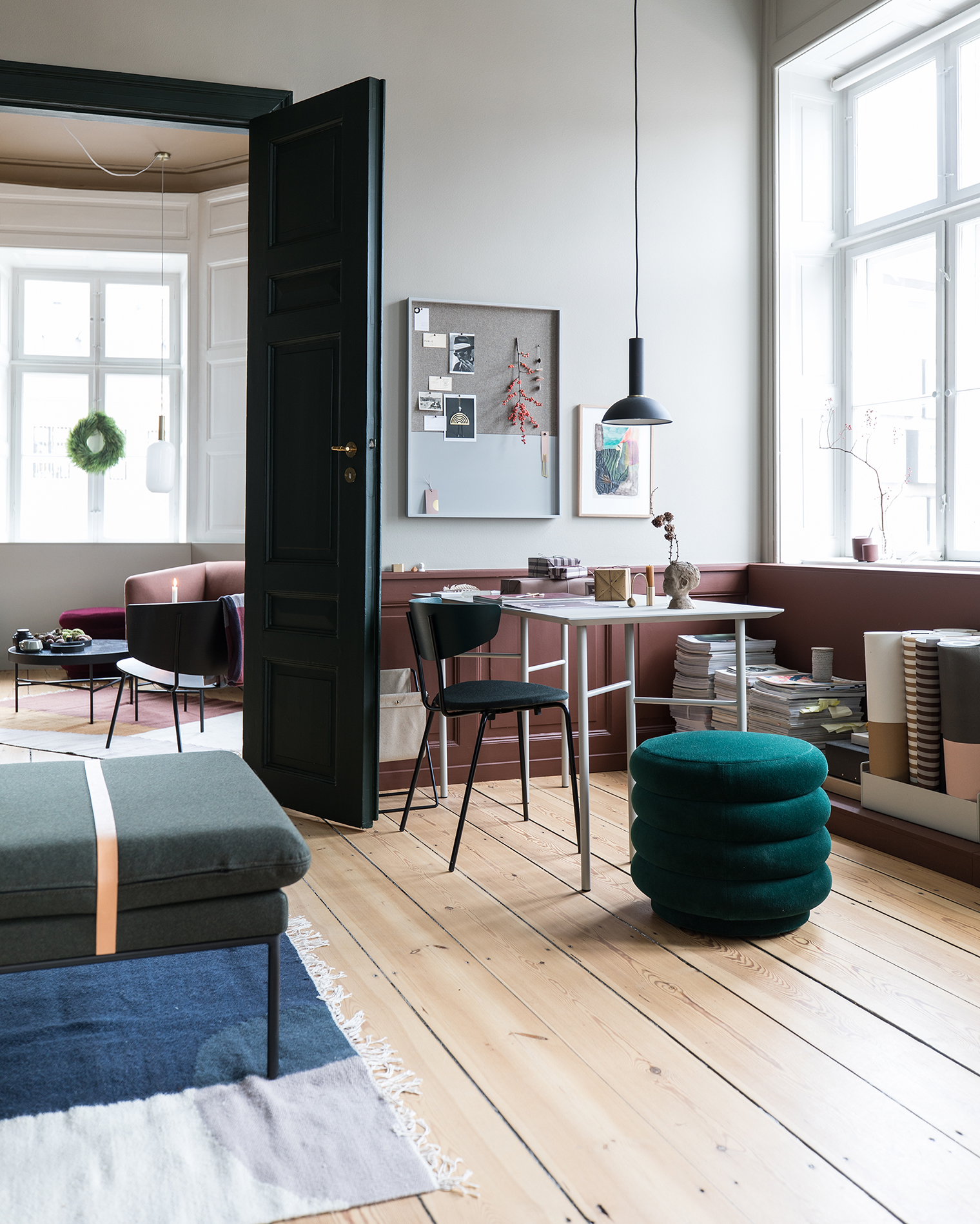 My favorite use of color in The Home by Ferm Living was to emphasize the architectural details of the space. From accenting ceilings with block color to highlighting architrave with accent color, the result was arresting and beautiful.
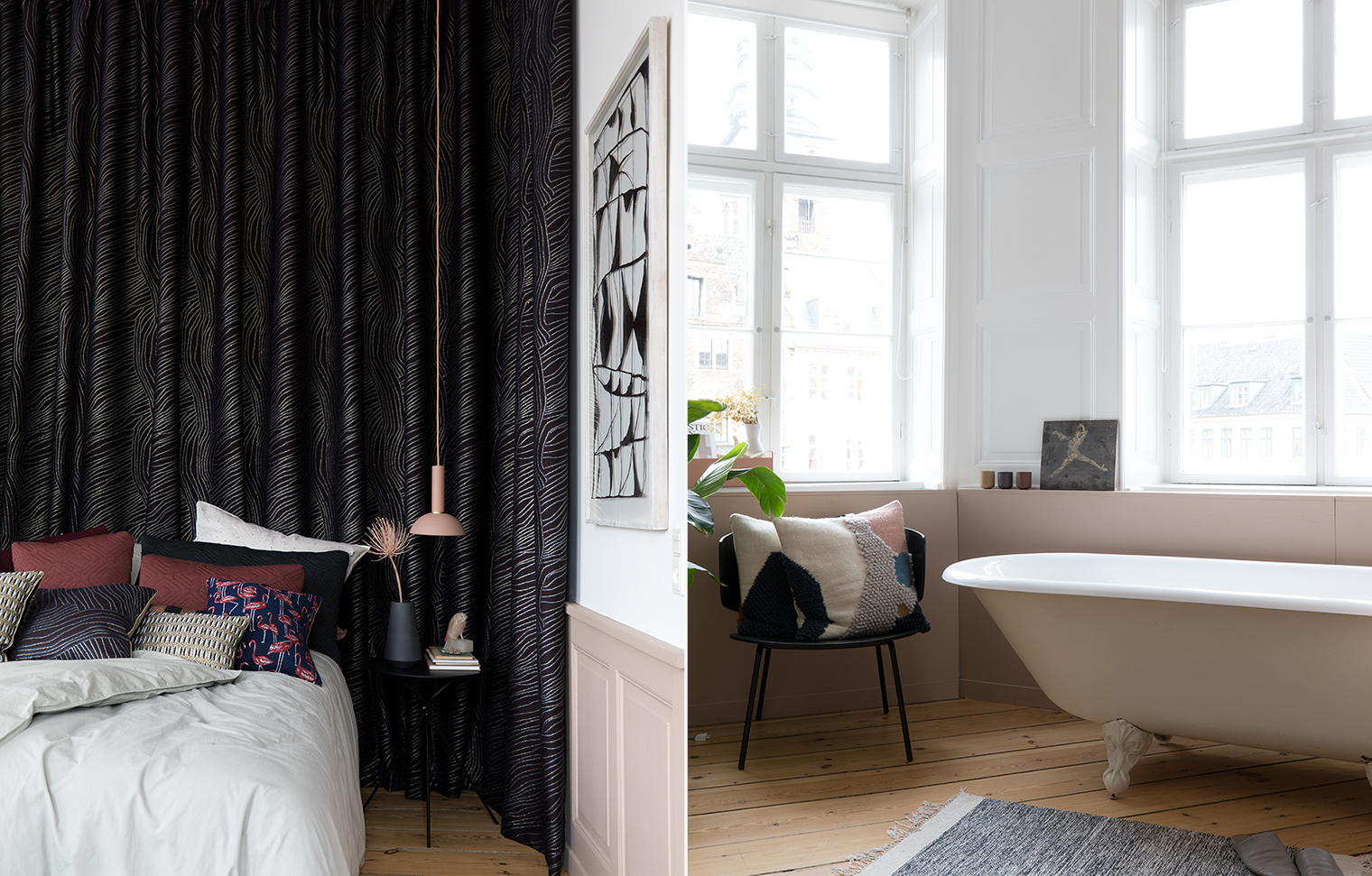 I also loved how hanging ceiling to floor fabric behind the bed, along with a low-hung pendant over the nightstand, made the bedroom feel cocooning and enveloping despite the high ceilings. Also, that tub. I mean…wow!
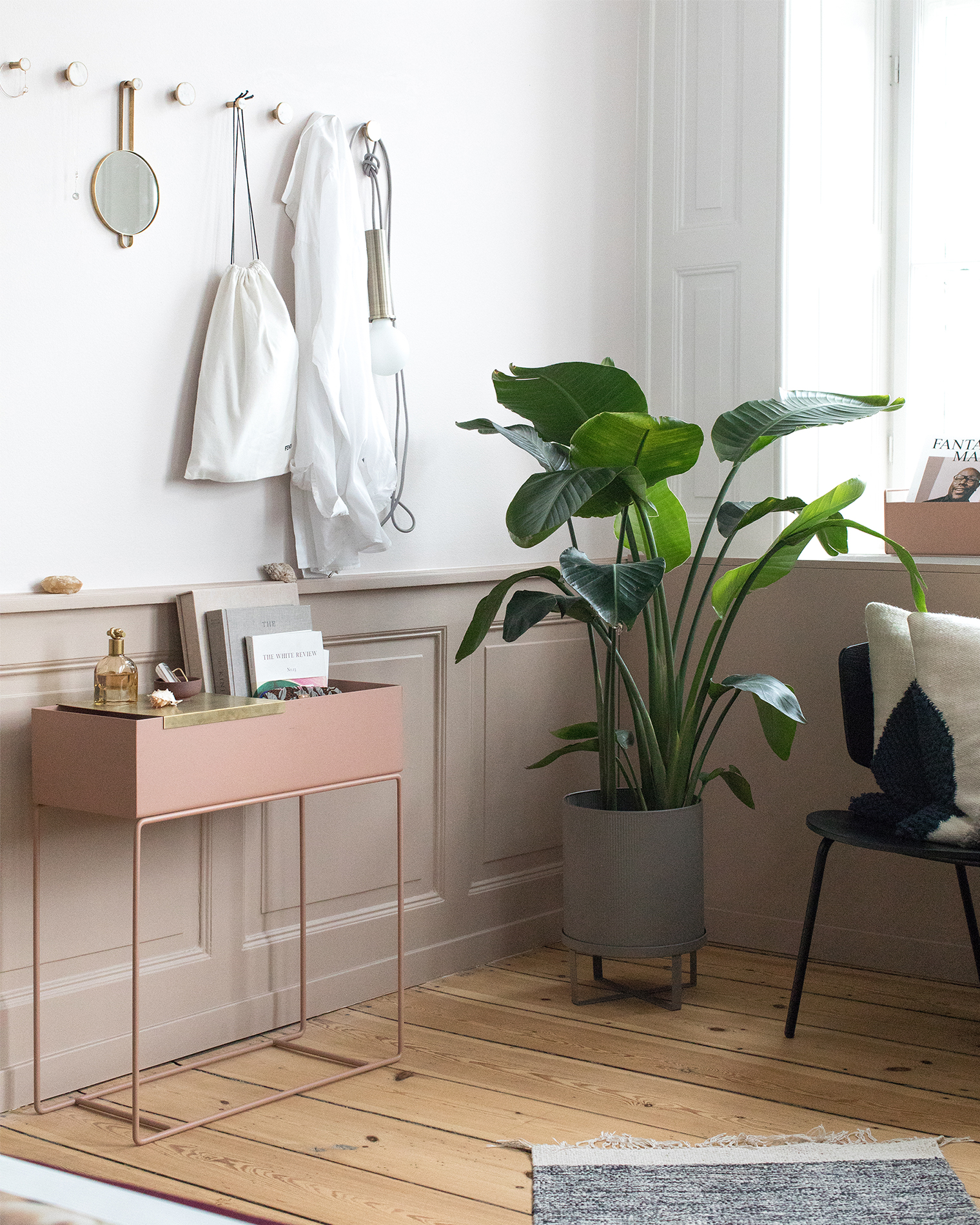 I’m thinking of getting this plant box for our apartment in the city because it’s such a versatile piece. I love how they styled it here as a storage piece for the bedroom. It’s so petite yet so practical at the same time, especially with the little brass shelf.
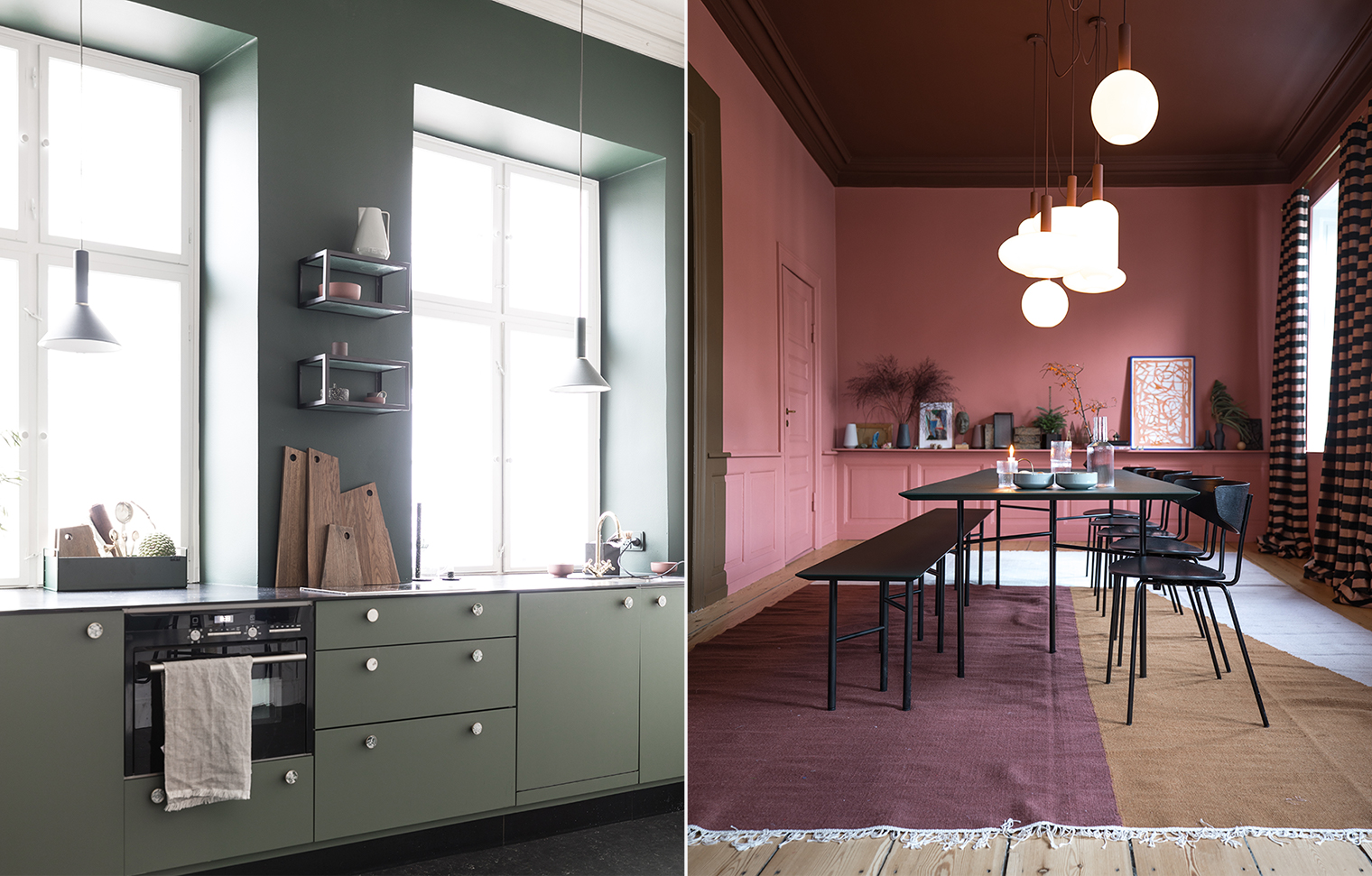 The kitchen was a lesson in streamlined Scandinavian design. One day I’d love to design a kitchen without wall-hung cabinetry. We considered it for a moment for our beach house kitchen but the space was just too small for it to be practical.
 So, if you couldn’t tell, The Home by Ferm Living is hands down my absolute dream apartment. What design details are you loving from this space?
 // Photography by Will Taylor
Welcome to Bright.Bazaar, my make-you-smile style corner of the internet. I’ve been sharing my love of beautiful design, feel-good homes, everyday style, inspiring travel and, pretty much everything in between, since 2009. As well as working as a content creator, I write interior design books and edit a bi-weekly e-newsletter called Smile Mail. I live in New York City with my heartmate and can often be found listening to Madonna’s Confessions album and dreaming up my next home renovation project.




10 Comments
Beautiful Will
@Marti – Thanks! It was such a fun space to photograph and I’m so glad I was able to experience it.
Brb I’m moving into that home office. 😉 Great post Will!
@Jackson – Haha! Saaaaaaame.
Total eyegasm happening over here RN!!! Love all the Scandinavian elements and the layers to the space. Thanks so much for sharing and inspring us! Happy Holidays from Chi!
@Quincy – Isn’t it just incredible? Legit my dream apt. And you are right, it’s so layered but somehow still uncluttered and relaxing. Happy holidays to you, too! 🙂
This is such a gorgeous space! Counting down to my Copenhagen trip in March!
@Meghan – Ahhhh you are gonna love it there so much! Can’t wait to see your pics!
love that low shelf in the dining room. Do you know the name of the wall colour in there?
@LoveMombo – I don’t know the wall color, I’m sorry!