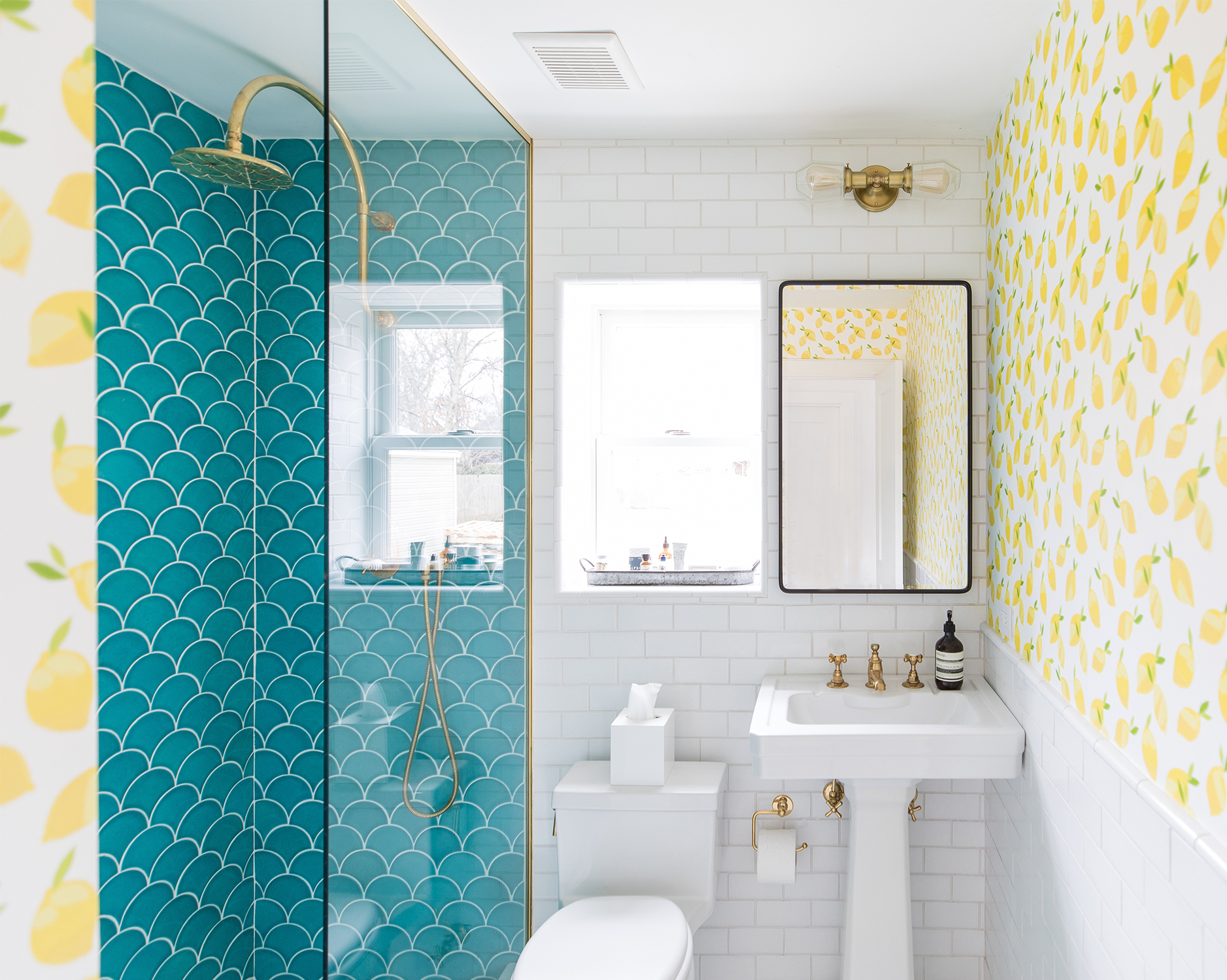
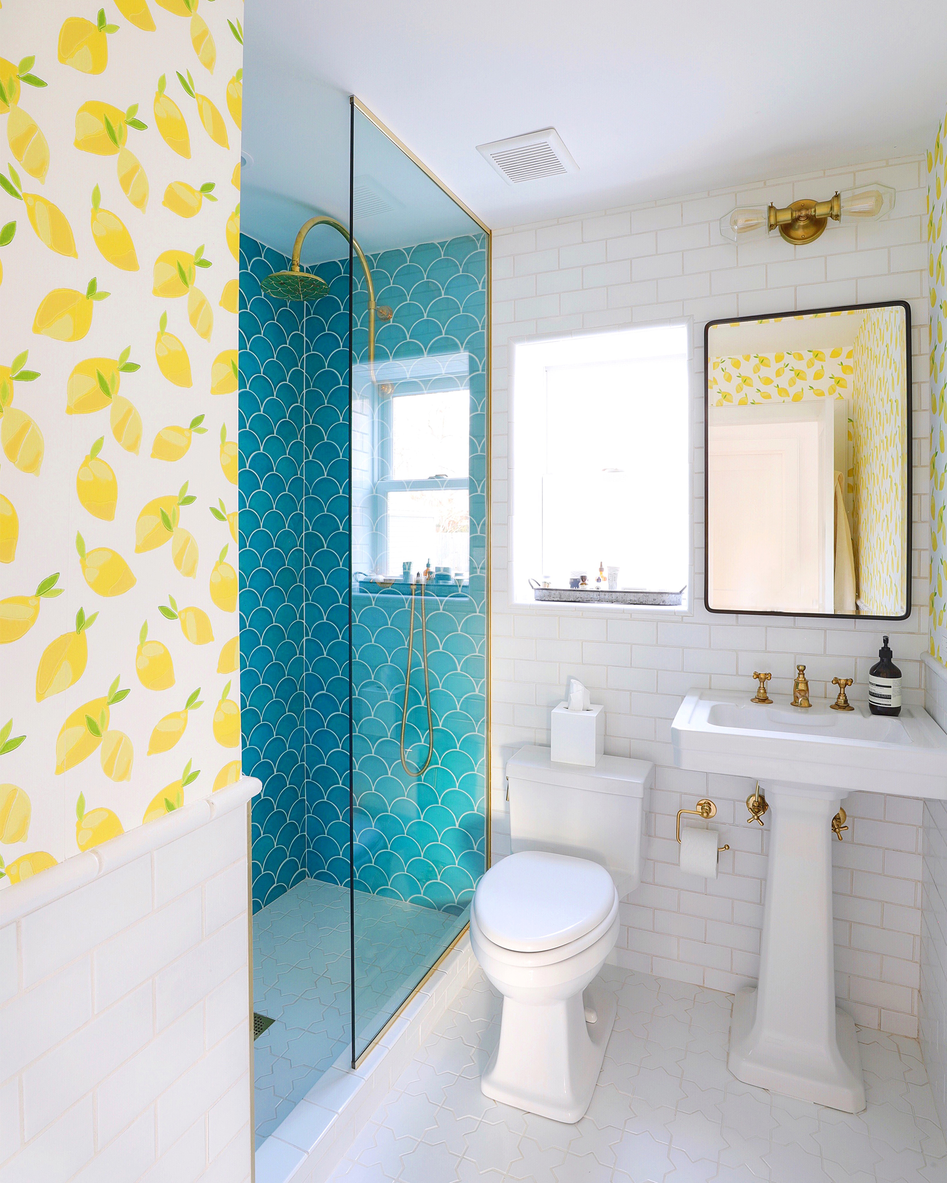
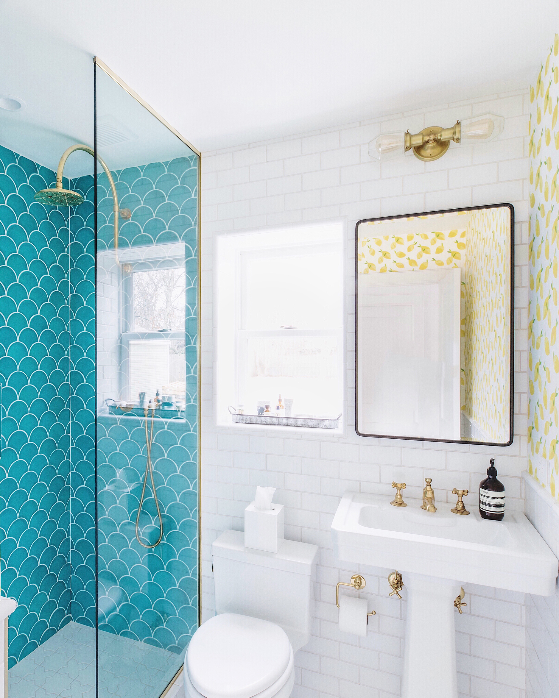
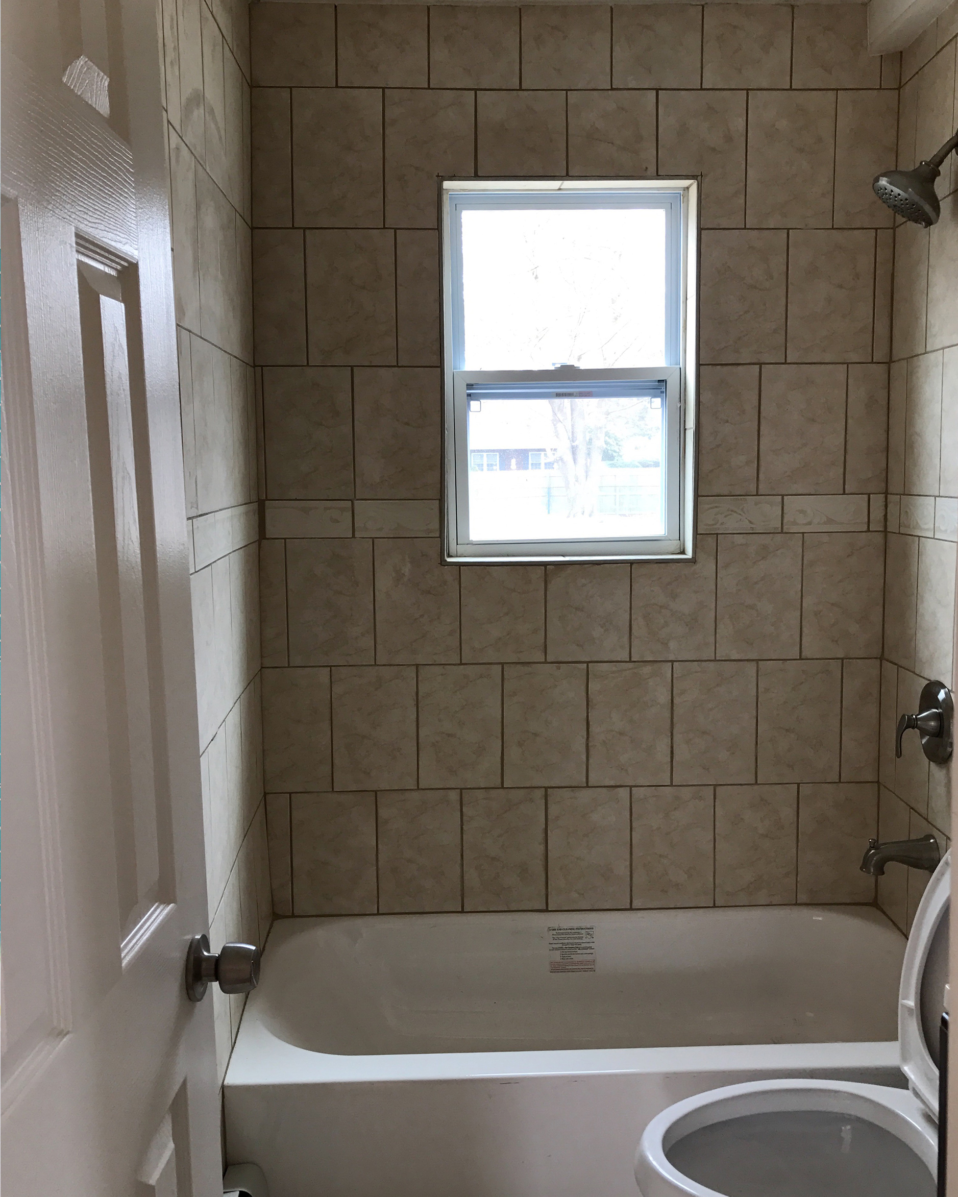
 Over on Instagram you may have seen the sneak peek I posted of the beach house guest bathroom last week? Well, today I’m excited to blog the full reveal! I love how we transformed what was a dark and dingy space into something that’s colorful and airy. The transformation is really quite something (if I may say so myself!), but don’t take my word for it – see the before and after for yourself in the slider below:
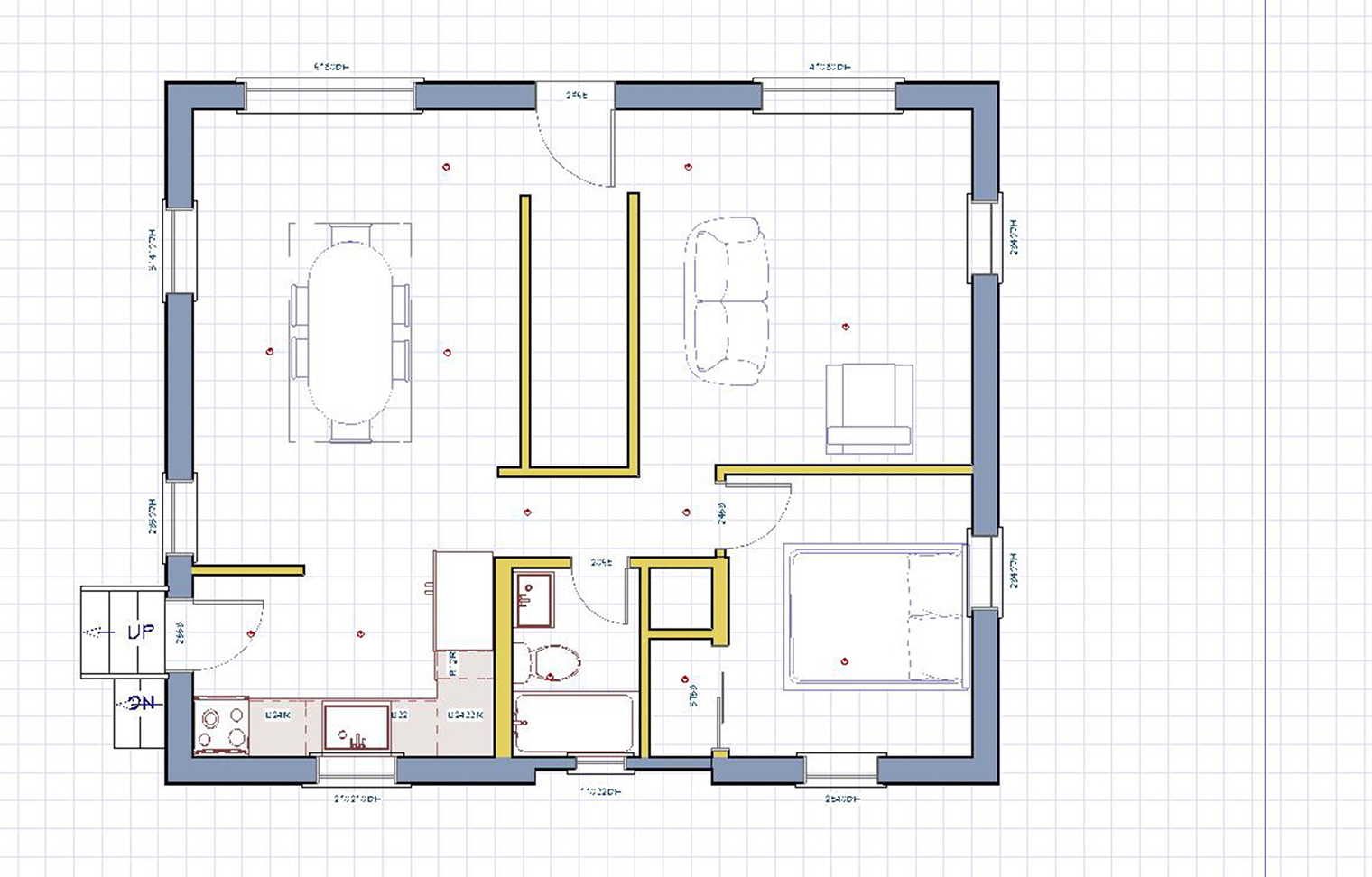
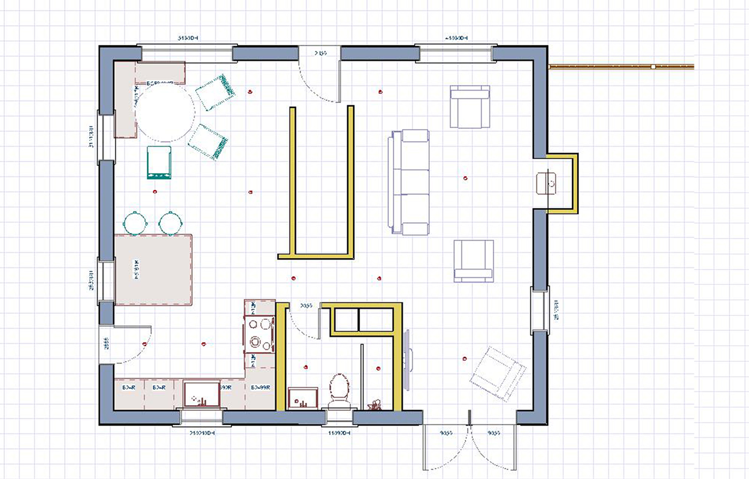
 If you are scratching your head about how we reconfigured the space – I don’t blame you! Last summer I shared this blog post which shows pictures of the guest bathroom before and during renovation, which is helpful to look at so you can see how we physically changed the four walls and layout of the space. Below you can see the downstairs floor plans before and after renovation:
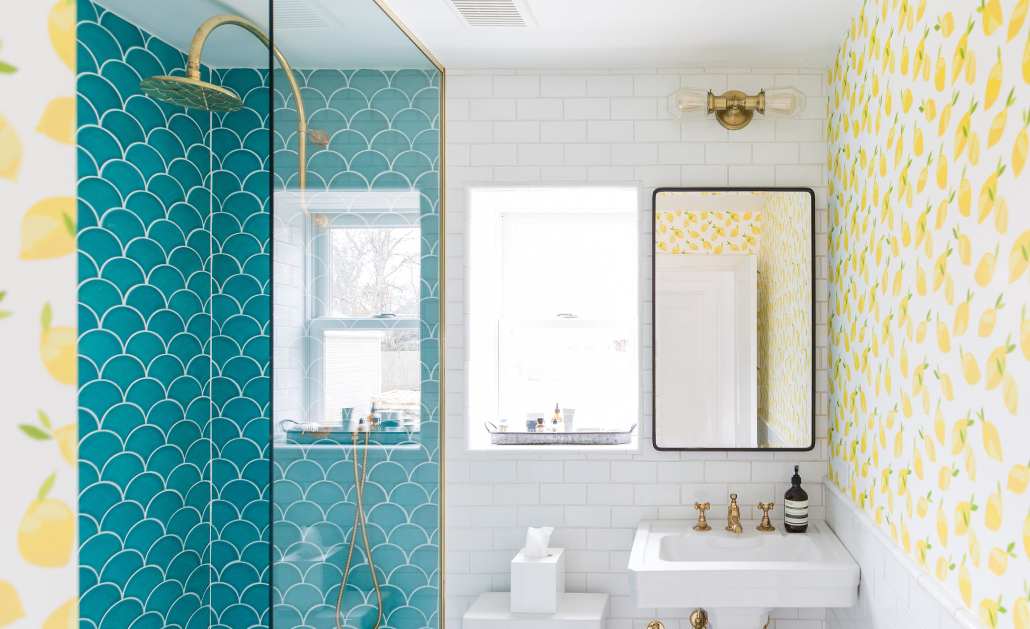
  As you can see in the floor plan the main change we made structurally to the bathroom was to incorporate the space from a closet that was in the adjacent fourth bedroom (which itself became part of the living room). Giving this closet space to the guest bathroom meant that we could have this walk-in shower area. I’m so glad we made this structural change because it gives the bathroom a much more luxurious hotel vibe. Plus, just adding in a few feet made all the difference. We also used the additional space to box out space for the HVAC ducting to run up and down the house. Finally, we reframed the window and moved it over about a foot so that it would be directly over the newly placed toilet. This gave us space to add in a pedestal sink and mirror next to it. In turn, this gave the guest bathroom a lot more open floor space and so it became a more spacious and enjoyable space to spend time in.
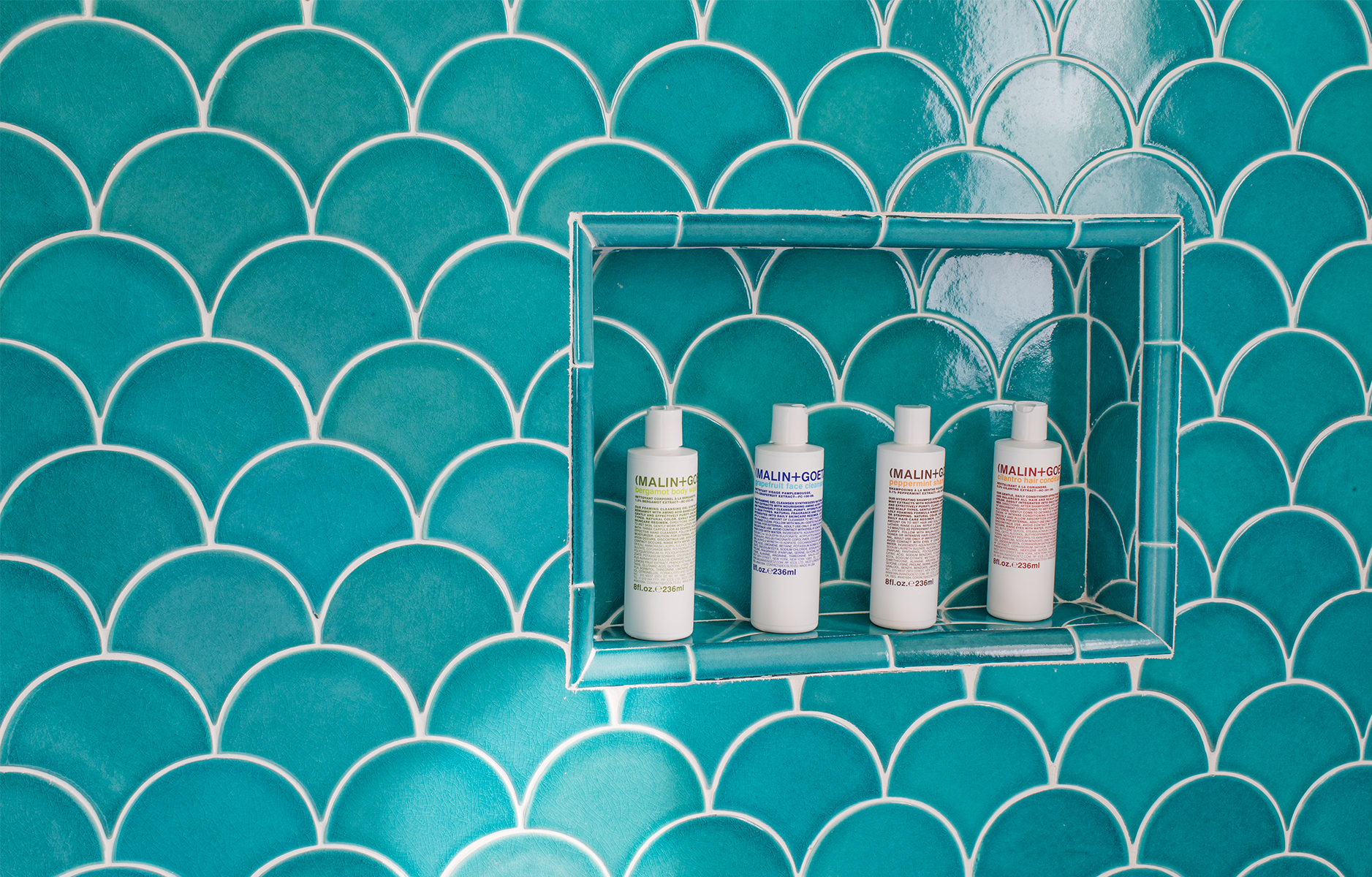
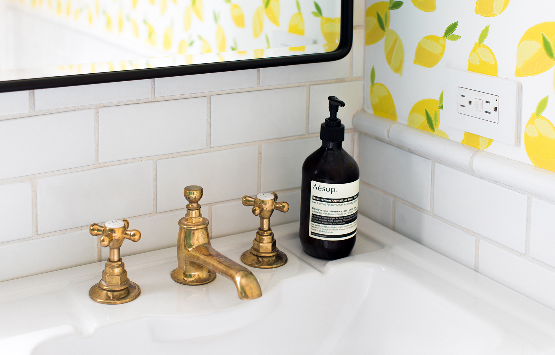 OK, so now we’ve talked structural changes let’s talk design! We sourced the rain head shower and the faucet from Waterworks. The pedestal sink was from DXV, and was the perfect fit for this small space.
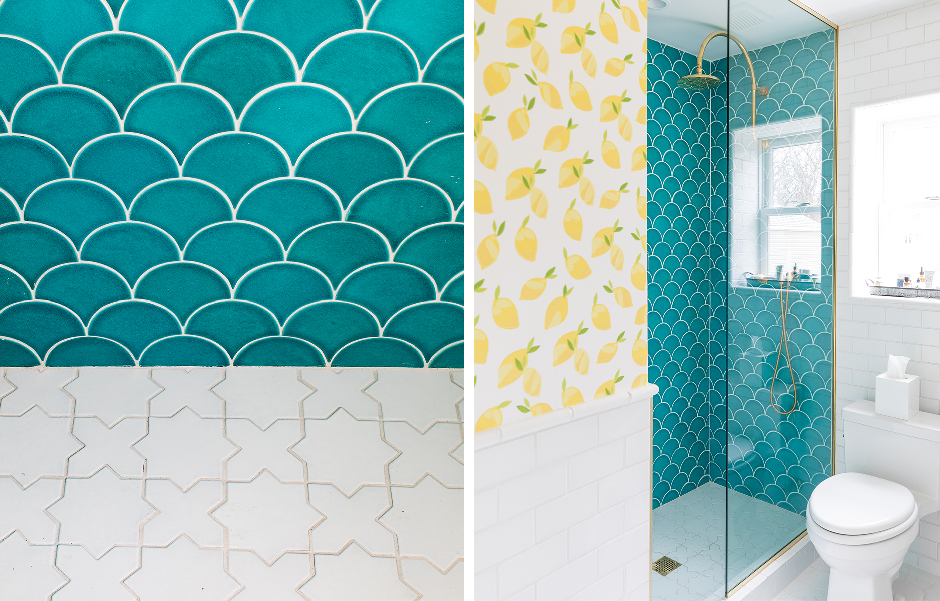
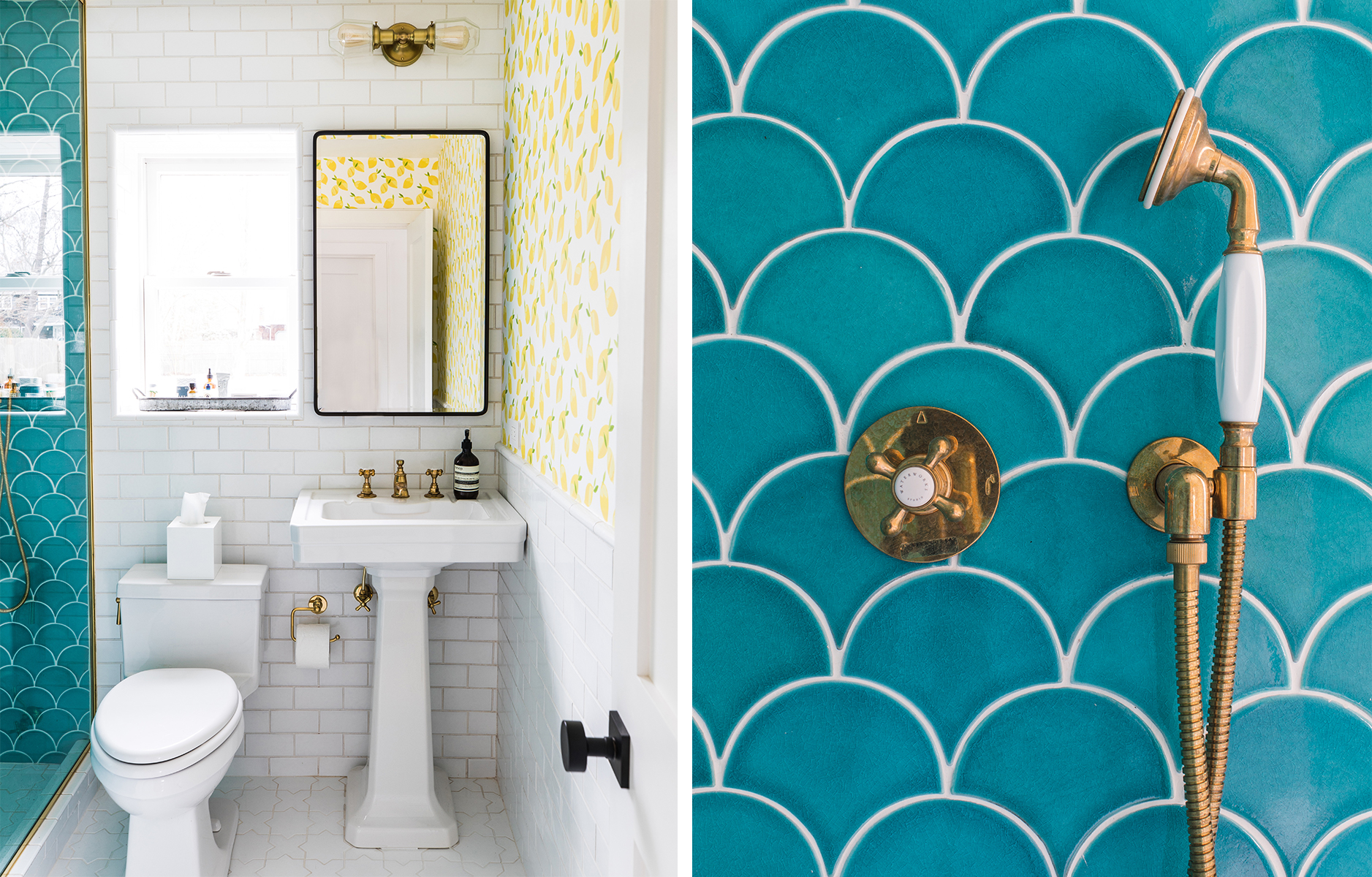 We sourced all of the beautiful handmade tile from Fireclay Tile, who are based out of California. In the guest bathroom we used Ogee Drops in Naples Blue for the walk-in shower area with Mini Star & Cross in White Wash on the floor, and 3×6 subway tile in White Wash on the walls.
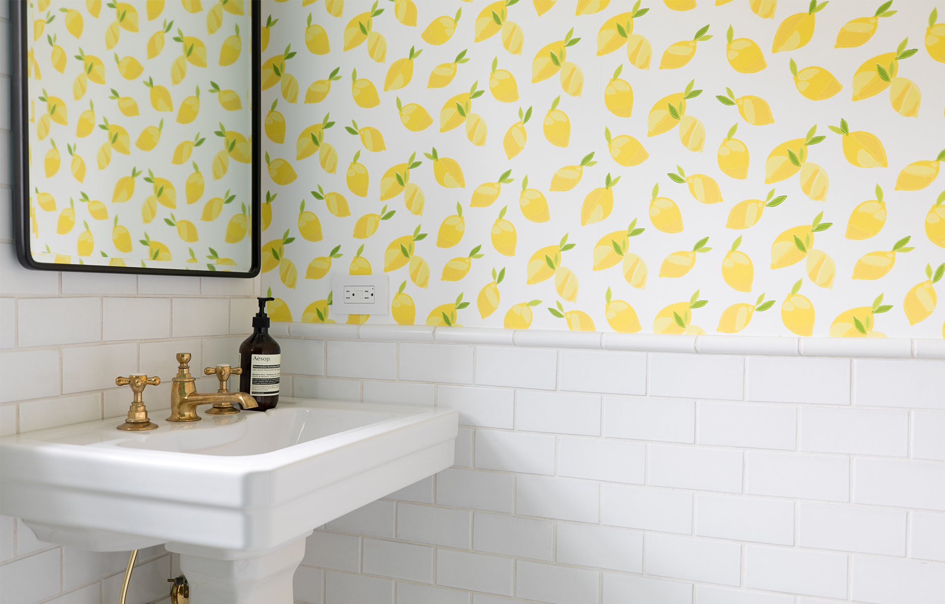 You may recognize the lemon wallpaper from the entryway in our NYC apartment? We actually redecorated that space a few months ago and ended up really missing the lemons, so we used the leftover pieces from the first time we used the paper for the guest bathroom at the beach house. The lemon wallpaper was from Serena & Lily but they no longer carry it, sadly. There’s a similar lemon wallpaper paper on Etsy – it’s removable, too! The brass sconce above the mirror was from Schoolhouse Electric, and the recessed vintage-style medicine cabinet mirror is from Pottery Barn. We love how this little guest bathroom came together – it feels so energizing and rejuvenating and happy. Now, we just need it to feel as summary outside as it does inside this bathroom!
 // Photography and interior design by Will Taylor


66 Comments
Oh myyyyy god! Will you are amazing!!! This is so beautiful I love it all!
@Kelsey – That’s so sweet! Thank you very much!
Obsessed with that blue tile
@Hari – Right?! Fireclay are amaaaaazing.
I love before and after pics! The slider is really cool. Great post and design as always! Deena xo
@Deena – Yay! I’m so glad you enjoyed seeing the transformation. Appreciate the support! 🙂
OH MY GOD! I want to live in that bathroom!! You’ve done such an amazing job transforming it 😱 love love love what you’ve done.. the blue tiles + the lemon wallpaper is such a striking combo!
– a new fan and reader
https://annicklau.com
@Annick – Oh, wow, that’s so lovely! Thank you! And welcome along, I’m grateful to have you reading. Heading over to your blog now… 🙂
You designed my dream bathroom when am I coming to visit?! 😉 😉
@Faye – Hahaha! I’m so glad you love it as much as we do. Thank you, Faye! 🙂
Great work. The tile is sick.
@James – Thank you! Fireclay make the most incredible handmade tile. We are in love!
love the lemon wallpaper!! wish I can have this nice design apartment
http://pacotse.com
Paco – Isn’t it so cute?! It makes me smile every time I see it! Thanks for stopping by the blog!
Thanks for making me smile!
@Alma – And thank YOU for making me smile with your sweet comment! 🙂
This is the happiest room I’ve ever seen! The epitome of #makeyousmilestyle!
@Jessica – I love that you think that! Thank you so much, Jessica!
Such a beautiful design, loving the photos!
Anika | anikamay.co.uk
@Anika – Awwww yay! So glad you enjoyed them. Thanks!
😍😍😍 this is beyond amazing!!
@David – Thank you so much!
OMG! This transformation is magical! I want to get ready in this bathroom every day!
@Elizabeth – Thank you so much! It was so fun to work on this remodel!
Wow this transformation is incredible! And wow it’s also so on brand with the blue and yellow?? Really loving the lemon print wallpaper. I have a lemon print tee that’s very similar, and I can’t help but think that wearing that shirt and taking a photo with that wallpaper would make such a good Instagram 😛 Honestly, your bathroom hits all the Insta-worthy criteria, and if it were a restaurant, I bet there’d be a ton of people lining up to get shots with the wallpaper and tiles. I really love how bright and fun your bathroom looks. Also the sliders were fun to play around with 🙂 && Amen to the weather -Audrey | Brunch at Audrey’s
@Audrey – Oh, wow, that’s such a lovely comment! Thank you. It was a really fun remodel to work on and I love how it all came together. The tile and wallpaper are the perfect pair! So glad you enjoyed the slider too. Thanks for stopping by and happy Friday! 🙂
what a transformation!
I love all the pretty lemons and those scale tiles! so dreamy
you did such an amazing job!
<3
The Sweetest Escape
@Stevia – Awww thank you so much! I love the combination of the lemon wallpaper and the fish scale tiles too! 🙂
Oh Will, is this actually MY bathroom? When I come to stay? I love it so much. The tiles, the wallpaper….everything. And the colours so remind me of you. xx
@Carole – Yes!! This is 100% your bathroom when you visit, which we can’t wait for! Hugs xxx
Such a great idea! The bathroom is so colorful! I need something like this too.
XO
Daria
http://www.dbkstylez.com
@Daria – Thank you! It really makes me smile every time I walk inside it!
Oh, this bathroom is so cheerful, I love it! I’m absolutely smitten with the fish scale bathroom wall!
http://www.rosegoldrhyme.com
@Deasy – I love that you describe it as cheerful. Thank you! 🙂
Wow, this is truly stunning. The colour combination is making my tummy flip! Lucky guests x
@Lucy – Awwwww yay! I’m so glad you like how it looks and thanks for the lovely comment!
Lovely stumbling into your blog — this is my first time! Oh my goodness, I am head-over-heels in love with all the color! Well done! This is definitely #goals.
Kim | Simply Lovebirds
@Kim – Thanks so much for stopping by for the first time, delighted to have you here! And thank you for the lovely words about our guest bathroom, it was such a fun renovation to work on!
OMG this looks amazing!
xx Lisa | lisaautumn.com
@Lisa – Thank you so much, Lisa!
Oh my goodness I’m so in love with these bathroom colors!! Would love to be game enough to do that at home x
@Carol – Awwwww yay! Thanks so much for the lovely comment, Carol!
Wow this place looks really insane! Bathroom goals and everything just so perfect! I dream about a home like this!
xx Dasynka
http://dasynka.com
@Dasynka – Thank you so much! So glad you love it as much as we do!
WHAT this is literal bathroom GOALS. I love this – the blue and yellow are such a great complement to each other and it looks so beach, fresh, and fun! Thanks for sharing!
-Emily | http://www.East91Blog.com
@Emily – Thank you very much! Every time I walk into this room I smile so much – it’s invigorating! Happy Monday 🙂
I have to say that this guest bathroom has the perfect summer feel! I love it!!
XO
Miri
https://currentlywearing.com
@Miri – I love that you described it as having a summer vibe! Thanks! 🙂
I love the fact all the tile patterns and shapes work so well together. And the wallpaper definitely makes the room pop. Goodbye bland bathroom, hello gorgeous!
@Juan – Thank you so much for the lovely comment, Juan! So glad you love it as much as we do! 🙂
Thank you for using Naples blue — that’s exactly the color my husband and I will use (in subway tile) in our bathroom remodel this summer.
@Kris – Amazing choice, I love this color so much! All the best with your upcoming remodel!
Oh my god! This blog is so amazing! I find so many inspirations in this website! I love love love it! Congratulations Will for this awesome blog. Greetings from http://www.misterloui.com
@Ben – Thank you so much, Ben! Grateful to have you reading!
Love it, love it, love it!!
@Renette – Thank you so much!
Pingback: 40 Powder Room Ideas To Jazz Up Your Half Bath - My Blog
Pingback: 40 Powder Room Ideas To Jazz Up Your Half Bath - interior4you
Beautiful, Will! Do you mind if I ask where you got the brass supply lines under the sink? We are also using brass fixtures in the bathroom we’re currently remodeling, and can’t find brass plumbing components anywhere for our sink and toilet. (The sink will be wall-mounted, and open underneath, so the supply lines will definitely be visible. Aaargh!)
@Leah – Thank you! Sure, they are from Waterworks. All the best with your remodel!
Thank you!
This lemon wallpaper is making all my wallpaper dreams come true. Absolutely perfect.
XO, sincerely colleen
@Colleen – Thank you so much! I love it! 🙂
Pingback: 9 Blue Bathroom Ideas - Lifesoever
Hi Will! Gorgeous bathroom, this is my inspiration for my upcoming bathroom renovation!!
Quick question: I went to Firestone’s website for the blue tiles and noticed that they are crackled. I’d gotten advice that it was risky to put crackled tile in a shower area as the cracks give space for mold to penetrate. I’m not sure when you re-did your bathroom but have you noticed any challenges with mold? And did you seal the tiles before putting them on? (I heard that reduces mold getting in…)
Thanks for the info!
Pingback: 9 Blue Bathroom Ideas - Lifesoever