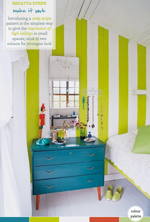
It’s no secret that I love stripes almost as much as I love colour, so you can easily imagine Mr. Bazaar’s delight upon discovering this cosy bedroom space that combines both such decorating elements. This little space looks like a cosy guest bedroom, which incidentally is also the ideal room to step outside your normal decorating boundaries. Much like with the design of a hotel room you can afford yourself the luxury of being bolder with your design choices in a spare bedroom. Here we can see how sticking to a palette of lime green and paper white has given the stripes more authority in the space due to the element of surprise. The lime green colour makes an otherwise all-white space feel very colourful but doesn’t prevent it from feeling fresh and calm. This balance is achieved by breaking the vibrant hue with wide white stripes and softening it with delicate lace textiles. The stripe pattern not only brings visual interest but it pulls the eye upwards making the pitched ceiling seem much more lofty than in reality. How do you use stripes in your own decor choices?
// Photography by Hus & Hem


8 Comments
I actually have a stripe post this week and I might just have to add this to it! I’m in love! Love the pop from the blue nightstand and are those orange legs! Besotted! X
LOVE the stripes! So dramatic and fresh. The blue chest looks amazing against the green and white. xoxo
You’re totally right, it adds a great splash of colour without losing the serenity of the room. The fact that the floor and ceiling are white too, allows more play with colour in the furniture, as with the addition of the blue chest which completes the scene perfectly. A white unit would be too bland. I’m not always the bravest with colour, but I’m learning that you can achieve some amazing results so long as the balance is right. Often one key feature piece is enough and then accessories and paint schemes can build on the theme.
@ChiChi – Yes, I agree that the peacock blue chest really throws the look off – fantastic addition of colour!
wowww!! those lime stripes are sooo neat! great colors!
xo,
Sandy
Sandy a la Mode
I ♥ the playfulness of this room and have to disagree with those that don’t like the chest colorl…the color of the chest is needed to ground the space! Great Job!
LOVE!
Love everything about this!