 Rugs are one of the quickest ways to liven up a room because they occupy a substantial percentage of real estate in a space. Whether you are looking to add temporary colour and pattern to a rented space (like me!), or you are keen to invite more visual interest into a home of your own, rugs are a great decorating element to exercise.
 To demonstrate how rugs can instantly change up the look of a space, I’ve partnered with Dash & Albert (Europe/America) by bringing several of their designs into my rented apartment. I decided to show two of the rugs in my kitchen space because this room is the most limiting in terms of design options due to it being a rental.
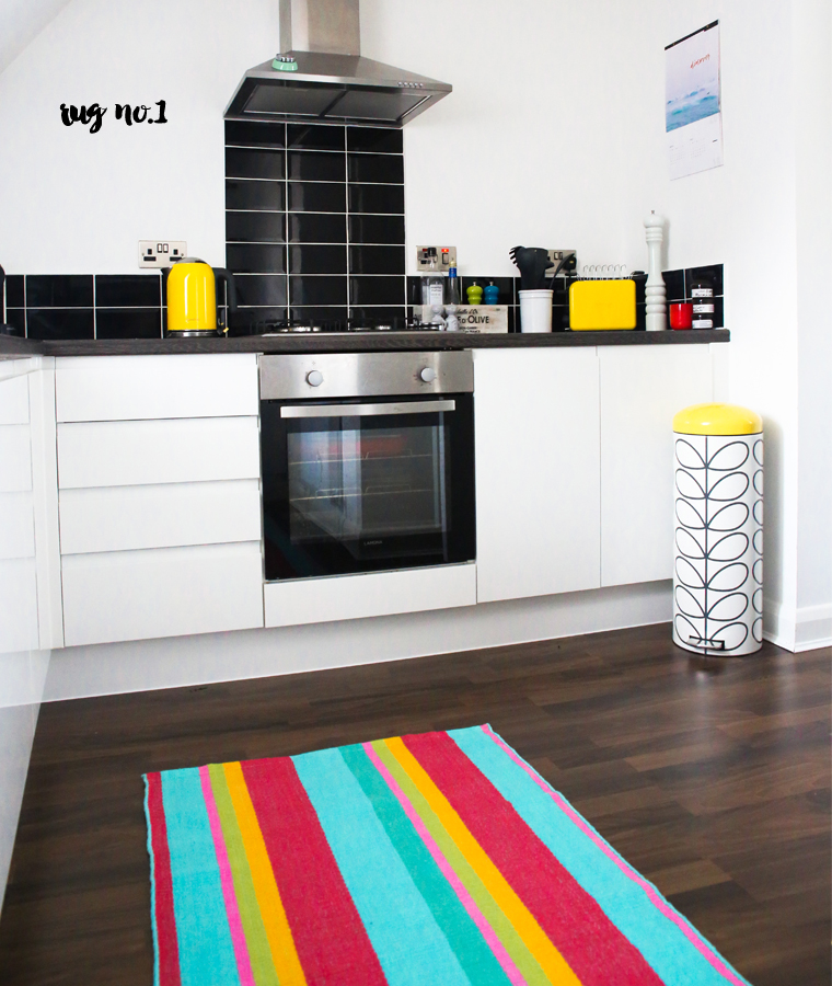
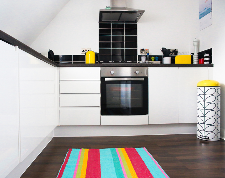 The all-white cabinetry is clean and modern, which I love, but I was keen to inject some #makeyousmilestyle into there! The first rug, Tiki Stripe, provides the perfect hit of hue the space needed. Not only that but I love how the stipe pattern elongates the space and draws the eye down the room. The yellow also picks out the existing accent spaces I introduced via the kitchen accessories on the countertop, which provides good visual synergy to the space.
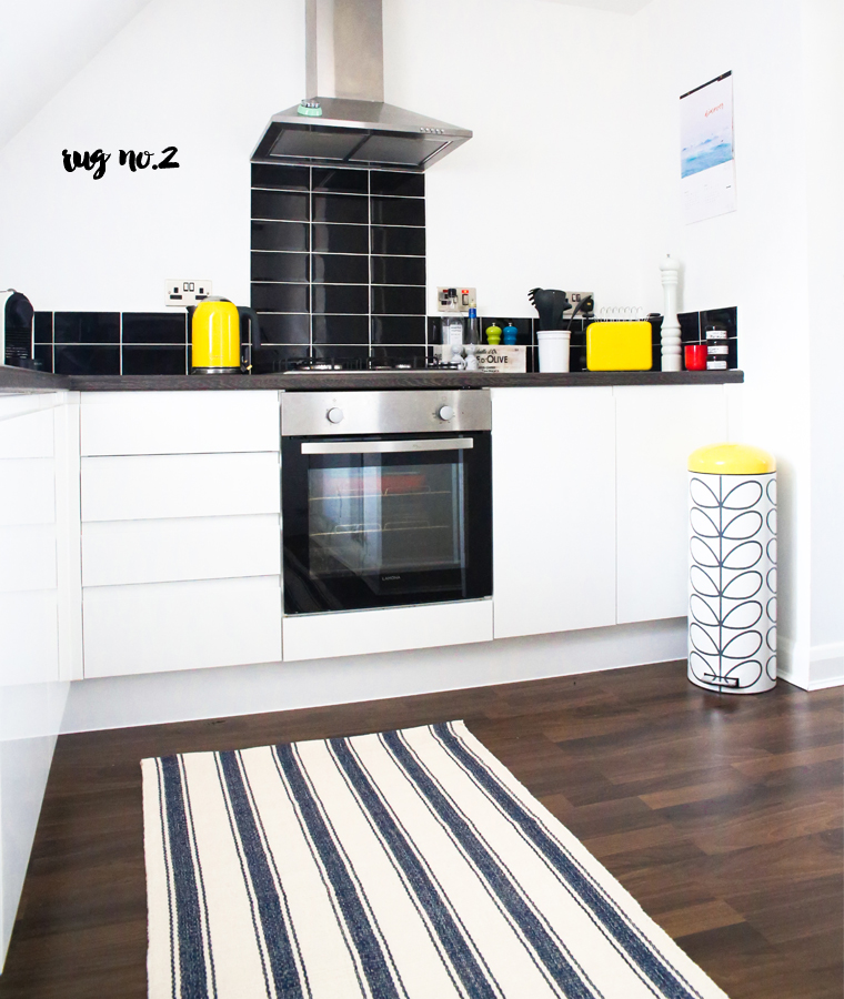 The second rug I tried out was the Blue Awning Stripe. The great aspect of this nautical-inspired design is that it’s classic look will not age over time. Plus, the stylish navy and white palette of the design sit’s alongside the rest of the space effortlessly. It’s not as much of a colour statement as the first rug, but it has the flexibility to work year round – the Tiki design is a great punch of hue for summer but too bright for winter.
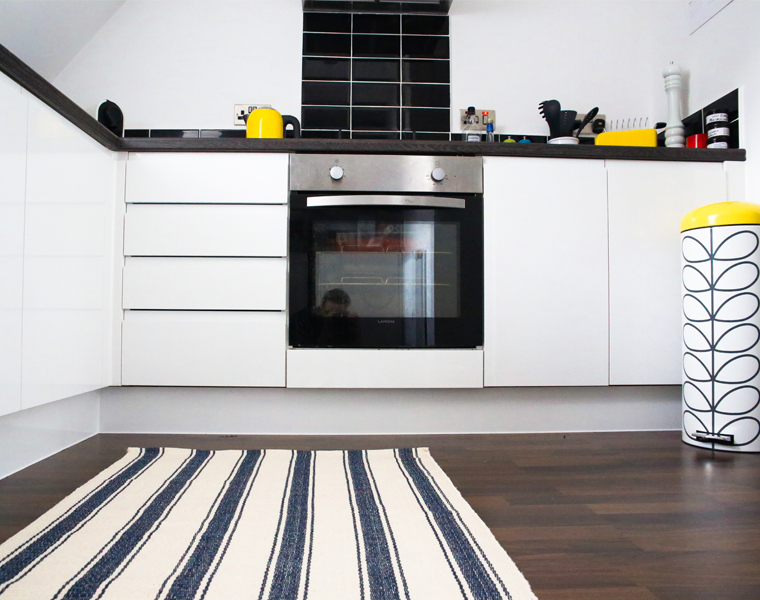 I’ve always longed for a beach house by the coast and while my current city apartment is about as far from that as you can get, this rug does give the room a hint of a seaside feel. The woven cotton material feels tactile underfoot when I walk in to make my morning coffee, so I like how it softens the contemporary shapes and edges of the existing kitchen cabinetry and wooden flooring.
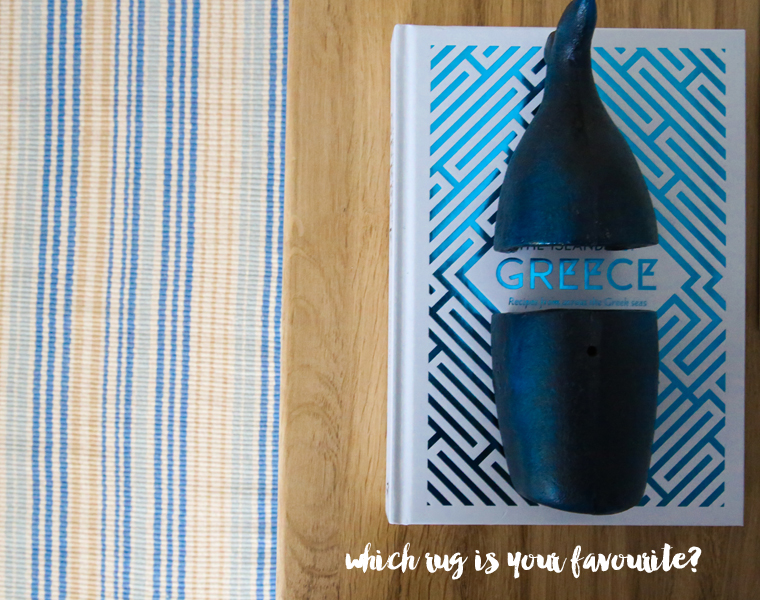
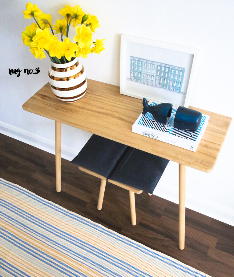 For my third rug I went for the Stockholm as it features blue and yellow – my two favourite colours! – in the design. Given the Scandi reference in its name, I decided it would only be right to pair it with a gorgeous piece of Scandinavian design! It looks wonderful against the pale, smooth wood of my console unit – the yellow hue of the rug works so well with the natural wood colour. Placing the rug in front of the console unit also really helps to anchor the piece into the space. Which of the three Dash & Albert (Europe/America) rugs I tried do you like best? How do you like to decorate with rugs?
// Posted in partnership with Dash & Albert; all views my own.



14 Comments
love the stripes
@Ryan – Me tooooo!
I love your kitchen, and I’m only a little jealous of the white + black motif of it, especially with these rugs!
Josh – The Kentucky Gent
http://thekentuckygent.com
@Josh – Cheers, man! 🙂
Ohh… LOVE the Stockholm!
@Beach mom – Likewise! So stylish!
I like the awning stripe rug. Dash and Albert rugs are a great way to add personality to a space and blue and white is always a classic color combination.
@Jon T – Agreed! Blue and white never goes out of style!
Love the Stockholm rug. Great choice!
I guess I’m the only one in love with the Tiki Stripe :(…
I really think it’s amazing to bring colour (to let’s say aseptic spaces) and help you to start your morning day with a smile in your face…. I definetely go for it!!!
@Sonia – I love the Tiki too! 🙂
I like the awning stripe rug. Beautiful and I must say that this is the cleanest ceramic Kitchen that I have ever seen. Love it..
Great colour! And, I am really attracted to the whale bookends. Is there a source for another!
@Mike – I bought them at a small decor store in Laguna Beach, Cali!