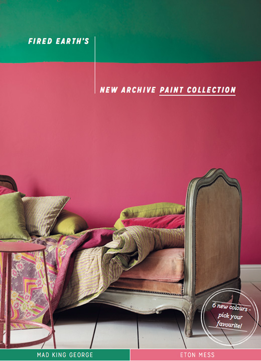
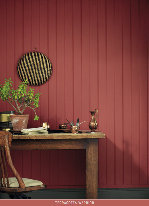
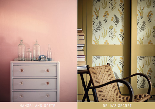
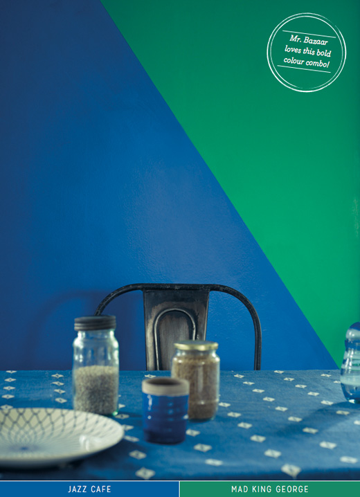
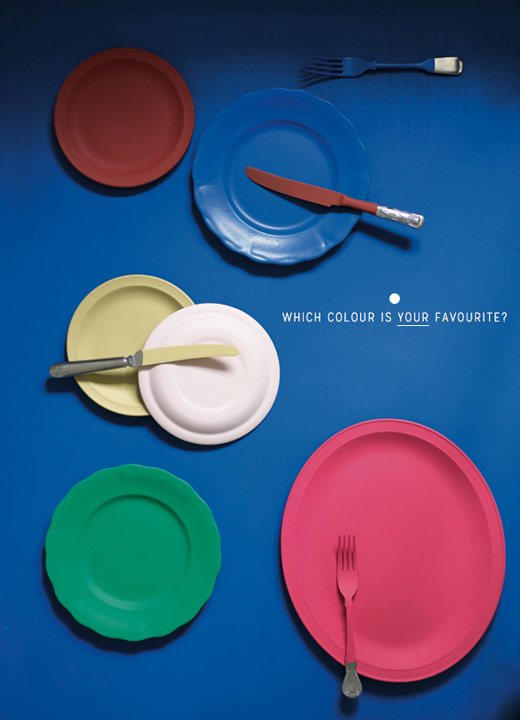
Mr. Bazaar gets so excited when he hears of a new paint collection – well, he is hooked on hue, after all! This latest offering of six delectable colours comes from Fired Earth who have released the hues in celebration of their 30th birthday. Taking inspiration for the collection from its extensive library of paint pigments the colours have been designed to be help make a statement in any space. As usual the names are almost as evocative as the colours themselves, from Jazz Cafe for the vibrant blue to Mad King George for the brand’s take on the currently en vogue emerald green. In fact, I just love the combination of Jazz Cade and Mad King George together, but, tell me, which of the six colours do you like best? Where would you use it in your own home?
// Photography by Fired Earth


17 Comments
Jazz Cafe is calling my name! Such vibrant colors!!!
Mad King George in the hallway 🙂
Pippa chooses Eton Mess for her room
@Ingrid – Both great choices. I love the idea of MKG in your hallway, isn’t it such a fab green?!
Jazz Cafe – I could almost dive into that blue!
I really like the association of Mad King George and Eton Mess, powerfull and delightfull !
Can Fired Earth do no wrong? They just keep getting better and better! I am not usually drawn to pink but I really love the soft Hansel and Gretel colour!
How gorgeous is Jazz Cafe! Such a statement colour!! Beautiful! Thanks Will
@Paul – Isn’t it divine? You almost feel like you could dive right into it because it’s so richly blue.
Hansel & Gretel – that would be a perfect soft colour for our bedroom, first got to convince my hubby about the colour. 😉
Hi Will seriously I love these colours, but I am craaazy about the names – so fab, made me chuckle. Hope you are having a lovely week so far,
Axx
@Anya – The names brought a smile to my face as well! 🙂 x
Drooling over all these colors!
For me it’s a tie between Eton Mess and Mad King George, just because of the names. These are not colours that I would normally go for, I just love the names!
The green mad king george is a lovely hue, perhaps for a small feature wall. I love colours but I’m not bold enough yet to have them on the walls.
@Geraldine – Small steps! Lots of ways to bring colour into a home other than on the walls. How about using the paint on the inside of a bookcase or an alcove for an interesting feature? x
Love Hansel and Gretel! Reminds me of plaster walls. Not as sickly as a salmon colour. Think sunbleached Italian villa walls, sunshine, smell of lemons …. sigh.
I’m with Geraldine on this one! ADORE ‘Mad King George’ but far too meek to splash it on the walls. I’ve been experimenting mustard and yellow tones in my home lately (mainly to combat the awful weather!), such as that ‘Delia’s Secret’. It’s a friendly colour but not too daunting 🙂