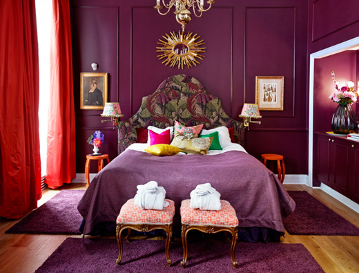
As I’m in Norway today shooting for the Bright.Bazaar book I thought it would be the perfect time to take a look at what’s hot in Norwegian design and colour right now. In fact, it’s perfect timing as Fargerike recently unveiled the new purple-centric decor of the Mikado suite at the Grand Hotel, Oslo, which is in honour of Norway’s colour of the year.
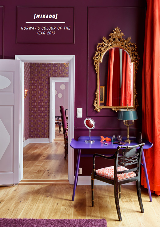
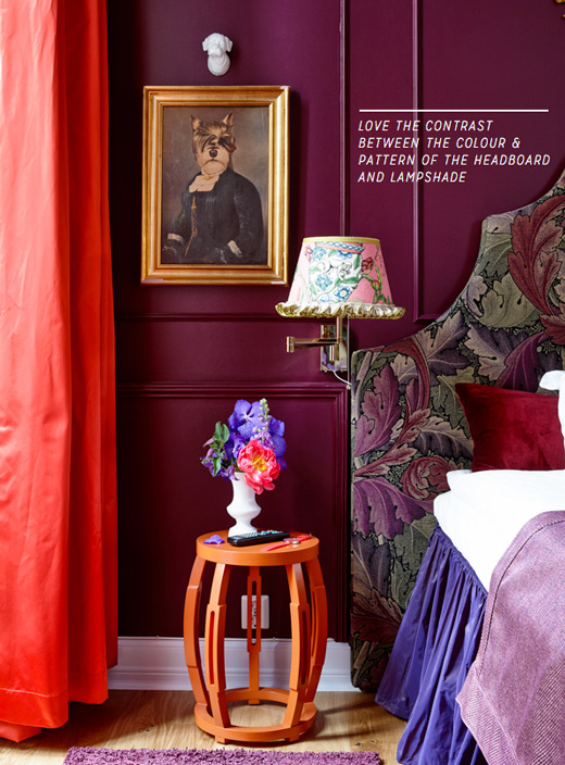
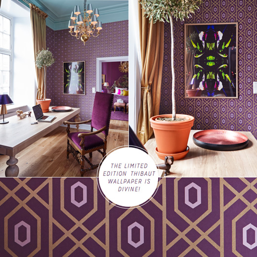
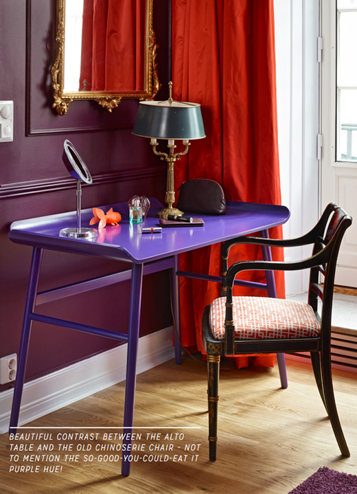
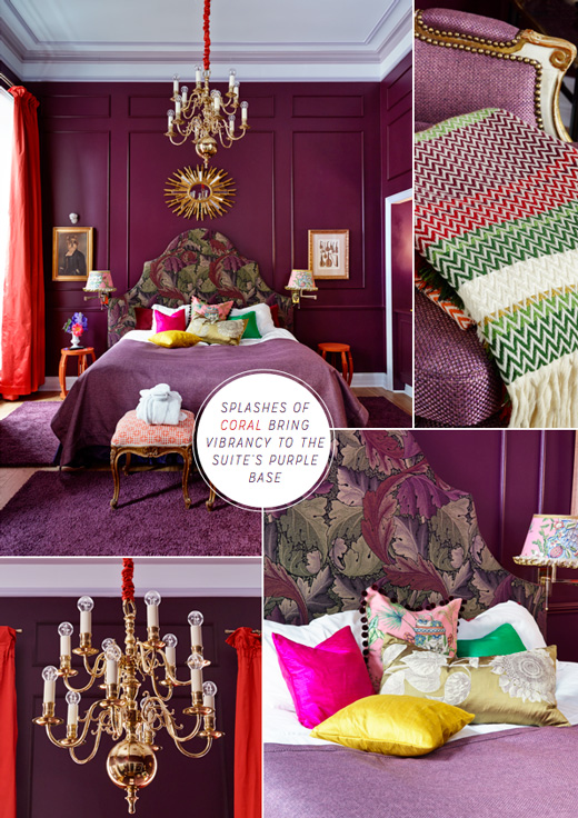
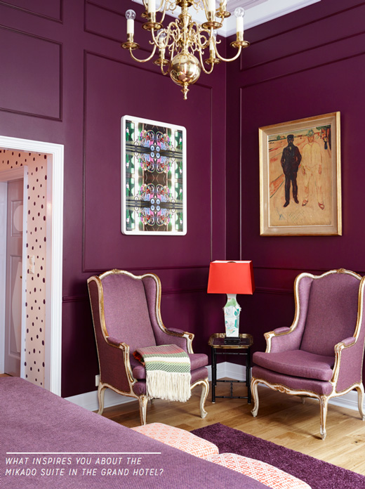
Let’s start our tour in the desk nook area where the Alto table by Andreas Engesvik and Fjordfiesta sits in a gorgeous indigo shade in front of a deep plum wall. Personally, I wouldn’t have thought to layer shades of purple in this manner but it totally works, especially with a splash accent of hot coral in the curtains to give the palette a vibrant lift. Speaking of bold colour accents, can you spot the Bunad throw by Andreas Engesvik? I waxed lyrical about it on the blog last year after it debuted at 100% Norway as part of London Design Festival, so I’m really excited to see it as part of the Mikado suite. I’m also delighted to see the Beacon Lamp by Magnus Pettersen because it’s such a simple yet beautiful piece that’s perfect for introducing a purple accent into a space. A new discovery for me was the Thibaut wallpaper, an exclusive design for Fargerike that I would bring into my home without second thought – I love it! I think the suite shows how versatile the colour purple can be when decorating: when using several shades in one scheme the key is to introduce a surprise accent hue from outside the purple colour family to bring visual interest to the room, or introduce pattern as a way to soften the stronger, more dramatic shades at the darker end of the spectrum. Have you ever decorated with purple? What inspires you about the decor of the Mikado suite?
// Photography by Sveinung Bråthen | Styling by Christine Hærra | via Fargerike

20 Comments
Great to learn more about current Norwegian design – thanks!!
The Beacon Lamp is gorgeous! Great setting for it.
Oh now we are talking color! Yes all the way. LOVE LOVE LOVE
Norwegian really? Amazing and who knew?
I LOVE everything about this. It’s very Colourliving.
Thank you for sharing x
Love this deep purple color!!!
And I really look forward to see your book 🙂
really like that shade, especially with the red surprsingly
I really like that shade of purple, especially with the red you know
Absolutely love this mix of colours and mix of purples. So cool! Very daring but really cool.
I have always loved the mix of older aesthetic with a more contemporary fun palette and accessories!
Thanks for sharing Will 😀
Oh wow! These rooms are so grand. My favorite is the bed with the bright pillows on it. I need some bright colors with all the deep, rich purples to make them feel a little less serious.
thank you for loving our Mikado suite! We love it to;-) I really wish I knew you were in Norway today!!!! I am crying…would LOVE to meet you Mr Bright Bazaar <3.
C
Purple always seems so strange and unwieldly, but these rooms are astounding! I love the additions of gold. It makes it beautifully bright!
what a suite!! love all the intricate detail in the space and how they have layered the patterns and colors all to bring out the best of plum!
I love so many elements in the space: the orange stool as side table, the polka dot wall, the geometric wallpaper, the killer chandelier with bright round bulbs … so much fun!
Wow, what a design statement, so sumptuous and chic. I really love the Thibaut wallpaper and the contrasting gold tones thrown in throughout the scheme. Very classy.
Pingback: How To Use PANTONE’s 2017 Trending Color Palettes In Your Home – RRBB
Pingback: How To Use PANTONE’s 2017 Trending Color Palettes In Your Home - THOP News
What color is the purple paint?
Pingback: Цвет года Pantone 2018 в интерьере. Комментарии дизайнеров - Дом, в который хочется приходить
Pingback: Ultra Violet: Pantone’s Colour of the Year 2018 | Clair Strong Interior Design | Blog
Pingback: 15 combinaciones de colores inesperadas ¡y que funcionan!
Pingback: 15 combinaciones de colores inesperadas ¡y que funcionan! - Decoracion.red