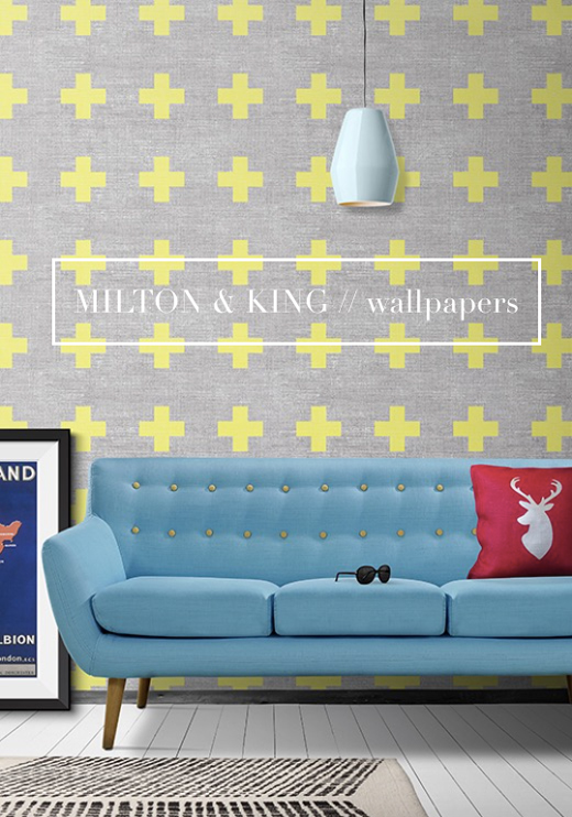
 Do you find that there are times when a designer, brand or story comes along that just captures your imagination from the off? This exact thing happened to me recently when two brothers, Richard and Bryce Capp, reached out and introduced me to their digital wallpaper company, Milton and King. Named after their parent’s middle names, the company was founded when the duo had just $250 between them and has grown considerably from it’s early days of producing canvas prints.
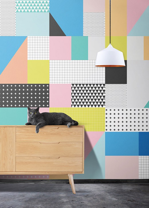 Now the company focuses on creating digital wallpapers – and thank goodness they do because the designs are right up Mr.Bazaar’s colourful street! Their latest collection, Ingrid & Mika was inspired by the functionality, simplicity and minimalist approach of Scandinavian and Nordic design. Clean geometric shapes and simple line work are seen loud and clear in these designs, and it’s these characteristics that make the papers ideal for a modern and contemporary home.
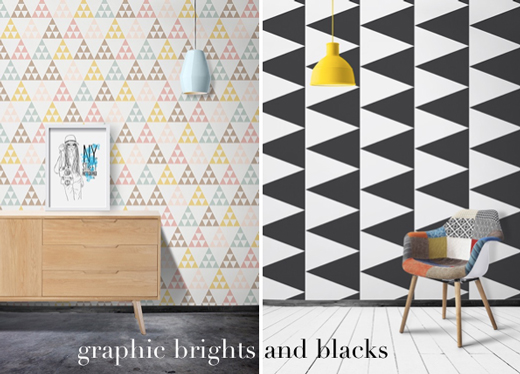 The main reason I am drawn to this collection is it’s versatility – there’s options for both statement brights and striking, graphic monochrome designs. I’ve written about my love for black in interiors on Bright.Bazaar before – the triangular black and white design of the Terminal wallpaper is a fine example of how a monochromatic base can be used to layer in an accent bright, such as the yellow pendant seen above.
 My personal favourite design from the new Ingrid & Mika collection is the Phonetics wallpaper. I love the combination of the popular 20th century type face, Helvetica and the multi coloured palette – it’s at once both stylish and playful. Both Richard and Bryce set out to create a collection that whole heartedly advocates positive change in one’s home, and wellbeing in general. Given my belief that colour does just that, we couldn’t be more on the same page even if we shared a paint pot! Which wallpaper design is catching your eye, folks? Where would you use it in your home?
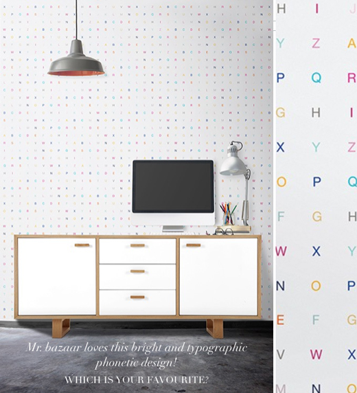
// Photography by Milton & King (used with permission) | Posted in partnership with M&K; all views my own




22 Comments
I’m with you on the Phonetics…..so stylish. Great to discover this brand. Thank you!
@Susan – Right?! So fun and playful but still super stylish.
Gonna need me some of these designs for the new apartment!!
@Justin – 100% you are! 🙂
Be still my beating heart. Geometric sugar rush! The wallpaper with the cat chilling out is just lurverly! 🙂
@Karen – Geometric sugar Rush, hahaha! Love that!
So bold, love these. My fav one would be the second.
@Matthew – Great choice!
Always love Grey + Yellow, and that top wallpaper is no exception. Also a huge fan of the brights paired with black/white.
Best,
Josh – The Kentucky Gent
http://thekentuckygent.com
@TKG – Right! Isn’t yellow and grey just such a classic combo? Love it!
Great, inspiring post. Thanks Will:)
@Natalia – My pleasure! Thanks for stopping by. 🙂
These are really awesome! I like the colourful letters the best!
@Trisha – Great choice! That’s my favourite too!
Looove them! So glad you introduced me!
@Rebekah – Yay!
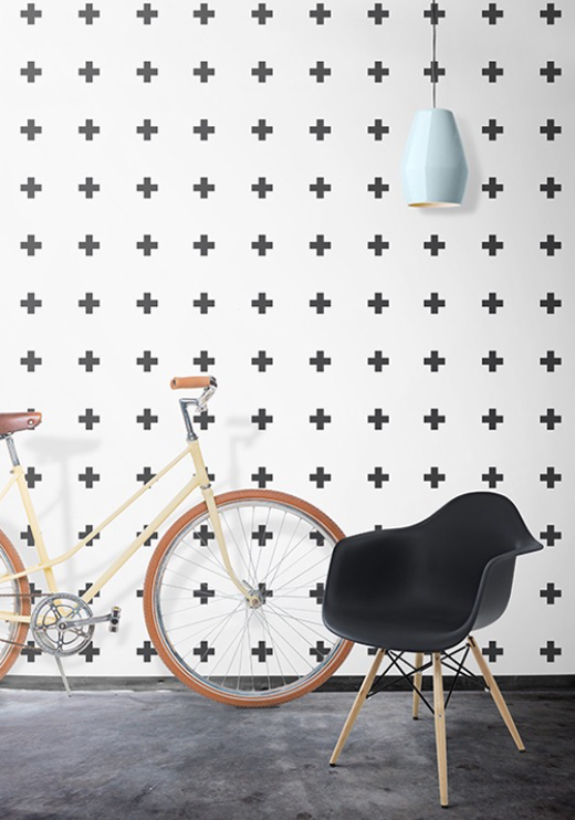
Wow, amazing collection. I love the grey with yellow crosses. Would be great for a boy’s room. I’ve seen the black crosses on white, not sure if it’s the same paper, in a bathroom and it looked amazing!
@Karolina – I think it would look great in such a space as well!
These are so awesome! I love the bright colors and crazy patterns. I would love to get the first one with the yellow crosses.
@TOS – Great choice!
Pingback: Interieurtrend Memphis: Welcome back!
Pingback: Negro + negro, black tendance! - mariatrends.com