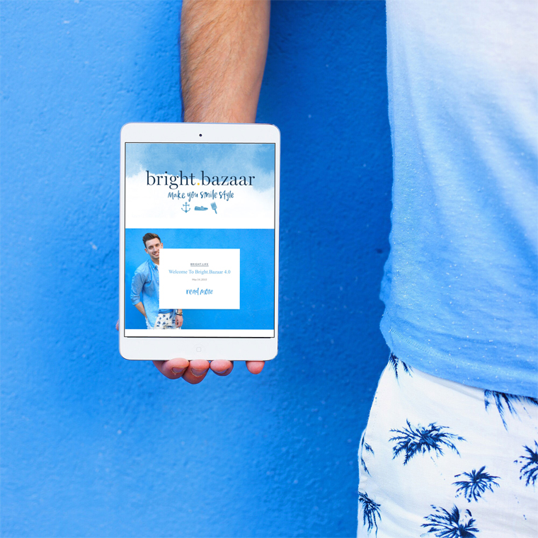
 The past week has been quiet here on Bright.Bazaar because I’ve been busy working on the finishing touches to my new blog design and branding! In the six and half years I’ve been blogging this is my fourth design and it’s my favourite to date. Over the past eighteen months or so I’ve been building out and evolving Bright.Bazaar’s content to share my relationship and experiences with colour across wider areas of my life. With a broader spectrum of topics, I was keen to give my content a home that represented the natural evolution of my style and aesthetic.
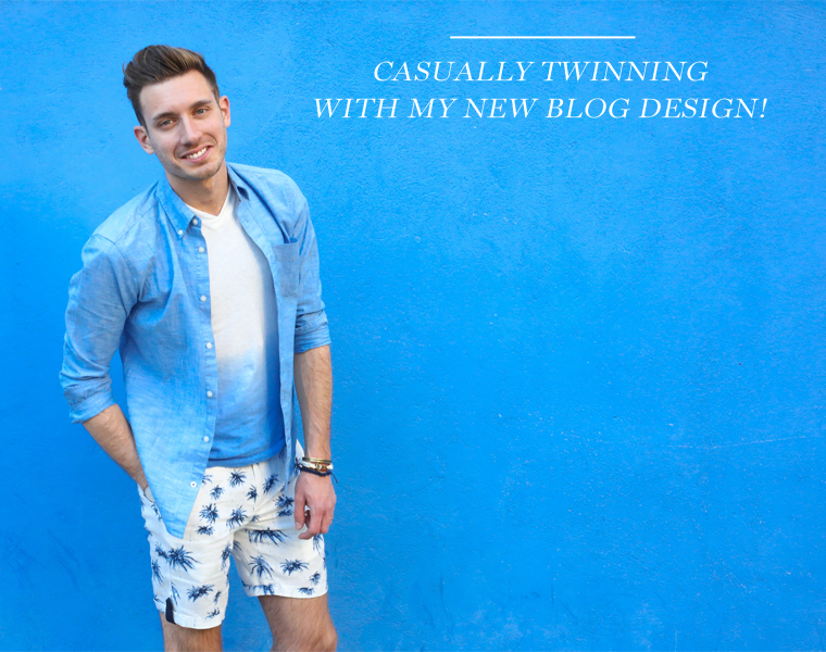 My aim was to create a site and brand that felt clean, sophisticated and friendly. Long time readers will know that blue and yellow has always been my favourite colour combination, so I knew from the outset that this should be the palette for the new look. I always like to think of blue as a neutral because it is such a versatile hue that other colours look great alongside. For the logo and hand lettering elements I worked with Eva Black. This Californian artist is incredibly talented and she nailed the vision I had for the brand from the outset – hire this lady, you guys! I like how the watercolour and hand lettered elements of the brand give the site a relaxed and approachable feel.
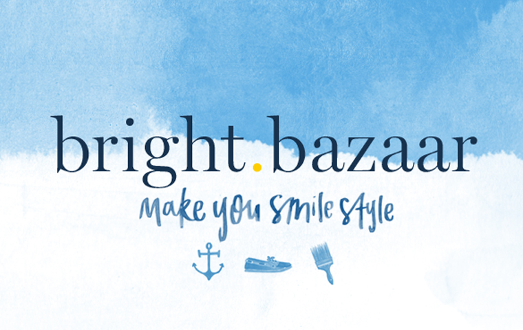 The old Bright.Bazaar brand had icons front and centre in the logo design, so I was keen to carry these through to the new look. As one of my aims with the redesign and navigation of the site was to make things simpler, so I decided to strip them back to three hero icons. Each of the three icons call out the three main pillars of my content: the anchor represents my Bright.Travel posts (and nods to my
 love obsession for all things nautical!); the boat shoe signals my adventures in Bright.Style; while the paint brush is the calling card for all the Bright.Interiors content.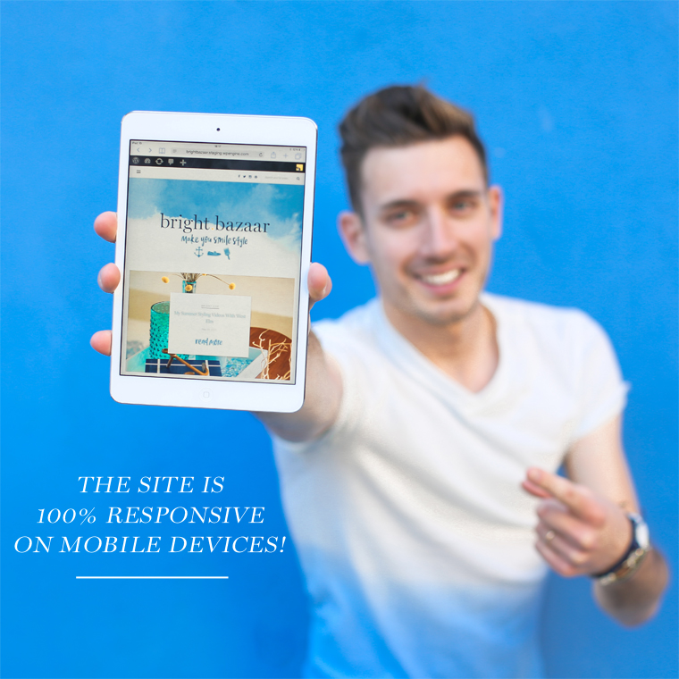 Overall I’ve tried to make the site cleaner and easier to use. The categories have been simplified so it’s now quicker to navigate and reach the content you wish to read. The pictures are a lot bigger (YEAH!) and the site is completely responsive, which means it loads really quickly, and at the correct size, no matter what device or desktop you are using. I hope you enjoy exploring Bright.Bazaar’s new home. Please do let me know if you spot anything that you think isn’t working and I’ll do my best to iron out the kinks as quickly as I can. Thank you all for your continued support – you rock! Here’s to many more #makeyousmilestyle adventures!



68 Comments
Will, it’s beautiful! Thanks so much for sharing your adventures with all of us. I love reading your blog posts and seeing your Instagram photos, and I’m always so inspired!
@Carey – Thank you for the kind words and for following along in the colour fun! 🙂
It looks incredible Will – bravo on such clear + conscious branding. It’s been such a fun adventure following you all these years, and this is also my favorite design. It suits you so well! xo
I love it Will! A feast for my colour loving eyes but still simple to navigate. Congratulations! x
@Stacey – That’s just what I love to hear. Thanks for all your support over the years! 🙂 x
Congratulations Will, it’s stunning. And it makes me smile!
@Candy Pop – Yay, that’s all I could hope for! Have a wonderful weekend!
Congrats! Looks fantastic, very clean & stylish
@Art & Hue – Cheers, folks!
Gorgeous!
@Christina – Thank you!
Congrats Will! It”s absolutely gorgeous! Great colors, fonts, style! (not that I expected less from you!)
Wish you all the best!
T
@Tomy – It means a lot to hear that from your stylish perspective and aesthetic, Tomy. Thank you!
<3
Loving the new site design Will! So fresh and bright and nautical! We have a similar theme for our site, but doesn’t even compare 🙂
@Joel – So pleased that you like it. Thanks for stopping by! 🙂
Great work Will! This is amazing and beautiful and is truly you! Eva is magic. Love that you two worked together. Cannot wait to see how this space develops along with your dreams and passions. So many hugs and high fives!
@Megan – Isn’t she the best? Such an incredible talent, I was thrilled when she agreed to work with me on the branding. Thanks for all your support and hope to see you and Mike again soon!
I love it, Will! It looks so good, loving the watercolour. Congratulations, a few celebratory fizzes for you tonight, I think! 🙂
@Gabrielle – Thank you! And, yes, 100% bubbles! x
Super nice, Will. The allover look is very coherent and appealing. Signature style a 100% accomplished. Congrats!xx
@Gudy – Great to read that you think so, thank you. Have a lovely weekend! x
Will, this looks SO fantastic! Love seeing the how the Bright Bazaar brand continues to evolve! You are a superstar. Lots of love xxx
@Jess – Thanks so much for all your support over the years, it means so much! xx
I love it! It’s gorgeous!
@DJ Yabis – Yaaaay!
Absolutly adore the new design!! Congrats! x
@Amber – Thank you very much! 🙂
Hi Will,
Just swooping in to say congratulations on the new site design – it’s looking especially delicious. Well done.
Have a brill weekend
Jon
@Jon – That’s really nice of you, thanks, Jon. Have a good one yourself!
Mate! Your site looks great and very responsibe. Nicely done and so fresh, really love this. Cheers :)x
@ziiarch | http://www.dapperhipster.com
@Zioarch – Thanks so much! 🙂
Pretty blog, pretty colours, pretty Will – I love it all!
@Christina – Yay! So happy you like it.
Beautifully done, what a perfect match of your style and energy! Bravo!
xoxo ~ Kate
Congratulations my friend!!! It’s looks amazing.
Congratulations my friend!!! New site looks amazing!
@Brooke – Thank youuuuu! x
I’ve missed you blogging Will so it was lovely to see you jump out in my bloglovin feed and even more exciting to see your new image. I really love the colours as always but it is the watercolours and the beautiful lettering which is hooking me in at the moment. I love how the watercolour brings out the nautical theme and the icons you have chosen are brilliant – it helps tell your story so well. I can’t wait to see how the new blog functions over time but can you please, please bring back 10 things I learned and loved soon, I miss it so much. I’m am so sad I know lol
Hope that everyone loves the new look as much as me and all the commentators so far
Jo xx
@Jo – Thanks so much! 10 Things is stills series, you can find it under the Bright.Life category menu in the top sidebar! 🙂
The new web design looks amazing! Congratulations
@Martyn – Thanks for stopping by and for the kind words!
Beautiful! I especially love the “meet Will” sidebar photo.
Christine | http://www.DimesandDonuts.com
@Christine – I love that picture too! Thanks!
So gorgeously you Will, I love it so much! Thanks for filling my days with colour and smiles 🙂
Allison x
@Allison – And thank you for following along! 🙂
A Big High Five! Will, this is sooo fresh and wonderful. Been reading your blog for quite a while and love everything about it. The new design looks amazing. Love it! Many congratulations! I was just wondering about getting a new design for my blog as well a few days back and watercolor and hand lettering were the first ones to pop up in my head too. 🙂 Lets see how that comes about in a few months.
Stay blessed and keep painting the world bright!
@Sheneela – Thanks!
Yay Will. What can I say? I love it. It’s brilliant, it’s you. I’ve so enjoyed watching you evolve with your love of colour more and more. It’s been a great evolution and awesome branding. You’re all class Will and a huge congratulations, the site looks wonderful. Mel xx
@Mel – That’s such a lovely comment and so generous of you to say, thank you. I love having you come along for the ride! x
Parfait!!!
@Lindsey – Cheers!
This looks great, Will! Such a lovely, fresh design.
Buckets & Spades
@Matthew – Thanks, I’m thrilled with it!
Hey! It´s stunning! Congrats, boy! You are always amazing in everything you do 😉 I´m your big fan and I love Colors as much as you do!! Kisses and hugs from Brazil
Love, Carmen
@Carmen – Thats”s so kind of you to say, thank you! Hugs right back! 🙂
Hey! I’ve been following you for a bit and finally checked out your (new and improved!) site! Well, it looks absolutely fantastic. Always get excited when fellow bloggers do site redesigns (that’s my inner nerd coming out, haha) — congrats! And it does, in fact, make me smile upon arriving at your site 🙂 looking forward to more inspo!
Best,
Talun
http://talun.me
@Talun – I love a good redesign, too! Thanks for the lovely words and for following along! 🙂
Congrats on the new site & design! I really like the new look and the small details such as the hand drawn icons and lettering. Being an interactive designer I really like and appreciate how it gives your blog a very distinctive character among all those look-a-like-blog designs.
I can almost feel the sea breeze 🙂
@Uljana – I’m so pleased you love it as much as I do – thank you! 🙂
Gorgeous! I absolutely love it. Bravo!
@Rachel – Yay! Thank you!
Will I love the new style of the blog! It’s you!
a big hug from Italy
vale
@Vale – Thank you so much!
Will, a splendid job once again! Eva is very talented and I’ve always admired her work. This blog design is SO you and I love following you along on all your adventures! xoxo
@Claudia – Eva is SUCH a talent, I agree! Thanks for all your support over the years! xo
I absolutely LOVE the new site look, Will! Congrats on all of the success, it’s been so fun following you through it 🙂
@Matthew – Very kind, thank you! 🙂