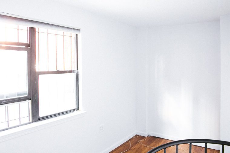
When my heart mate and I decided to move to New York City we were prepared to downsize. And downsize we did: to be exact, from a two bedroom, two bath apartment with separate kitchen and living areas, to a one bedroom with an open plan living, cooking and dining space. Having photographed a tiny one bedroom apartment on the Lower East Side for my second book (more on that very soon!), I was expecting our first NYC rental apartment to have a tiny bedroom. I’m glad I had my expectations in line because I was right – our first bedroom here in NYC is tiny! That said, I love it. Yes, it’s tiny but thanks to its south facing aspect it’s flooded with natural light. There’s a also a private roof deck with views of Central Park (well, if the tops of leaves count as a Central Park view – humor me…!), and you can even see Times Square in the distance, so expect to see lots of fun content from out there once the weather improves. Click through after the jump to see the whole process of transforming our tiny NYC bedroom, from blank canvas to an exotic bold blue space with a destination vibe, that’s also super comfortable thanks to my new Leesa mattress, which was designed to meet the needs of all types of sleepers!
 Regular readers, or anyone who follows Bright.Bazaar on Instagram, will know how I look for most of my design inspiration from my travels. Similarly, I love all things that have a nautical aesthetic. During my trip to Santa Barbara last year I made a mental note of this photograph and how I was keen to inject the majestic mystery of the intense midnight navy color of the ocean into a future scheme.
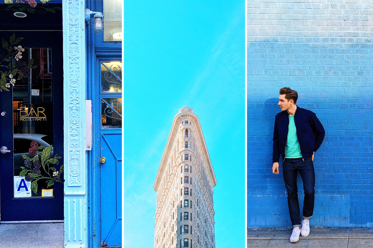 As I began to start planning a new color scheme and design direction for the bedroom in #BBbrownstone, I kept the that gorgeous golden hour moment from Santa Barbara strong in my mind. I knew that I was keen to inject an unexpected edge to the midnight navy, so when I happened upon an electric blue door next to a dark navy door I decided in that moment to invite that shade of blue into the space. The summary blue skies I saw in this city last summer and knowing how well a splash of blue-green mint would layer into the space, I had my palette set!
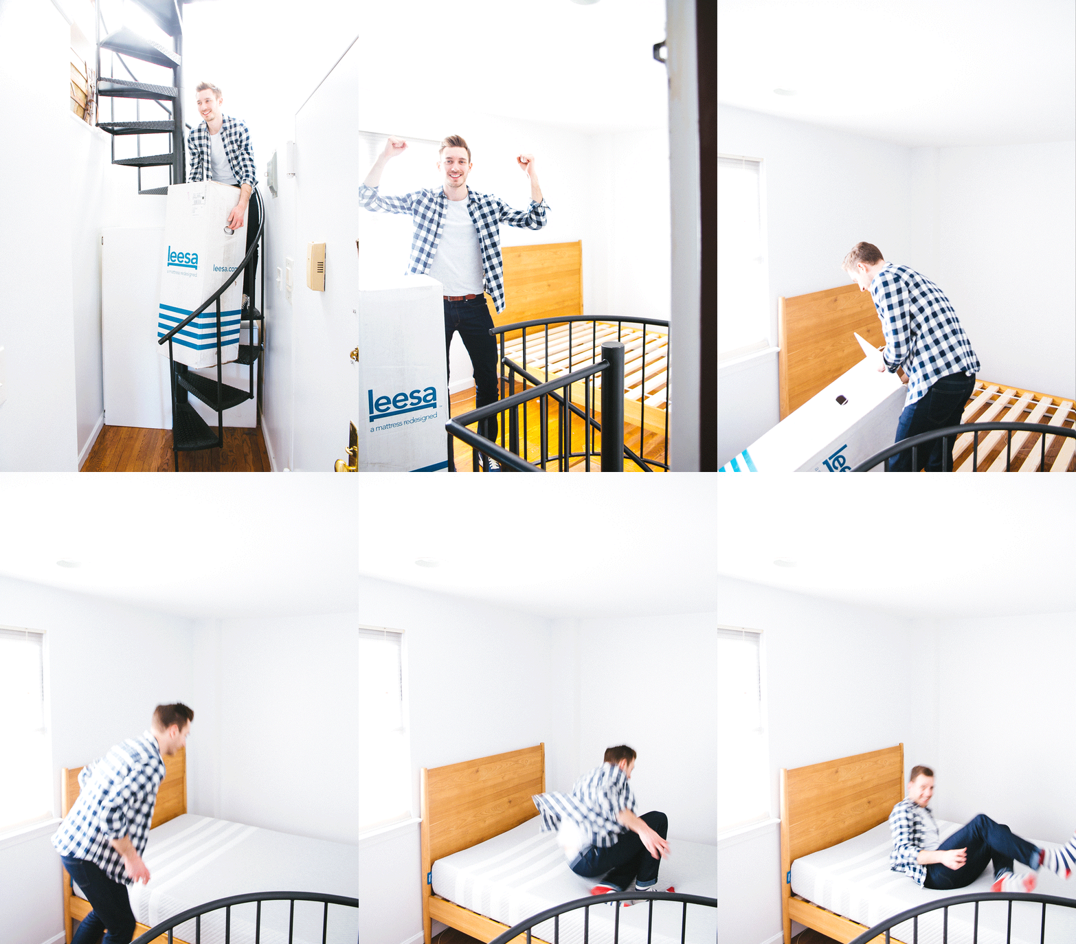 I may have had the color palette ready to go for the new space but in reality I was still sleeping on an old mattress on the floor! I had been searching high and low for a bed but because the space is so tight almost every option was too big, and so the mattress remained on the floor! So when Leesa kindly invited me to road test their revolutionary mattress, it was just the catalyst I needed to overhaul the space, finally find a bed and put my chosen color palette into action! When I realised that the Mid-Century bed would fit the space I was over the moon – the warm oak was the perfect addition of texture and warmth for the space. Not to mention that I would have the ideal stage for my new Lessa mattress to live! Last time I bought a mattress it was a real struggle to get it upstairs and into place. So imagine my delight upon learning that Leesa compress and package their mattresses into a manageably sized box. So manageable, in fact, that I was able to easily carry it up my spiral(!) staircase in #BBbrownstone, so that I could un-package and place the mattress on the bed in a matter of minutes with ease. Of course, I had to test my new mattress out with a quick jump!

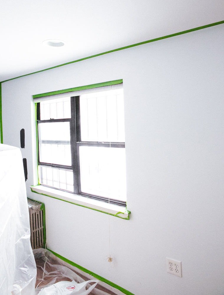 Before I could get to work on painting, I needed to prep the space. Walls were washed and taped, furniture covered in drop sheets and chaos came to my tiny little bedroom. I remember saying to my heart mate before I started painting: I have forgotten what it’s like to sleep in normality! Still, often to get better things have to get worse and so I embraced the mess and got to work.
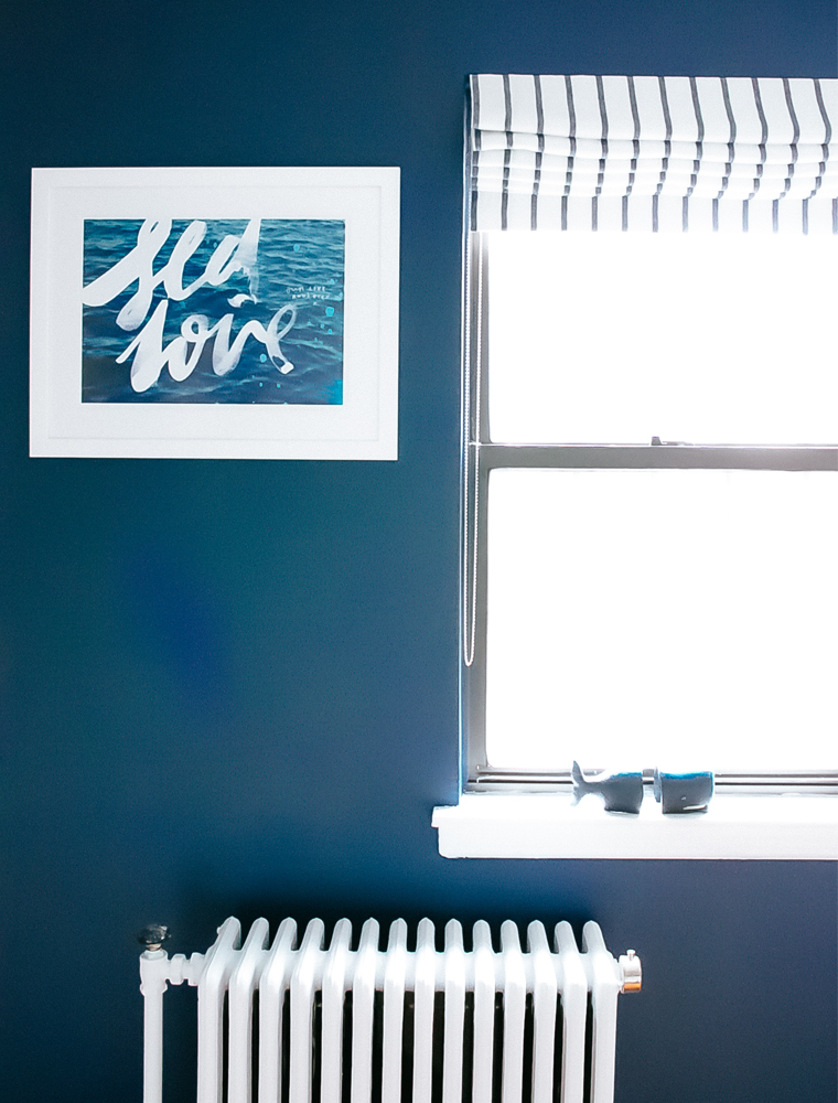
 I love that moment when the brush or roller touches the wall for the first time with the new paint color. Here I am applying the first lick of Newburyport Blue to the main wall in the bedroom.
 On the other side of the room (which is divided by the top of the spiral staircase) there is a smaller wall. I decided to paint it in a contrasting Electric Blue color. It’s one of the colors closest to that used in the makeover of Carrie Bradshaw’s apartment in the first Sex and the City movie. I promise that’s not the only reason why I love it…!
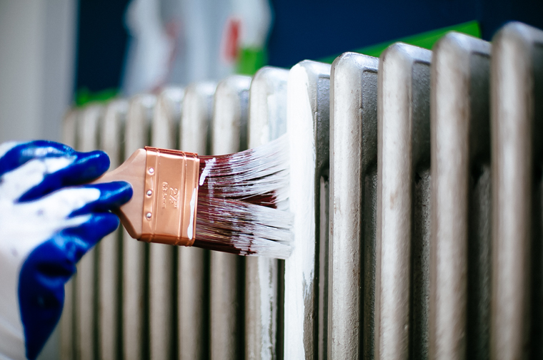 To create a cool and clean contrast with the navy wall I painted the radiator in a matte white.
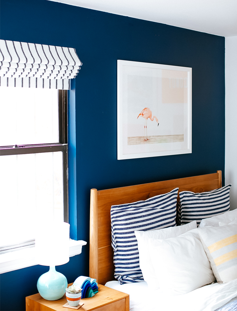 Continuing that cool and calming contrast, I dressed my Leesa mattress in soft white linen bedding accented by graphic striped euro shams and a ticking stripe quilt. I then referenced those stripes via the gorgeous indigo fabric I chose for the new roman blind.
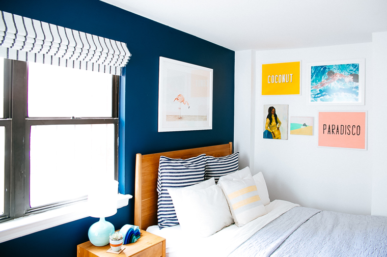 With the walls painted and the bed dressed, I turned my attention to artwork. I picked a striking flamingo print to hang above the headboard. Not only does it bring the exotic, destination vibe I was looking for but the negative space brings an added feeling of breathing space to the overall scheme.
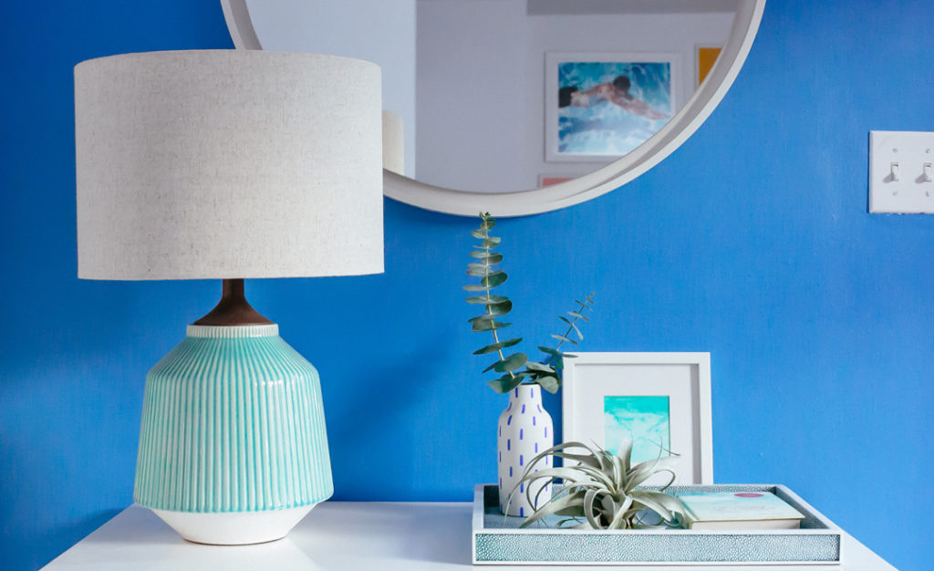
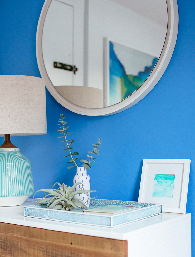 Remember the inspiration picture of me wearing the green tee in front of the ombre blue wall near the start of the post? Well, that was what inspired me to layer in mint green accessories as accent colors to the space. I painted my own mini watercolor to place on the Reclaimed Wood Dresser.
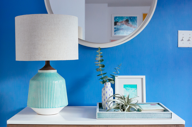 The Roar & Rabbit designed ceramic table lamp pairs perfectly with my watercolor, and the round mirror helps bounce light around the space.
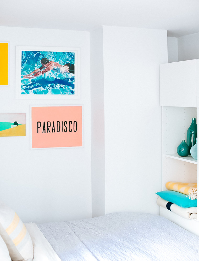 There was a slither of dead space at the end of the bed, so an affordable storage solution helped bring much needed storage to the room. Not only that, but it made the bed feel snug and cozy in it’s little nook, too.
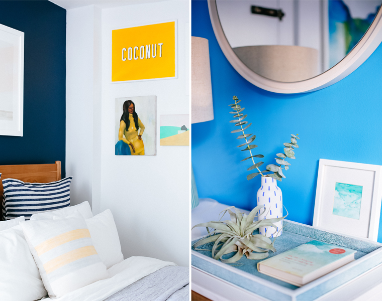 Art is a great way to pull a palette together, and this small gallery wall gave me the opportunity to splash in blocks of accent color and typographic pieces to the space.
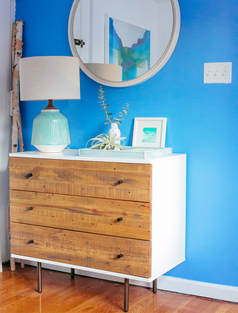 I love waking up and seeing this vivid blue hue, it fills me with energy and joy!
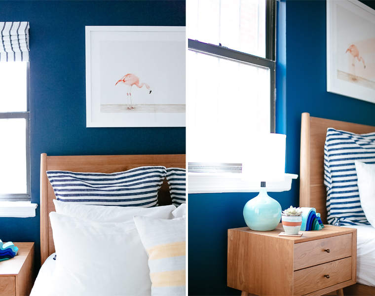 The irony of a beautifully designed bedroom is that it’s all pointless if the key part of room – the bed – isn’t comfortable and encouraging of a good night’s sleep. For the last two years I’ve suffered with on and off back issues and been through several different mattresses to try and find one that helps my recovery. Genuinely, over the last month that I’ve been sleeping on my Leesa mattress I’ve found the support to my back to be first rate. I was concerned at first that because the mattress has a two inch layer of contouring memory foam that the mattress would be hot. I was completely wrong! I’ve always been a ‘hot’ sleeper, however, on the Lessa I’ve felt not only felt comfortable and supported, but thanks to the layer of Avena foam it’s cool, too. I’ve had so much fun decorating the tiny bedroom in our NYC rental – let me know which elements from the destination inspired bold blues scheme you like best! The first 50 readers to buy a mattress will get $75 off their order. Just use the code BAZAAR at checkout. Leesa gives you 100 nights to try your mattress, risk-free.
 // Photography by Will Taylor | Posted in partnership with Leesa, all views my own. Thank you for supporting the brands that help keep Bright.Bazaar going!



58 Comments
I love the darker blue on the wall. It’s so calming which is perfect for the bedroom and the blinds are awesome.
@Liam – Thank you! Calming is the perfect word as it really does feel that way.
This room is so darn beautiful! I love how colorful it is – what a perfect escape from winter.
@Gabriella – Right! I think it shows how strong colors can be calming and soothing.
You completely transformed the space, wow! Love the combination of blues!
@Susan – Yay! My favorite color did me proud! 😉
I was gonna head to Macy’s to look for a mattress this weekend but think I’ll try Lessa now. Thanks!
@Ben – Smart move. I can’t get over how much the mattress has changed how my back feels when I wake in the mornings. Quite life changing, honestly.
Will, you have such a talent for pairing colors together. What a beautiful space you have created. The blind, the bed, the art…adore it all!
@SB – That is such a lovely comment, thank you! It was definitely a challenge to decorate but I love how it came together!
Stunning! I like all the layers in the room. xo
@Karen – Me too, they bring so much depth and texture to the space.
Will the space looks absolutely fantastic! It’s inspiring seeing you use a dark color in such a small space – it adds SUCH a design impact.
Molly {Dreams in HD}
@Molly – Right? I’ve gone dark in small spaces before and it just adds so much depth and interest to the space. Thanks for stopping by!
You’re so good with a small space! And those blue are rich and joyful. Love that quilt — you use it as a replacement/substitute for a full comforter?
@Lindsey – Too kind, thanks! I use it as a bedspread/throw over the top of my main duvet/comforter! Super comfy and cozy!
So fun! Makes me want to found our own place right now and start getting busy decorating and having fun. Nice job!
@David – Thanks! Makes me smile that you found it inspiring. Hope the hunt for your own place is going well! 🙂
I love that swimming underwater piece! Just beautiful. (As is the whole room!)
@Kaitlin – Isn’t it beautiful? I found it on Etsy a few years back! Thanks 🙂
The room turned out great! Love the idea of painting the radiator white to stand out from the darker wall, definitely breathes new life into a piece of the room that can sometimes be a bore.
Josh | The Kentucky Gent
http://thekentuckygent.com
@Josh – Thank you! I agree, it’s great to take an existing element of a room and turn it into something beautiful and eye-catching.
I love it, such alot of thought and care in your decision making. My fave parts are the hints of mint which give it an extra pop and I really the paler blue. I’ll be thinking up some new ideas when I find a new abode xxx
Jo xx
@Jo – Kind of you to say, thanks! Have a lovely weekend! 🙂
Will, great job with the makeover and congrats on the Dream Decor promo at Times Square! I was wondering if you could make a post about how to pick art for a room… I feel the need to relate to an art piece in order to bring it home and that doesn’t happen often! Haha.
Thanks,
Soutrik
@Soutrik – Thanks for the kind congrats! Funny you should request that as I have something fun coming up to do with art in the next month or so – stay tuned!
Love this look. I unfortunately do not have a room with enough light to use such strong color although I love it. Years ago I had a roasted pumpkin family room. Everyone thought I was crazy when I painted it, but when the room was all finished they loved it. The mint green touches make the room and those I CAN use…..not to mention the colorful art!
@Libbynan – Thanks! Loved reading about your roasted pumpkin family room, too!
I love it! 🙂
@Esther – Thank you!
I love everything about your bedroom but especially how your mirror is reflecting all your fabulous art! Thanks for sharing, Will. Can’t wait for the book.
@Mary Beth – Thanks! That’s one of my favorite parts of the room, too.
Gorgeous. Good job. I love the slider. I was trying to pull all the photos on this post. hmm. Inspired by tones of blue.
@Alexandra – Glad you like the blues as much as I do!
Oh this looks SO beautiful x
@Oliva – Thanks, Liv! x
Absolutely lovely Will! I wish we could paint our rental, plus do window treatments. Definitely make you smile style.
xo Lynn
@Lynn – Thank you! It really does make me smile. 🙂
Love how the striped window shade echoes the “striped” radiator. Tell me about the whale in the window…
@Joan – I like that part too! The whale was from General Store in Venice, CA!
Your room looks fabulous – both stylish, sophisticated and I love the nautical theme. The darker blue works so well with your choice of curtains and the Matt White radiator. I also love the contrast of the lighter blue. The lamp also stood out for me as well as your sweet painting. Perfect prints too. Have followed you for some time on Instagram as I am also a big fan of colour (see my insta food shots) but only just gone onto your blog. Seems I have some catching up to do as it looks wonderful. Don’t know what took me so long. Best Torie
@Torie – Thanks so much for following along and for your kind words about the space! 🙂
Two of my favourites! Blue hues & nautical decor. I particularly love the way you manage to get everything in the frame when you photograph in small spaces like this.
@Shreyas – Thanks so much! 🙂
Love the 2-tone room! The blues are so crisp & energizing. Quite lovely indeed.
@Andrea – I love how they paired together, too!
This is so lovely! Just goes to show that even with a smaller space, a room can still look just as lovely.
@Jo – Thanks! 🙂
Will, compliments! Your bedroom Looks fantastic. (And i am not saying this because blue is my favourite colour;-)
@Sara – Oh, thank you! And I’m right there with you re: blue! 🙂
Such a lovely room! I would say its my dream room actually! Being an undergrad does not let me live in a place I get to decorate. So I must live through wonderful blogs/websites like yours. x
@Lara – So pleased you like it, thank you! Hope you have your own a place to decorate soon! 🙂
Again, brilliant job. You even made the ugly radiator look good!
@Monica – Thank you so much! 🙂
What a bright cheery space! Where do you get your Roman shades made in NYC? OR do you make them yourself?
Thanks so much!
@Erica – Thank you! I had them made at NYC Blinds!
That brilliant blue is absolutely beautiful.
I mean the electric blue is absolutely beautiful.