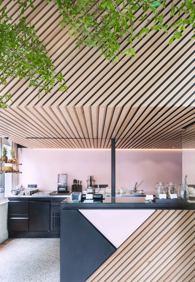
 It seems that as more and more healthy-eating spots and juice bars pop up across the world, the interior design and architectural details of those eateries become evermore stylish and eye-catching. After touring the stylishly stark and unique interior of SHOT and the colorful and utilitarian 400 Rabbits, both in London, it’s time to head to Amsterdam! Today we are touring a tiny 32 meters squared juice bar that’s full of texture, color and unexpected details. It was designed by Standard Studio and Build in Amsterdam> – you can check out the full The Cold Pressed Juicery tour after the jump!
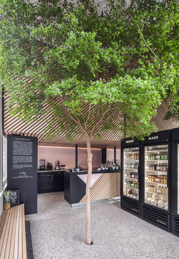
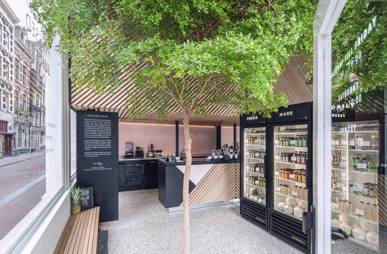
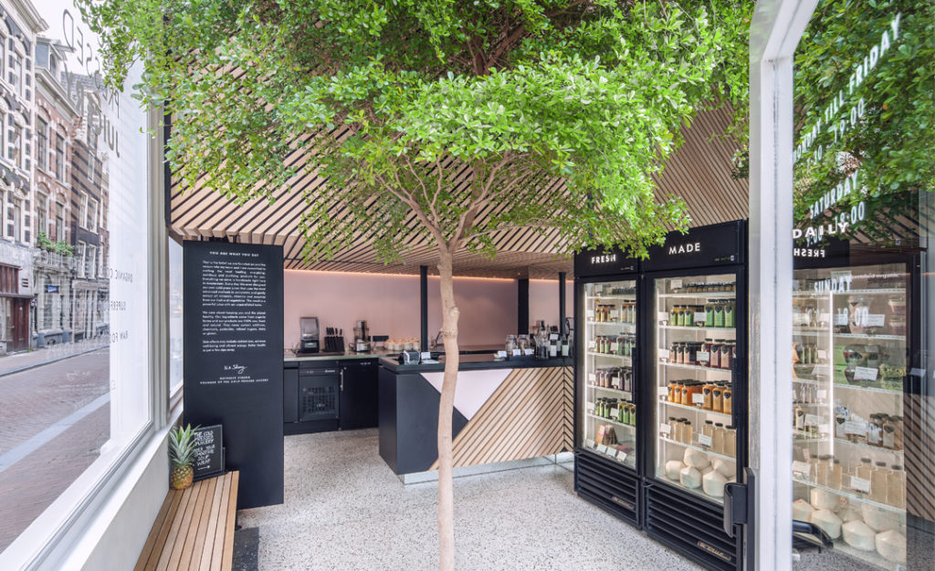
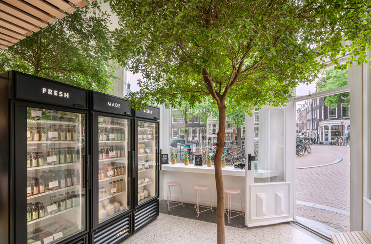 The focus of the design is the living tree located in the middle of the store, the aim of which was to provide a calm environment from the hectic pace of the city. The tree is a symbol of nature and a reference to the daily fresh ingredients the the company use to produce the juices.
 The background and the diagonal lines of the design were translated into the material with black and pink powder coated steel (obsessed!) and wooden slats, which bring so much warmth to the space. As the slanted lines are recurring they accentuate the architecture: both the wall and the ceiling above the counter become more prominent in the space.
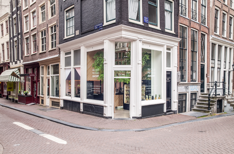 The designers like to think of the space as ‘urban retreat’, a place to come and unwind under the tree with a refreshing
drink. And doesn’t it look just that – I love it!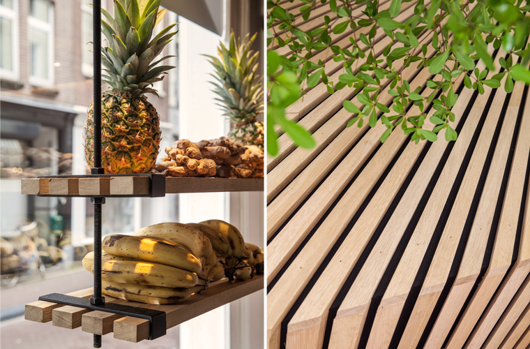 In order to keep the real tree alive, the architects created a big bucket in the basement with fertile soil and irrigation to allow the tree a healthy life. I love that the thought went into the longevity of the design and the elements with in it. It’s design that’s more than skin deep and I like that.
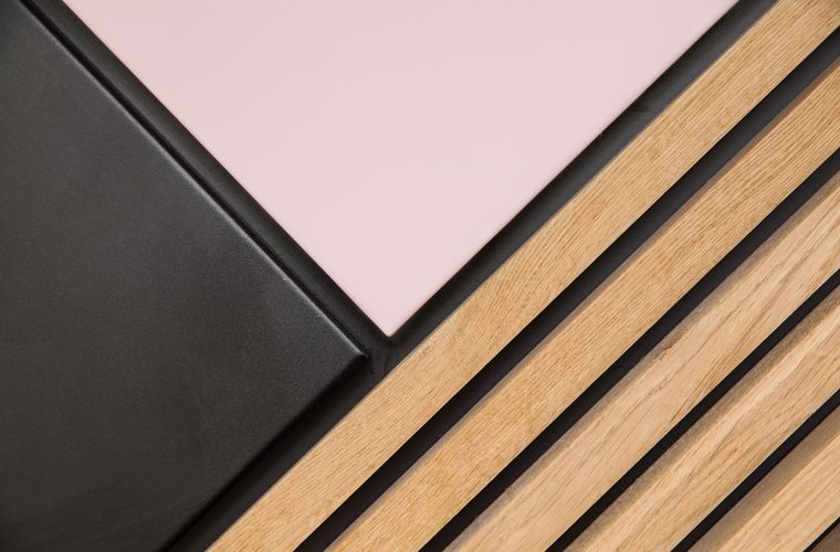 I love the contrast between the black and pink powder coated steel and the wooden slats. What details of The Cold Pressed Juicery do you like best?
 // Photography by Wouter van der Sar, used with permission. | Design by Standard Studio




18 Comments
I love how open and spacious it feels in such a small space. The tree is a big part of that. You know, if there’s a tree it must be huge. Very trompe l’ oiel.
@libbynan – I agree, it’s corner location really helps with making it feel so light and airy!
Beautiful interior. Thanks for sharing with us.
@Bea – My pleasure. Thanks for stopping by!
Pink! I wouldn’t have thought of that for such an interior like this but it does work! 🙂
@Alicia – Totally! I love the contrast with the black and the wood.
Neat! I’m heading there soon so I’m gonna heck it out
@Robert – Jealous! Have fun and safe travels.
Cheers to that! Just added the juicebar to my Amsterdam blog Amsterdamnext.com too and ofcourse had some tasty juices:)
@Desiree – Perfect! 🙂
Oh, those sweet pink stools against the gray floor!
@Mary Beth – Divine details!
Beautiful interiors, love the designs, thanks for sharing!
@Mike – Thanks for stopping by!
Totally in LOVE with this!
@Ash – Me toooooo!
Amazing!! Do you know which tree they used?
@Silvia – I don’t, I’m sorry!