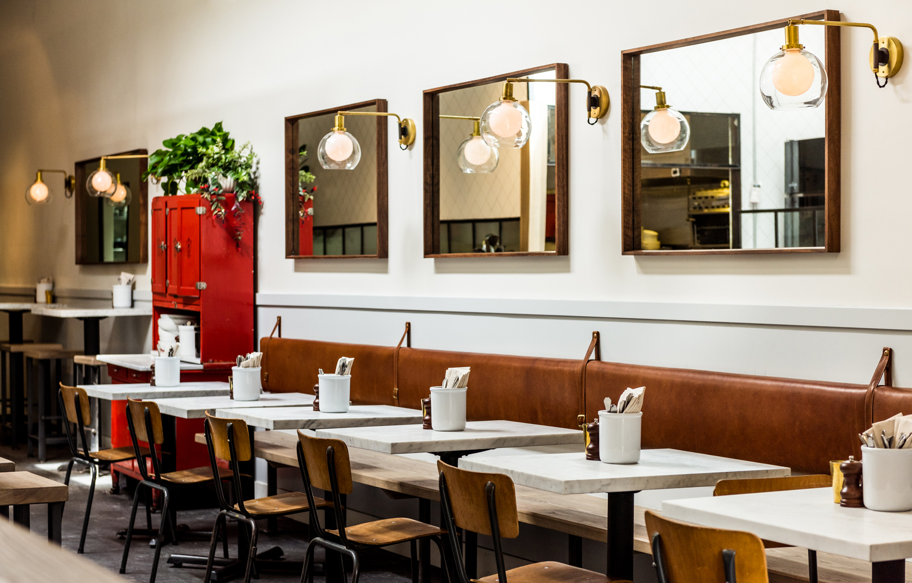
 You guys know that I dig inspiring restaurant design. In fact, it’s often equally as important as the food I’m eating at the time. I guess that’s the result of being such an interior design geek! Eighteen months or so ago I visted San Francisco for the first time and I was taken with their vibrant food scene. Not only were the dishes delicious but the restaurant design was often on point, too. Case in point with the restaurant design of fine-casual American pasta bar, Barzotto. Click through after the jump to see this stylish space in full!
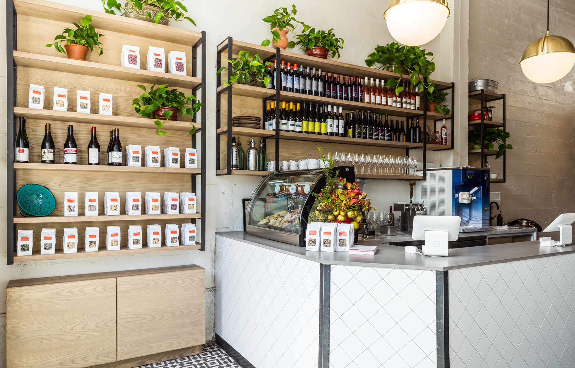 I always feel drawn to spaces that aren’t too try-hard or showy. I’m just not about glitzy-glam interior design. For me, when it comes to design the less sparkle the better! I like spaces that mix styles and design directions to create a comfortable and lived in feel. A space that evokes a welcoming, cozy vibe – that’s the key for me. It’s for this same reason that I felt drawn to Barzotto’s restaurant design. Let’s start with those simple square white subway tiles laid in a diamond pattern: a simple way to add visual interest to timeless looking design element. Love that!
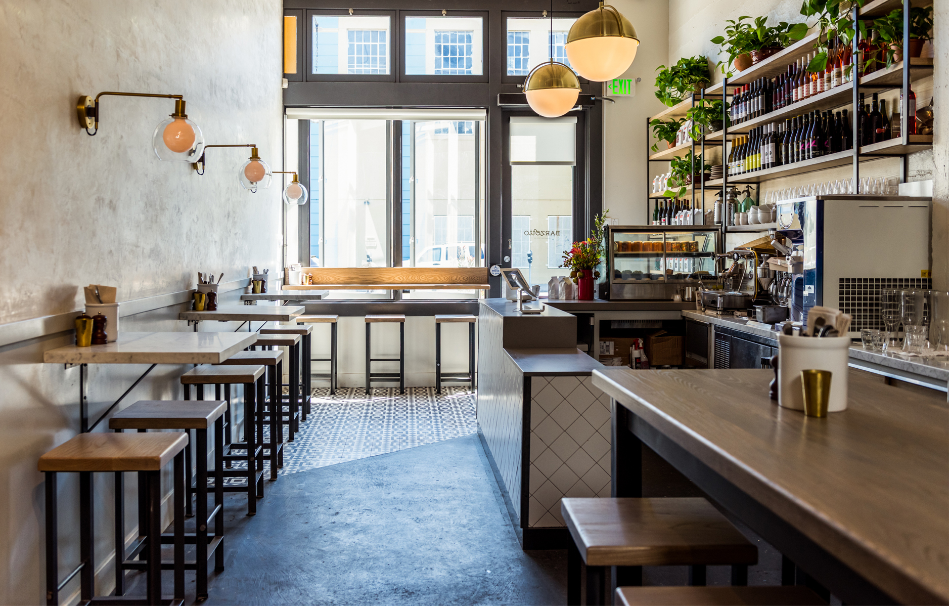
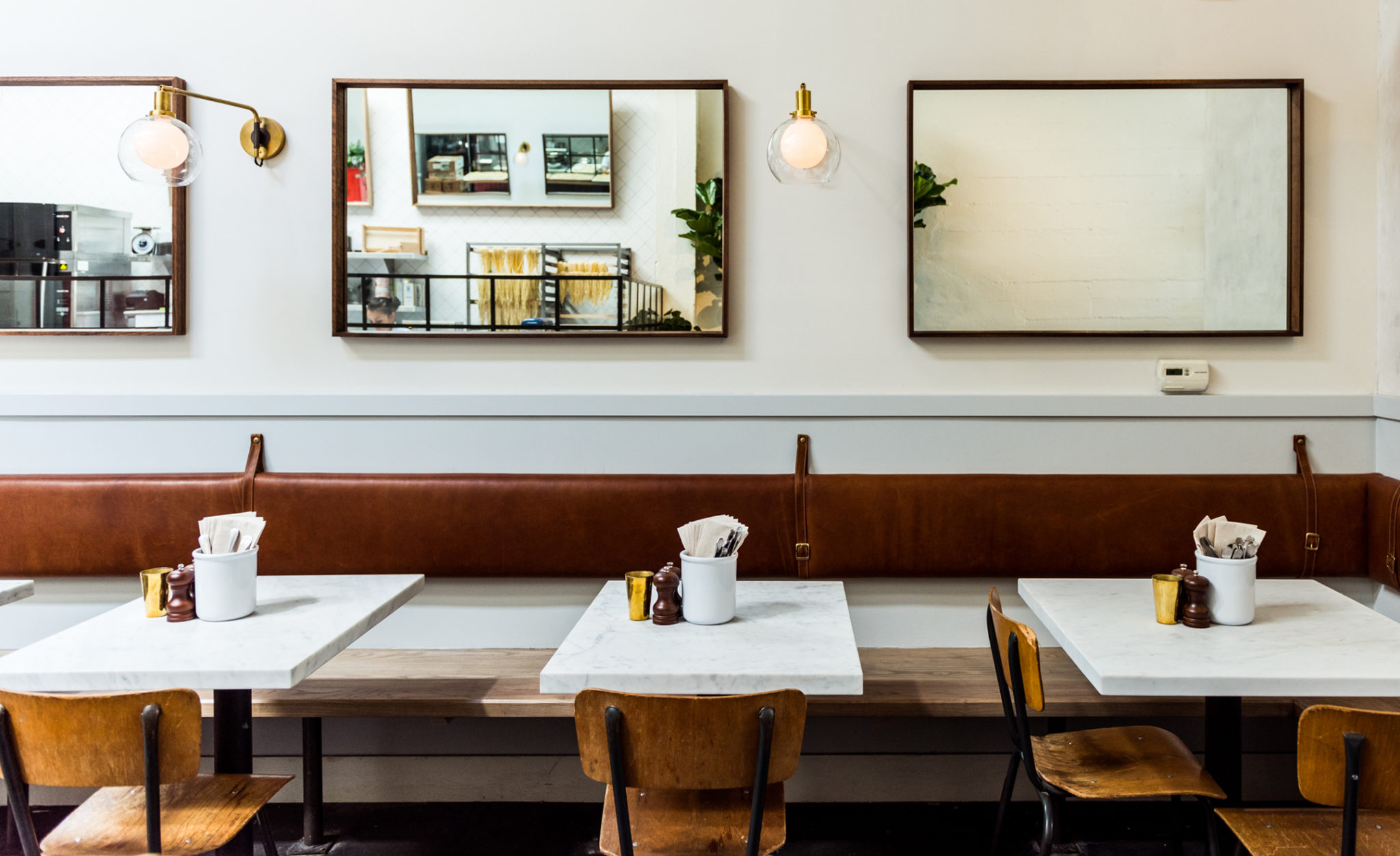
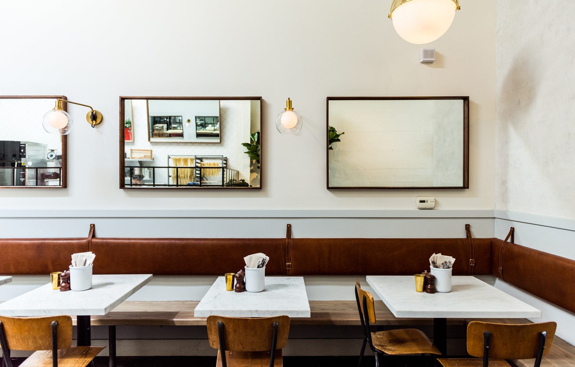 The restaurant interior design is a mix of vintage/collected objects. In fact, the former restaurant’s bright red hutch now serves as a side-station! Vintage Italian cookware thrifted by the owner, Marko, from Alameda Flea Market fills the front counters’ shelves. This touch gives the space a lived-in, relaxed and welcoming feel, don’t you think? The strapped leather seating pads are a beautifully subtle element to the design, too.
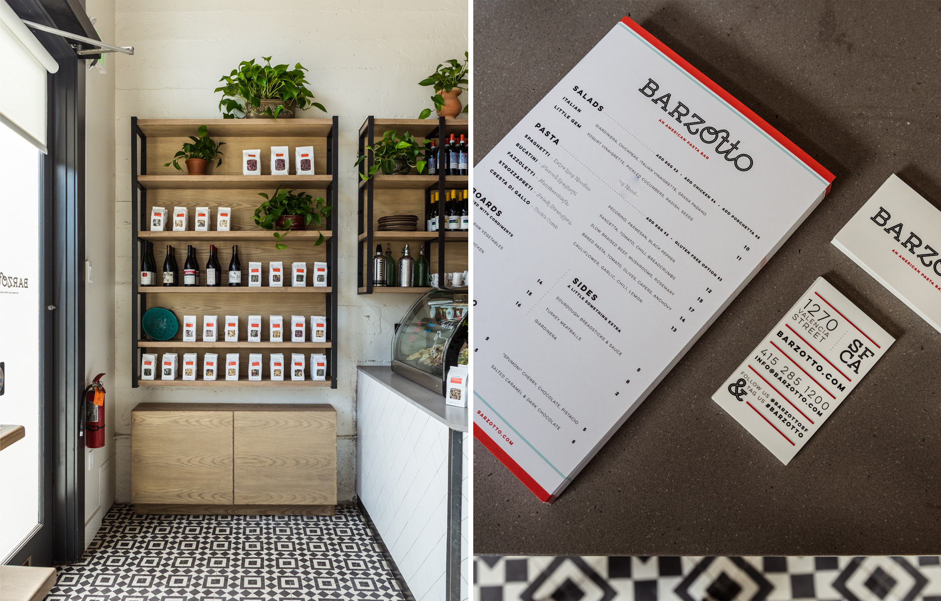 As part of a major renovation all the walls were taken to white (either original exposed cinderblock walls or Venetian plaster), the beautiful wood-paneled ceiling was white-washed, and a central open kitchen bar became a focal point. Guests who sit here at the heart of the restaurant can watch the kitchen team hand-rolling fresh pastas. Extra-long spaghetti hangs on drying racks for practical reasons (and dramatic effect, of course!). Speaking of dramatic effect: the restaurant’s branding is on fire! I love the use of striking typography and vibrant color. Once again, this simple approach has paid dividends as the menus will feel effortlessly stylish for many years to come.
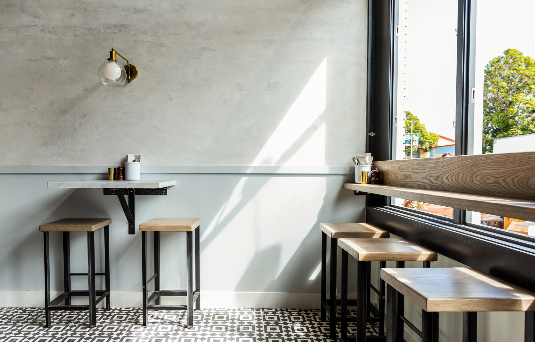 The moment I saw the lighting in the space I recognised that much of it was from one of my favorites, Schoolhouse Electric. The contempoary brass pieces are mixed in with designs from Restoration Hardware and CB2, too. This front section of the restaurant (pictured above) is a lovely part of the design as the simple seated bar at the open windows allows diners the opportunity to relax and watch San Francisco’s Mission neighbors stroll by. Guests are greeted at a custom counter and built-in shelving for retail wines, fresh pastas, and soft serve gelato sundaes. Yum! All in all, this stunning restaurant design makes me excited to plan a return trip to San Francisco. Have you dined at Barzotto? What’s inspiring you about the space? Do you get design ideas from restaurants interiors, too?
 // Interior design by Hannah Collins | Brand identity and graphic design by Danielle Moore | Photography by Kassie Borreson; used with permission


11 Comments
I like the stools and the open shelves.
@Max – I like the shelving by the entrance, too. The beautifully packaged pasta isn’t hard in the eyes either! Haha.
The floor tiles! The floor tiles! Yes I am excited about them! 😉
@Kait – Perfectly normal and understandable excitement! 🙂
Love the tiles…and the wall scones. Need to check this place out. Thanks for posting will!
@Alicia – Schoolhouse Electric do the best lighting!
What a dreamy space! Adding it to my list next time I’m on the West Coast. 😉
@Susan – Beautiful, isn’t it!
Love the flow and natural light in this restaurant
Buckets & Spades
@Matthew – I agree, it has a very natural flow to it. Have a great weekend!
Pingback: Barzotto – COTA ZERO