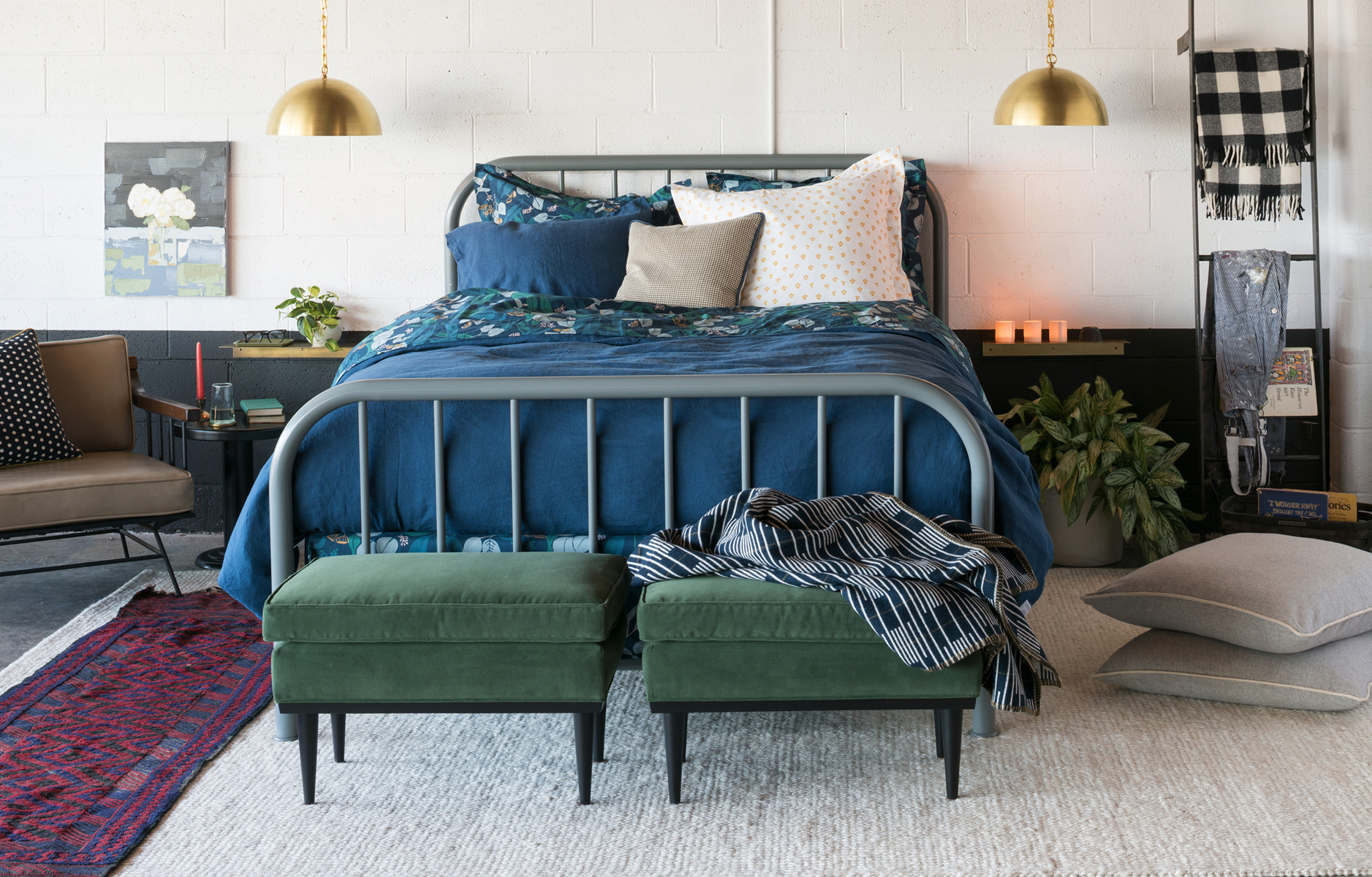
 Ohhhh, I could wax lyrical about my love for Schoolhouse Electric for dayyyyyys. In fact, with each new collection the Schoolhouse Electric lighting and furniture options just keep getting better and better! Last year, I blogged about their slow living concept that sat at the heart of their spring/summer collection. This season, they are focusing on the theme of “Making Home” and the art of living. The new fall collection went live last Friday and it’s a packed full of design delights! So, click through after the jump to take a peek at their stylish new catalog. (P.S. Anyone who has ever said blue and green shouldn’t be seen has obviously never seen the space above!)
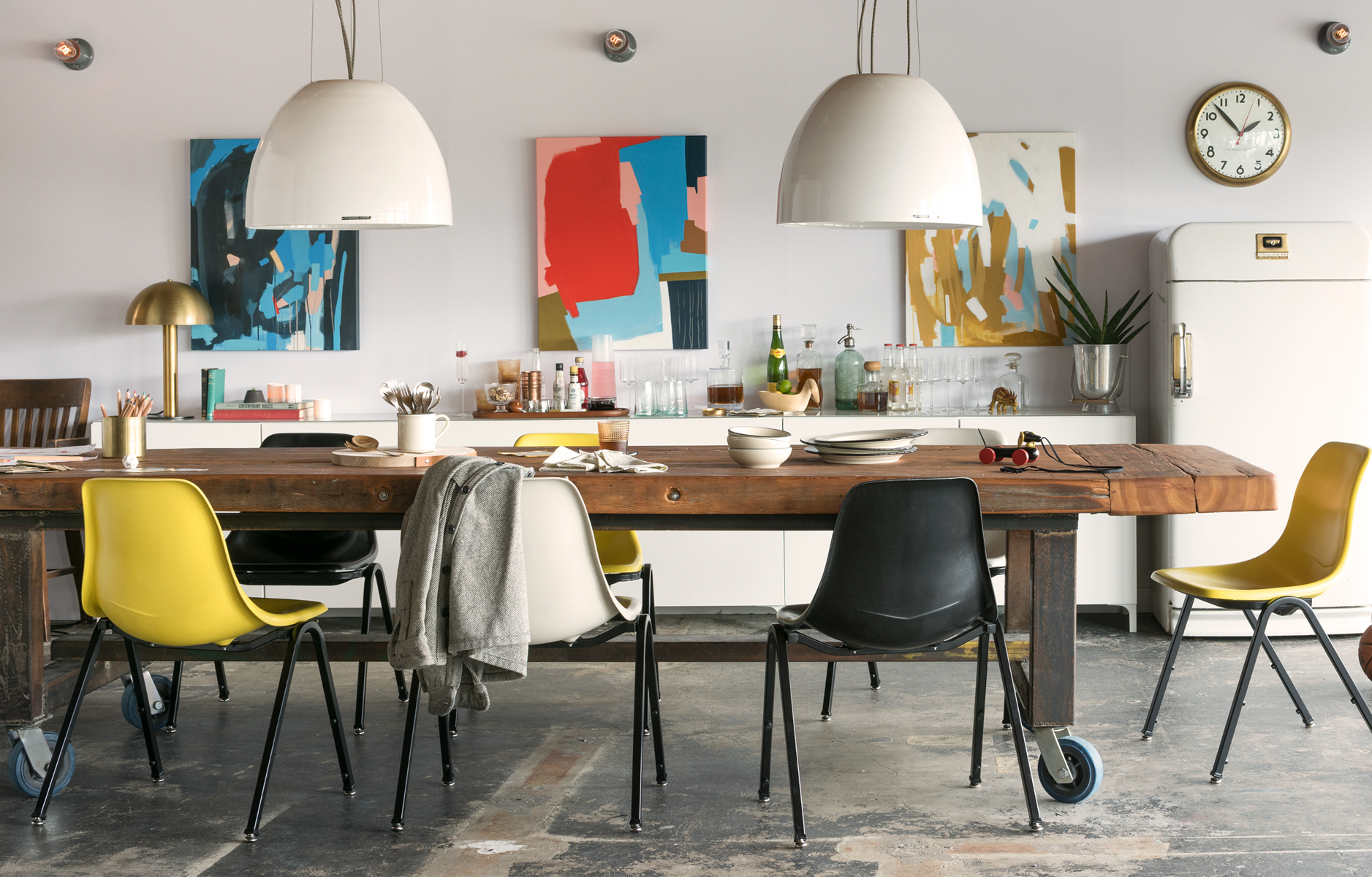 The folks at Schoolhouse believe in craft, community and making things that make lives better. Over the years I’ve interacted with several people who work there and you can sense their passion for the products and designs – even over email! I’m itching to make a trip out to Portland, OR one day so I can tour their HQ. I love how their aim is to create the next generation of heirlooms that can create meaningful spaces for years to come. They like to mix eras and styles, which is something I’m always keen to do in design, too. Just as they have done here, by pairing the classic design of their Classroom Stacking Chair with original artworks and a rustic wooden table.
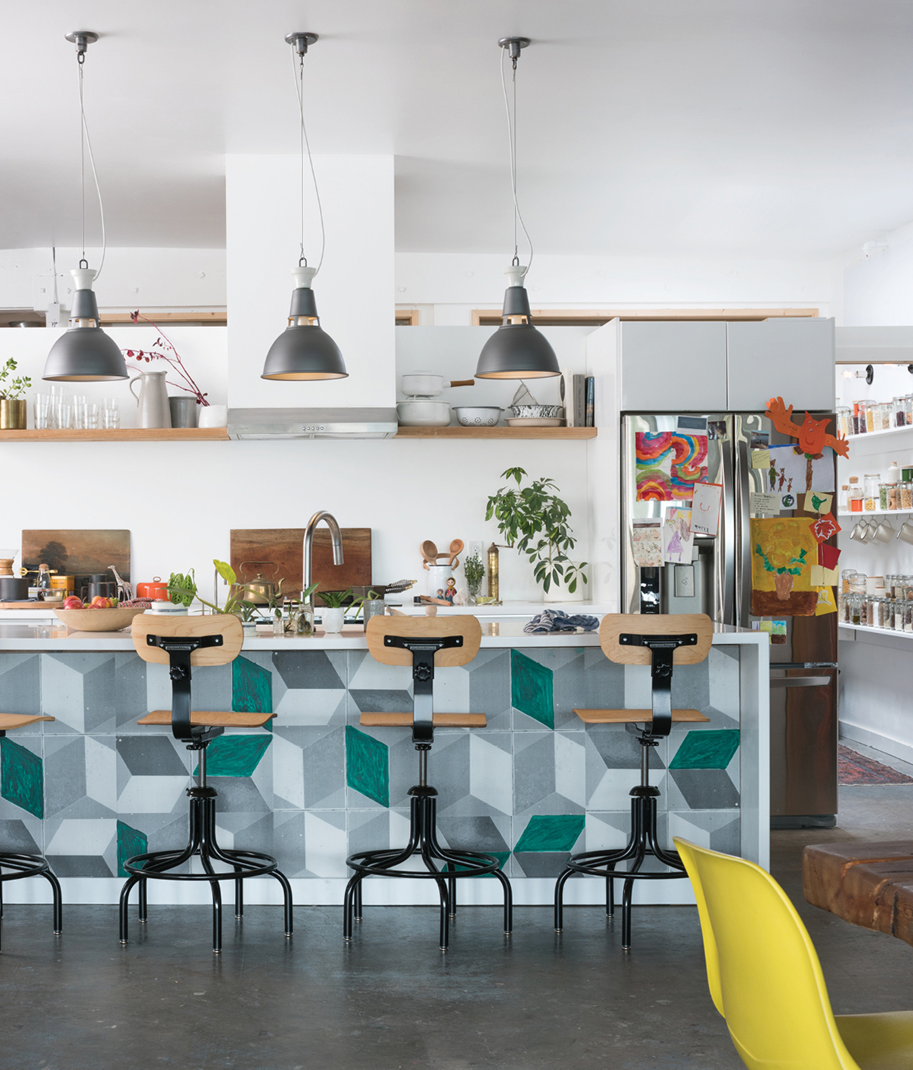 I’m mad about their new metal Factory Shade No.3, which was inspired by the timeless design of industrial factory lighting. Popularized in the 1950s, the compact dome profile provides a sophisticated and uniform style that has a timeless sensibility to it. Of course, it doesn’t hurt that they come in an array of colors, too!
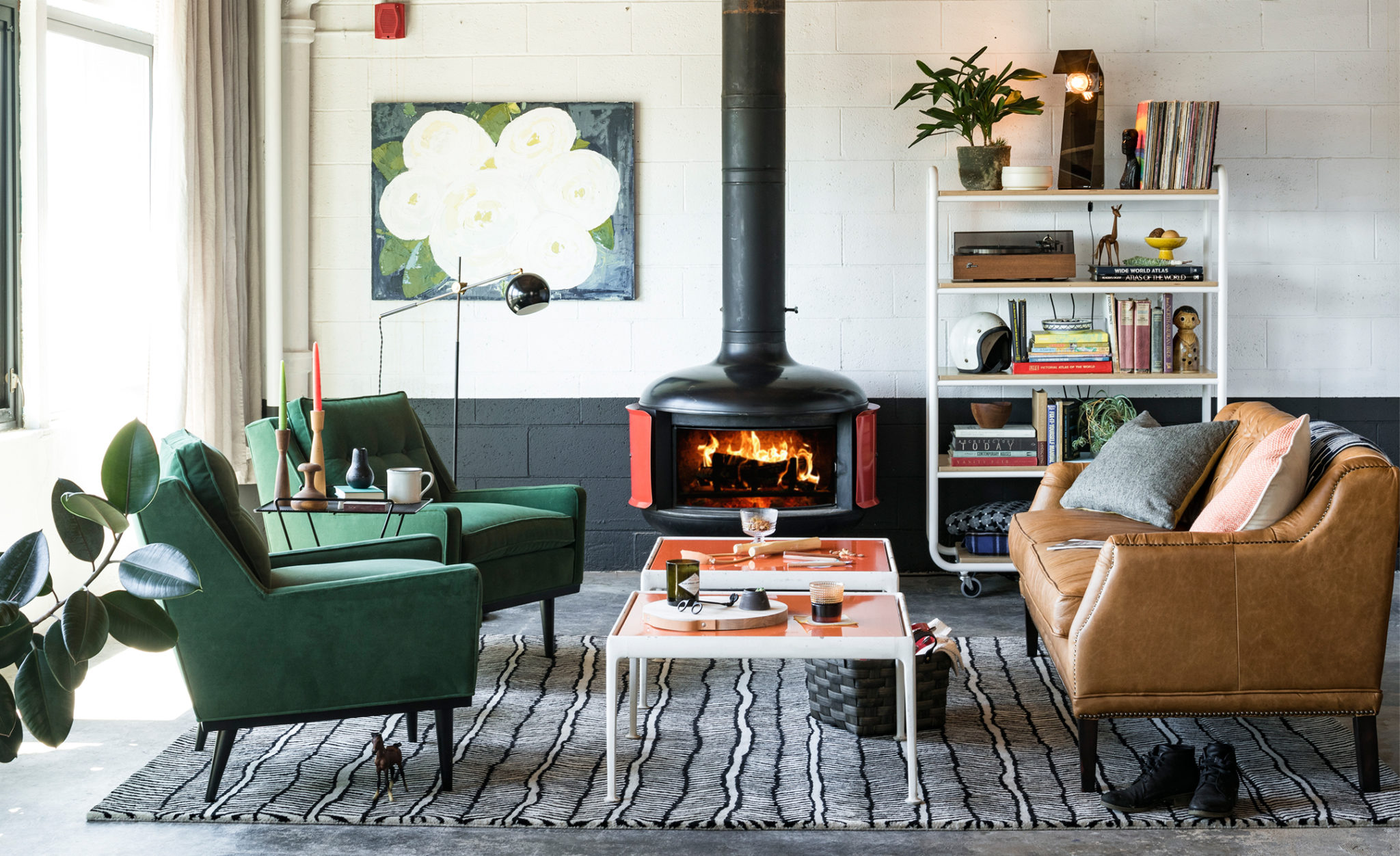
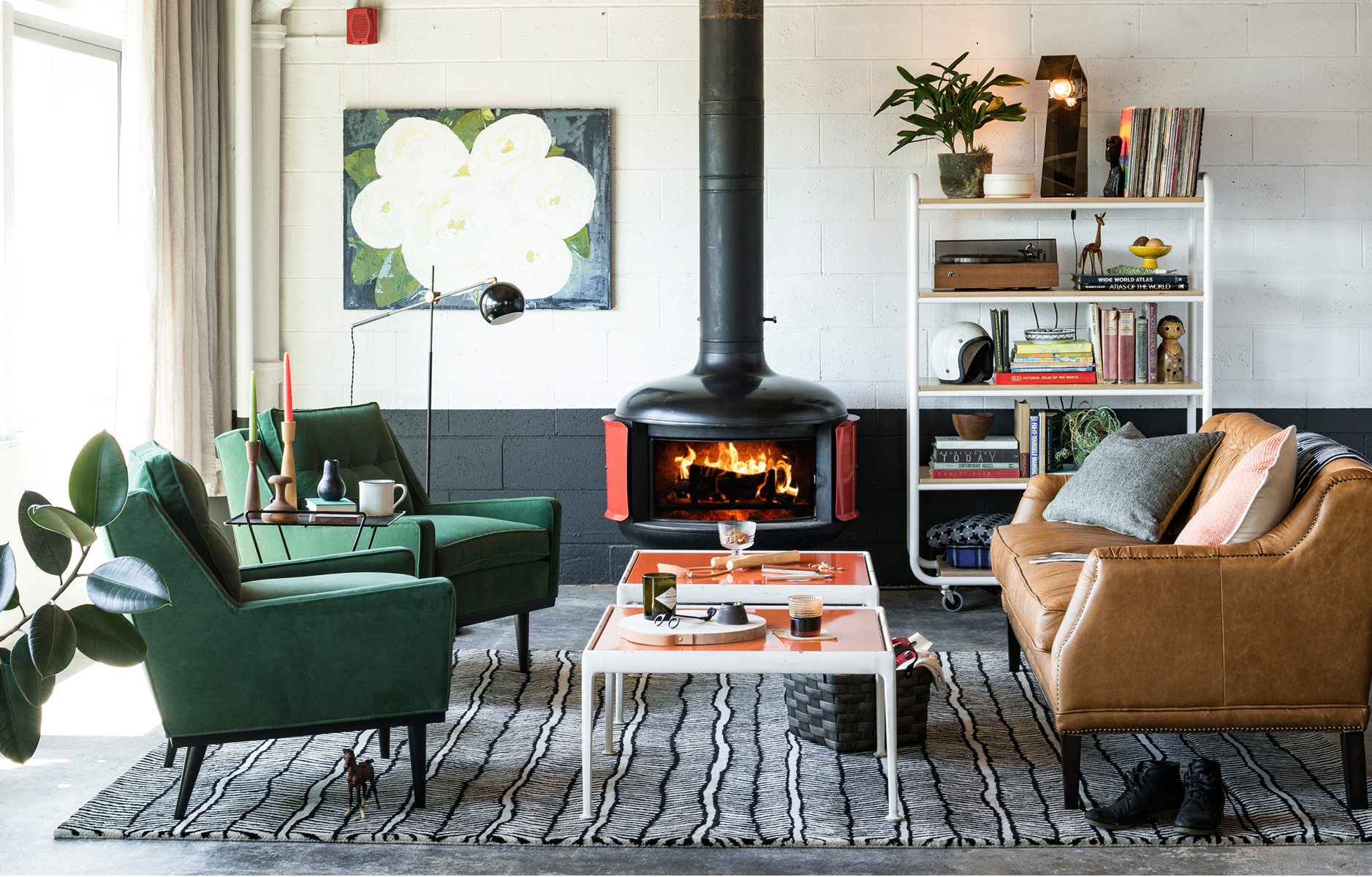 Speaking of colors, how divine is their green velvet Jack chair? If you love mid-century design then this is the armchair you need! It is a faithful reproduction of a vintage piece they fell in love with while antiquing. Personally, I like the splayed hardwood legs and low-slung arms. Which pieces are catching your eye? Are you refreshing your home for the new season?
 // Photography by Schoolhouse Electric; used with permission




19 Comments
How had I not heard of them before?! New favorite!!
@Kristina – Aren’t they so great! Their lighting options are hard to beat IMHO.
I like the Jack chair in the b&w check.
@Barret – YESSSSS! Such a good choice! 🙂
Thanks for this post Will…these guys are just the lighting source I was after!
@Justin – Yay!
Oh my gosh! That space is utterly amazing! Obsessed!
@Jenn – Right? Their catalogs and NYC store are always so beautifully styled and edited.
Schoolhouse Electric is always drool-worthy.
@Jamie – Right? Always!
Best blog ever!
@Florence – Really kind of you to say, thanks!
i could look at school house electric bits and bobs all day ! thanks for the inspring images today Will 🙂
@Fiona – You and I, both! Thanks for stopping by!
Yes, I love them! Thanks for pointing out the new offerings.
Carrie
http://www.wearwherewell.com
@Carrie – My pleasure! 🙂
As a big fan of your blog, I couldn’t be more thrilled to see you feature the gorgeousness of Schoolhouse which was shot in our space! The Jack chairs are a huge favorite for us as well.
@Summer – Your space is 100% stunning!
“Blue and green should definitely be seen”, based on the evidence of the first photo. Perhaps it’s the foliage either side of the bed that helps compliment the green at the front. Increasingly it seems as though rules are there to be broken with furniture and interior design, which is very liberating! Thanks Will.