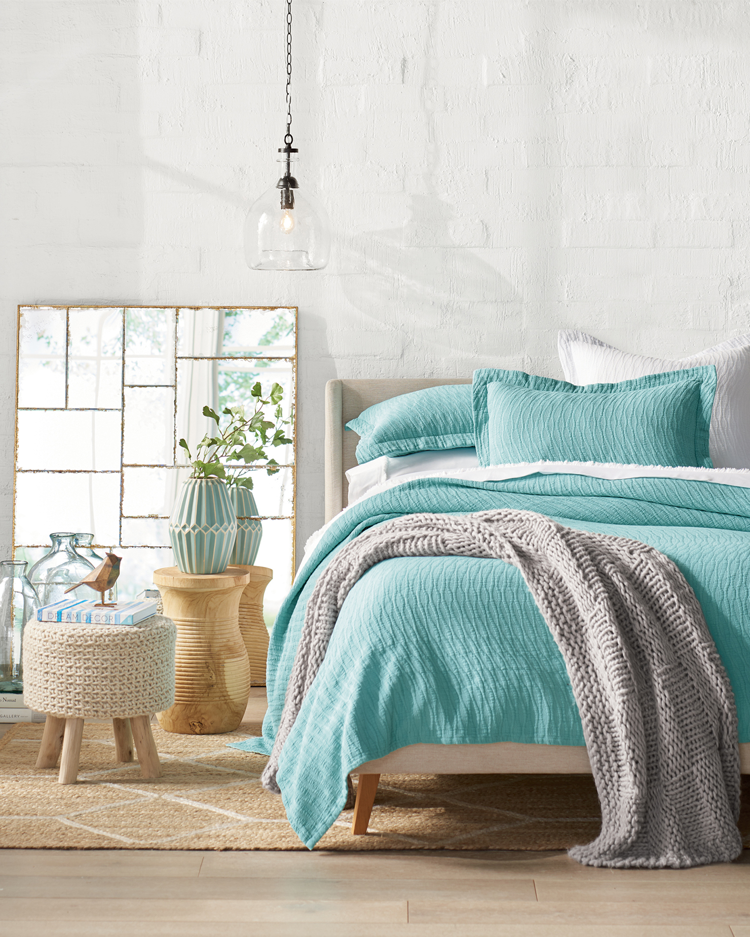
 I’ve always loved a bedside table moment so I was thrilled when grandinroad asked me to create and style three different bedside table looks. The reason I love telling design stories through bedside tables is this: no matter the size of our home we almost always have space for at least one bedside table in the space. The bedside table offers a great design opportunity to set the tone of your bedroom and imprint your personality on the room. With that in mind, I styled up three different bedrooms influenced by different design aesthetics: organic, luxe and playful.
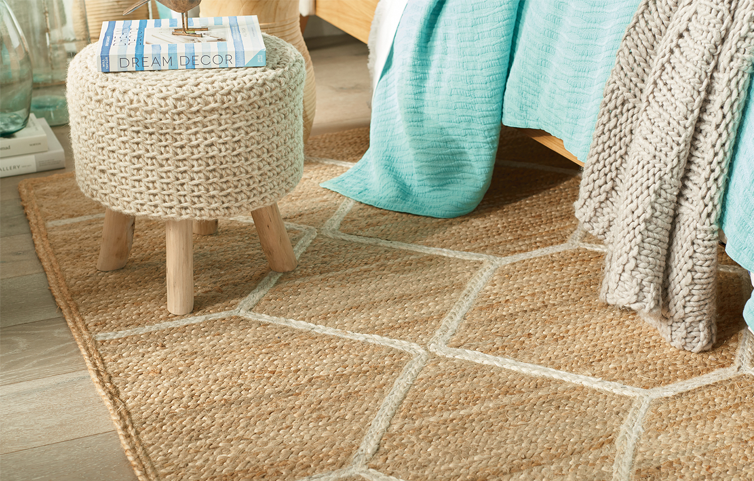 The first look, organic, sees a referencing of natural materials and elements, and lots of texture. I love how this organic space calls upon natural materials and elements, from layering the bed with lots of textiles to make it very comfortable and inviting, through to the exposed wood stool, to create a calm and comforting space. I love the beveled detail to the Ellery Teak stool as well; again, that brings another tactile element to something that already is very natural and organic: this design approach very much plays to touch as a sense. The Grayson mirror is a key piece in this look as it keeps the space very light and bright. The glass vases also help with this vibe as they let the light through; they’re not heavy in the room. The organic approach to decor is about creating a very fresh and open feeling – reflecting natural light and bringing natural design elements into the space to enhance it rather than block it is what works best. Why? Well, it helps to keep the room light, in both senses: it feels light, and it looks light.
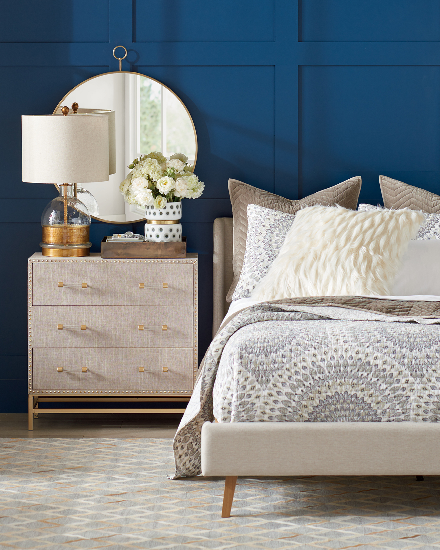 Luxe was the name of the game for the second bedside table. The key to this space? The marriage of the neutral furniture with the deep, rich color painted on the feature wall behind. A dark wall like this is so powerful in creating a luxe vibe. By doing a deep interior color like this midnight navy, it creates a moment of contrast – it’s very cozy. It almost feels regal.
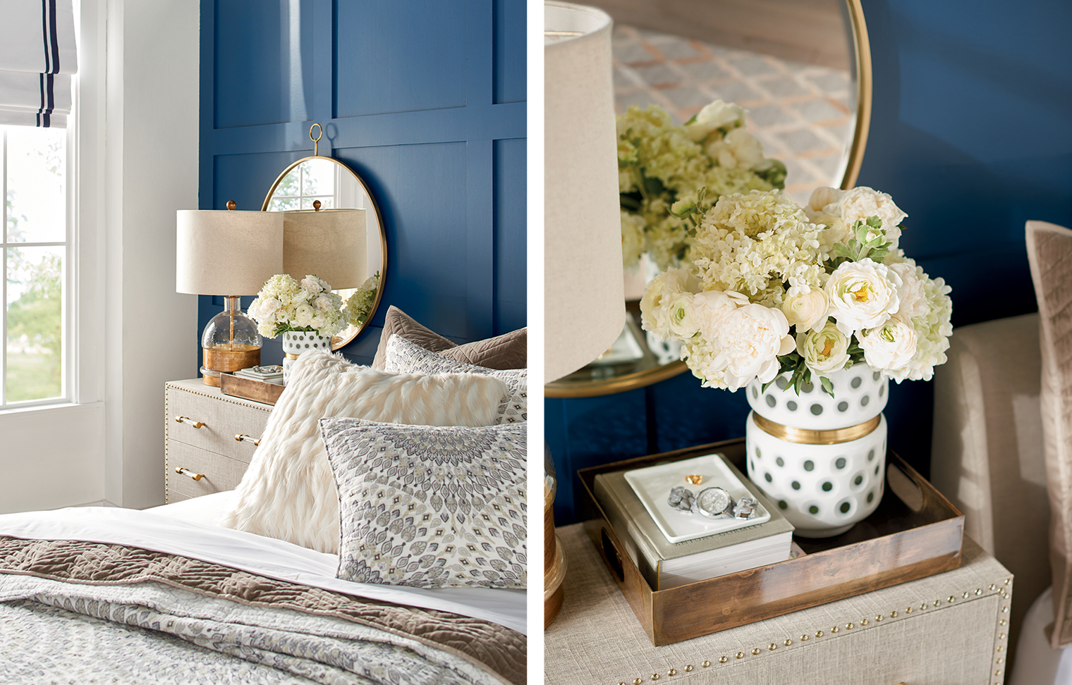 You can see there is quite light furniture in this space – it could almost feel fresh if used in a neutral space – but this dark, rich color behind it creates a striking contrast. It invites you to snuggle up and feels cocooning. You can also see that metallic elements like the Sadler Table Lamp, the Perrie Mirror, and the details on the Emile Chest – these all enhance the luxe feeling. If you were take any one of those elements away you would strip out the luxe and cozy feeling of this space. It’s really a triple threat – it all comes together to create the luxury vibe.
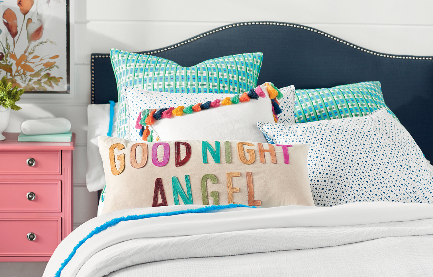
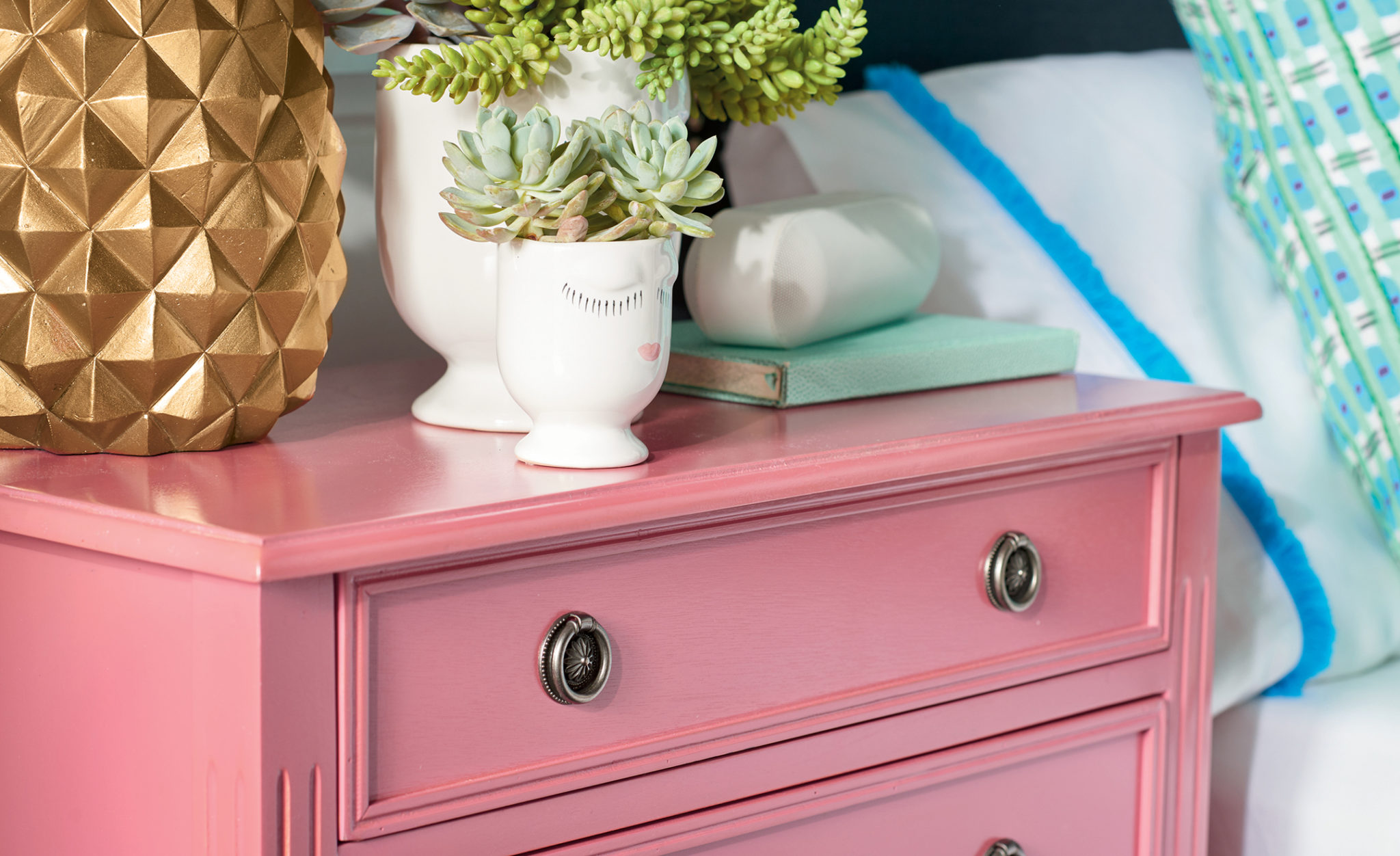
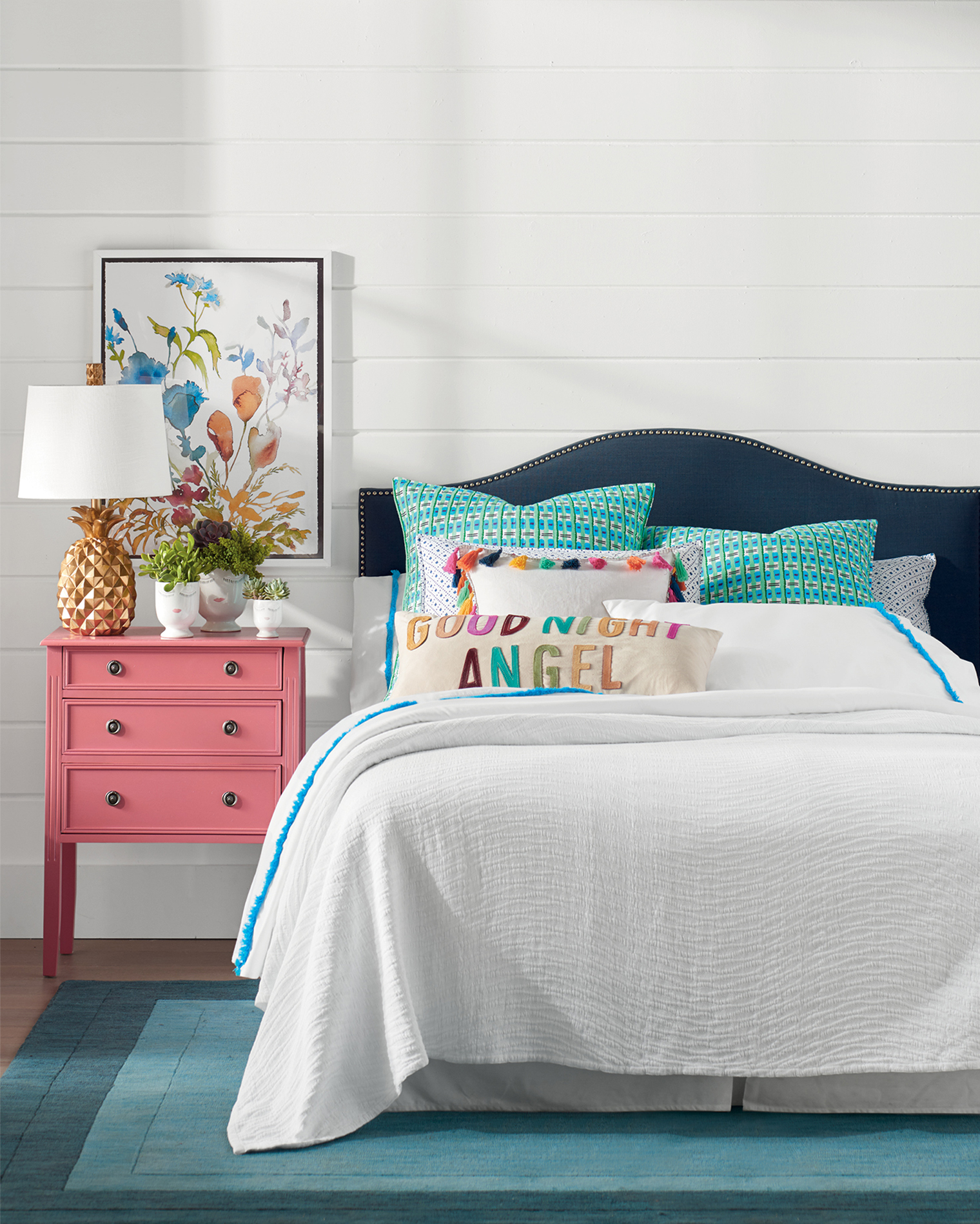 Playful is the third and final bedside table look and it encourages layering color on color on color! I always say that when designing a space to have a color statement you should pick one color and make that the color statement in the space. Here we have white shiplap, which is a neutral backdrop, yet it immediately feels very colorful thanks to the layering in a few colorful hero pieces. A hero piece like the Eliza Chest in a beautiful pink color pops against the white shiplap. It works because the base of the space is so calm and neutral. This allowed us to layer in other colors into the space in smaller touches. For example, the deep navy headboard is a tempering agent to the brightness of the hero pink: it means they eye has a focal point and a place to rest. You can see the pink referenced among the colors of the Goodnight Angel Pillow and Rainbow Tassel pillow on the bed. This sutble reference to the color of the chest creates a co-ordinated vibe without feeling forced. Which of the three looks if your favorite? Remember, stepping away from the expected will often pay design dividends. The sweet spot for me is when you truly decorate a room to represent you!
 // Posted as part of my on-going partnership with grandinroad | Shop all of the products in these three looks right here.
Welcome to Bright.Bazaar, my make-you-smile style corner of the internet. I’ve been sharing my love of beautiful design, feel-good homes, everyday style, inspiring travel and, pretty much everything in between, since 2009. As well as working as a content creator, I write interior design books and edit a bi-weekly e-newsletter called Smile Mail. I live in New York City with my heartmate and can often be found listening to Madonna’s Confessions album and dreaming up my next home renovation project.



16 Comments
I want to move into the aqua bedroom and never leave!! 😉
@Jessica – You and I both!
I saw you in my catalog last week and squealed! You are achieving so much… it’s inspiring. Thanks for all the design ideas you share with us Will! xo
@Emma-May – Awww yay! I get so excited when I see the catalog, too. Thank YOU for all of your kind support!
Luxe looks like a fancy hotel room. I want! Lol
@Dustin – Love that you wrote that because it’s exactly the vision I had for this space.
Hey Will. Ohhhhhh it’s so hard to pick. I think I would choose organic but I do love those colorful accent pillows in the last room. May I have all three?! 🙂 Have a great day!
@Lacey – Haha! Maybe you can have them on rotation?! 😉
I love your tips so much Will! Thank-you so much for the great advice! All of these are so beautiful!
Happy Tuesday!
Michael
https://www.mileinmyglasses.com
@Michael – Yay! So glad you enjoyed the design tips. Thanks for reading and have a lovely evening!
I agree with Jessica, although I like the playful version, too. I’m not a huge fan of pink, but I like the pop of color. If it were my room, I would do a different pop of color: maybe yellow or aqua.
@CeCe – LOVE the idea of using aqua!
Lindas inspirações. Amo quartos.
The second one, i fell in love in there!
@Luis – Great choice!
Thanks for the valuable knowledge. You have make the article so easy to read and it’s easy to understand. Keep sharing good work.. Love your creative work.