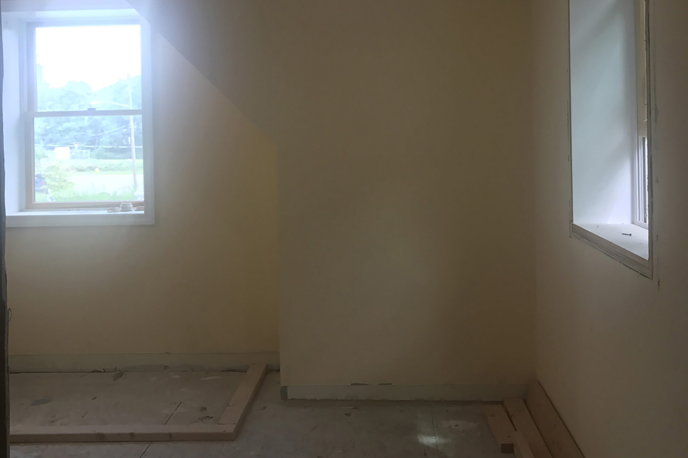
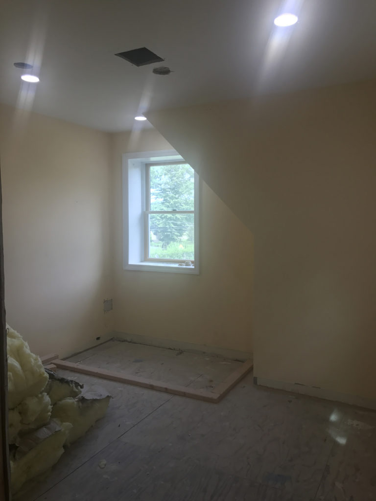
We have all been spending a lot of time at home, so I thought I would share our completed main bath at the beach house! You might remember when I blogged about the upstairs floor plan changes we made to the house? As a quick reminder: we turned the tiny family bathroom upstairs into a walk-through closet and converted a small twin bedroom into an en-suite main bath for our bedroom.
Today, I’ve partnered with Cottonelle to share the before/after’s of the space, talk you through the design process, and share how both the newly designed space and adopting Cottonelle’s #DownThereCare routine have made a positive impact on my life. The original beach house was relatively small (only 1,300 sq. ft.) but the flippers we bought it from had squeezed in four (yes, four!) bedrooms. A whole bunch of small, oddly shaped bedrooms didn’t suit our lifestyle, so we decided to convert one of the three upstairs bedrooms into an en-suite for the main bedroom..
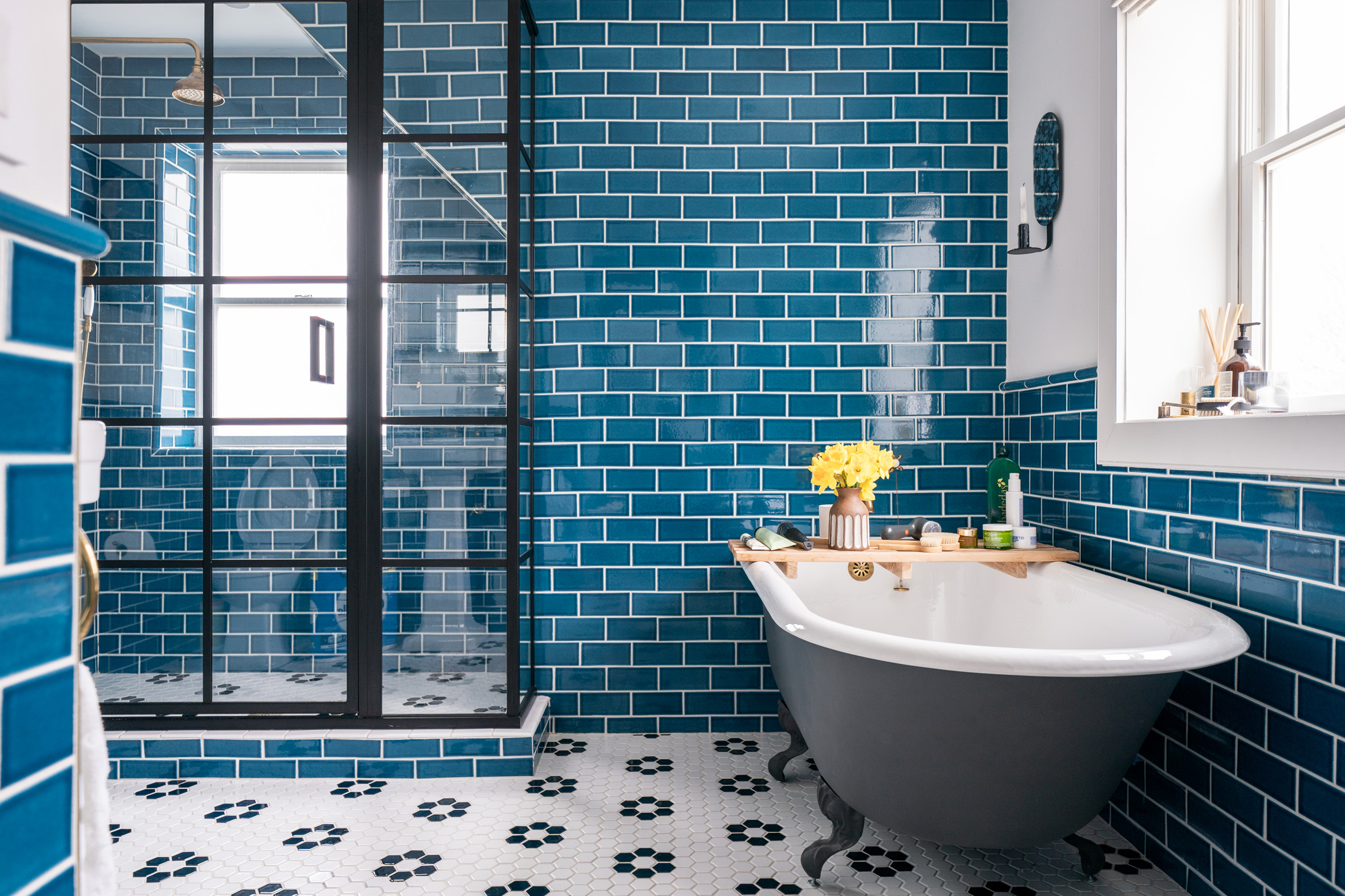
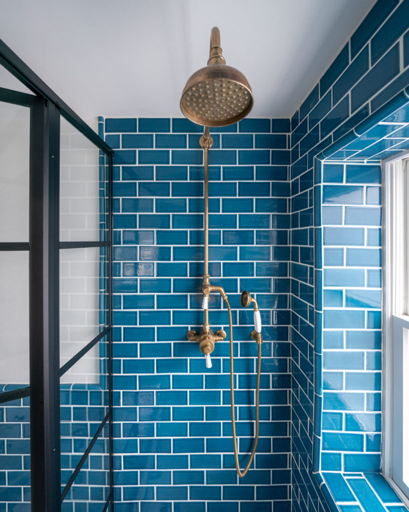
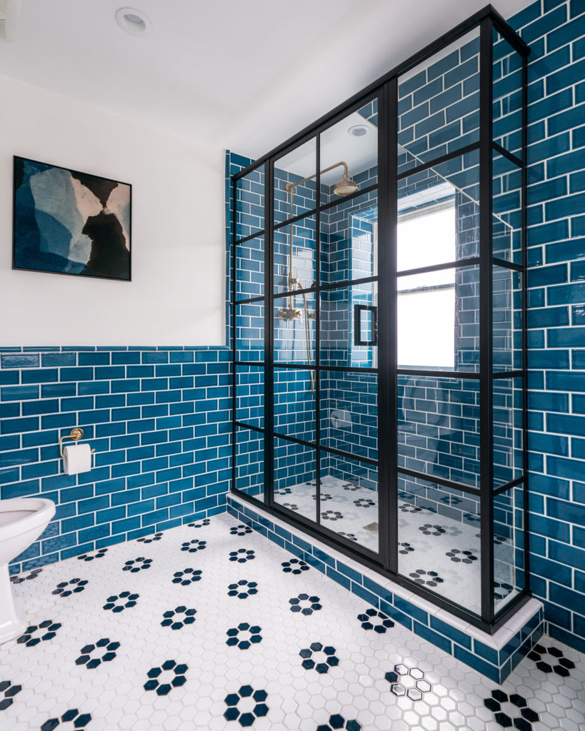
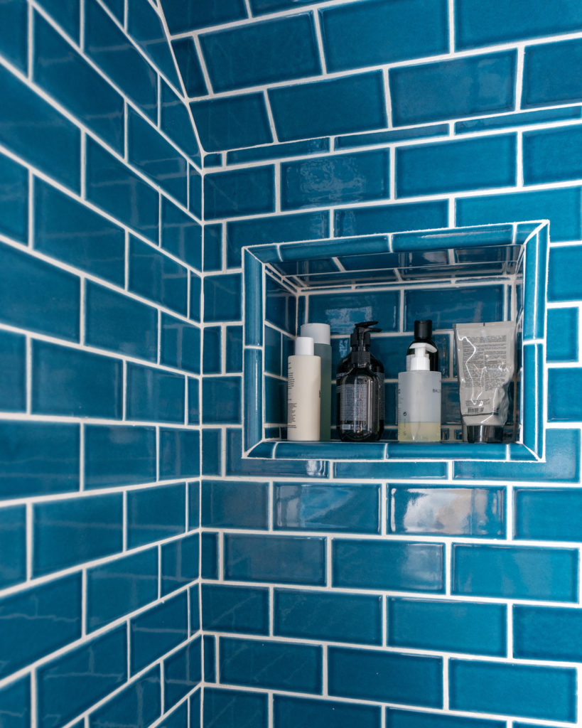
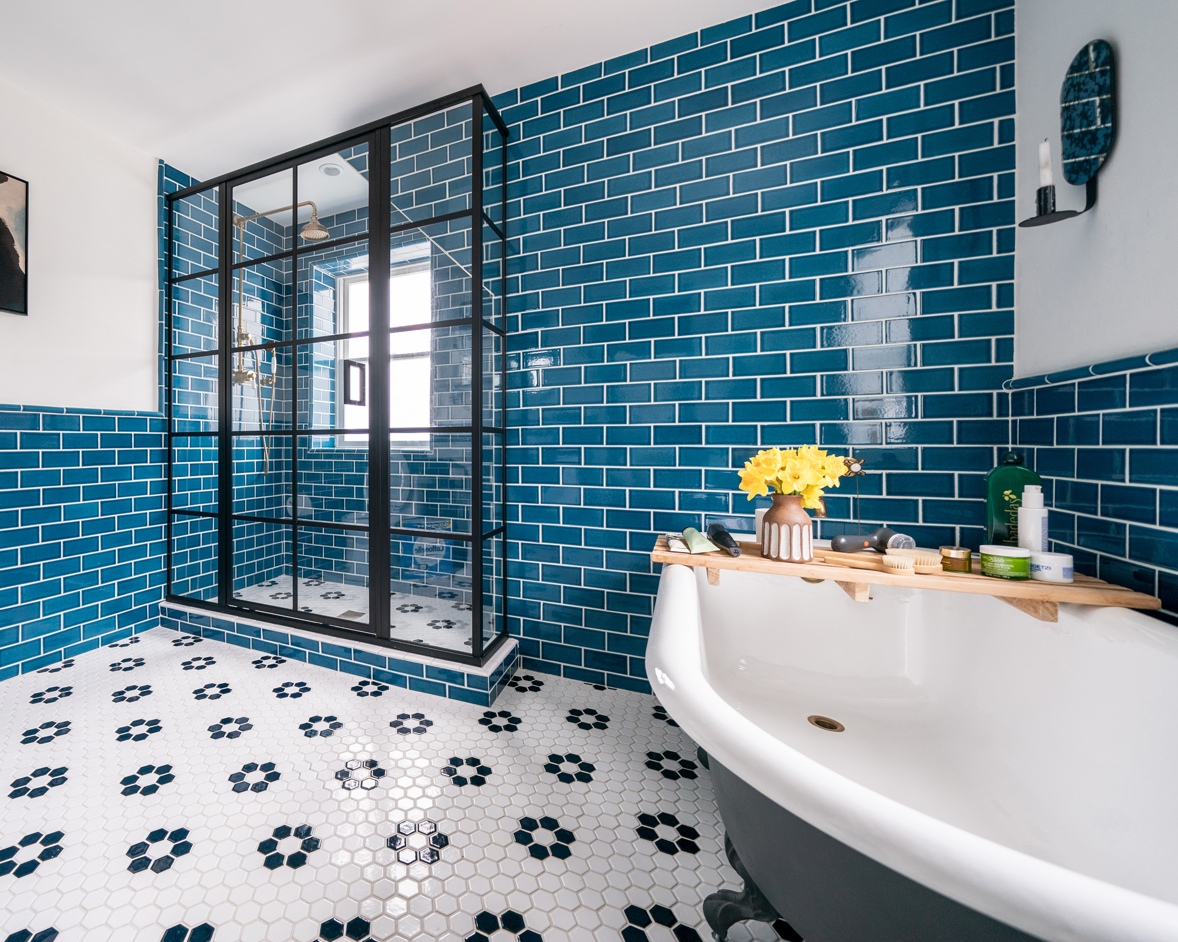
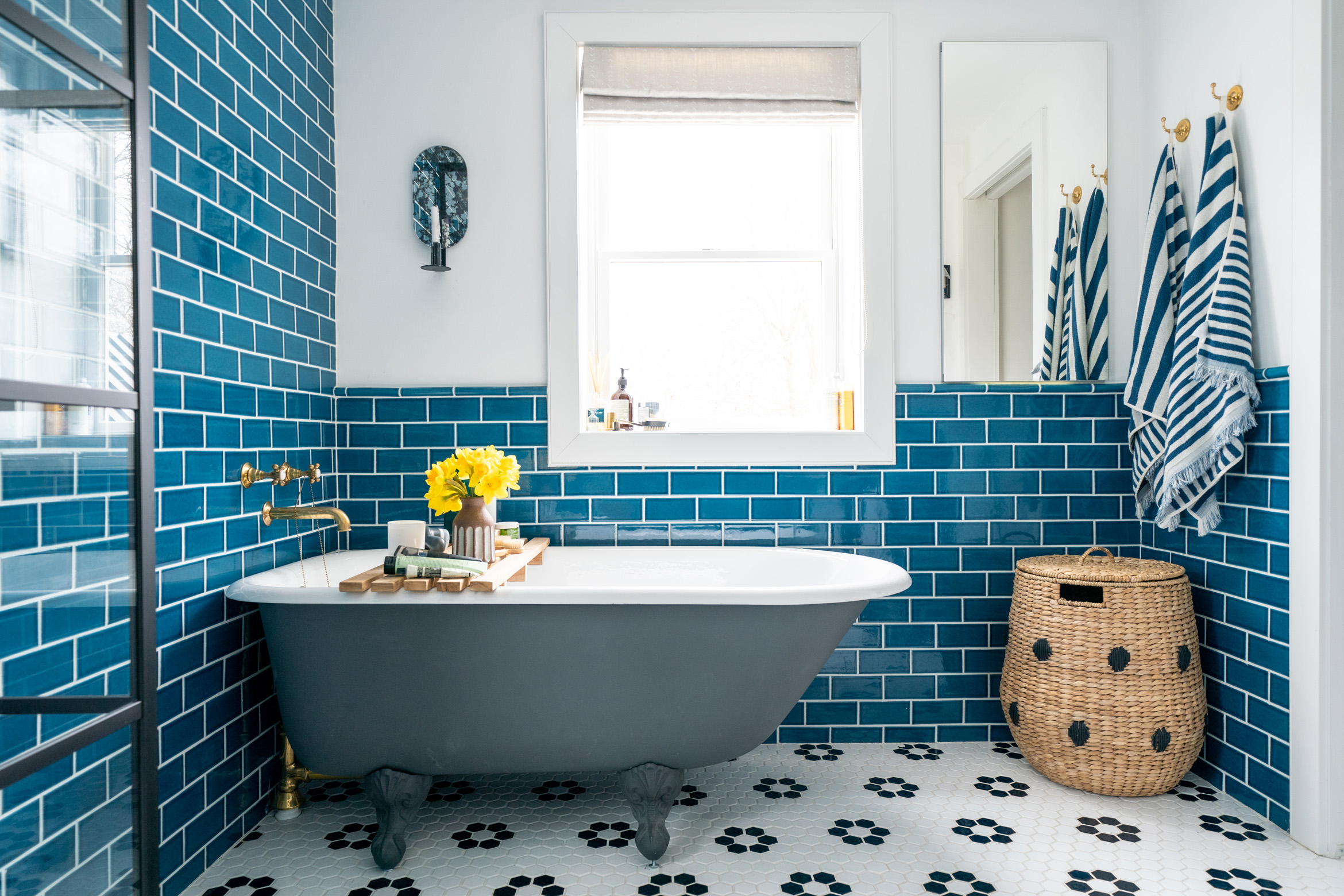
The first challenge was working out where to place all the elements of a main bath in a small space. I was really keen to try and make a freestanding tub and a walk-in shower fit, but the awkward dormer roof was making it tricky to figure out placement and spatial flow that worked. After some head-scratching, I realized I should just embrace the architecture of the dormer roof, rather than trying to ignore it. Instead of seeing the space under the dormer as ‘dead space’, I decided to utilize it for the walk-in shower, creating a hidden niche on the wall return (see above) and frosting the glass for privacy without any loss of natural light. A steel and glass style enclosure surrounds the shower and creates a ‘wow’ moment in the space.
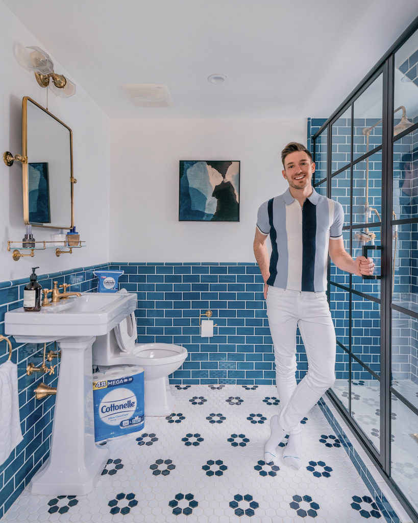
This meant that the freestanding tub could sit neatly under the second window in the room, while also tucking into the corner to allow space to pass when entering or exiting the room. I designed the space to an English heritage meets modern-industrial vibe — with a little beachy twist, given the house’s locale! I paired a hex flower pattern tile underfoot (hello, heated floors!) with classic 2×6 subway tile in a rich maritime blue (for the coast) laid in a brick pattern and finished with quarter rounds (for the heritage look). By taking the subway tile all the way up to the ceiling on the shower wall, and extending it across to the bath, it helps to unify the space and makes the slant of the dormer roof visually ‘disappear’. Unlacquered brass faucets and exposed shower system rounded out the look and are already beginning to take on a beautiful patina.
Sourcebook:– Tile | Faucets and exposed shower | Freestanding bath | Pedestal sink | Wall sconce | Art | Bath tray | Laundry basket | Candle holder | Mirror | Window fabric
// Photography by Will Taylor | Posted in partnership with Cottonelle; all views my own.





2 Comments
Pingback: The best American men's lifestyle blogs | Samuel Windsor US Blog
Amazing colors. A cool combination of modern and retro. I like it, congratulations 🙂