I recently revealed the bathroom in Scandi barn and today I’m excited to share the wet bar, which is located in the great room living space of Scandi Barn. I designed the wet bar to give us space to prepare drinks while entertaining, as it sits in the largest space in the house. This is in partnership with Delta.
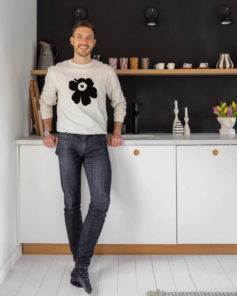
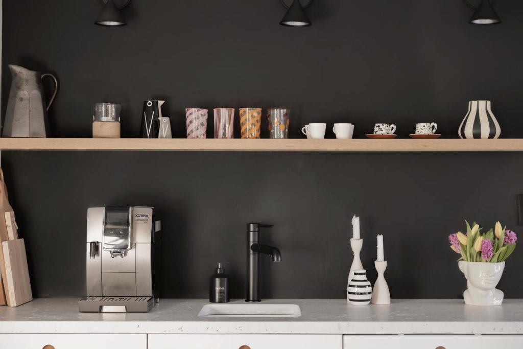
The wetbar is located against a dramatic black wall, which is why I went with contrasting glossy, white cabinetry, organic, concrete countertops, and a floating white oak shelf. This adds warmth to the room. My aim with the wet bar design was to create a modern wet bar that was practical but also looked in keeping with the minimal-meets-organic vibe of Scandi Barn.
Matte Black
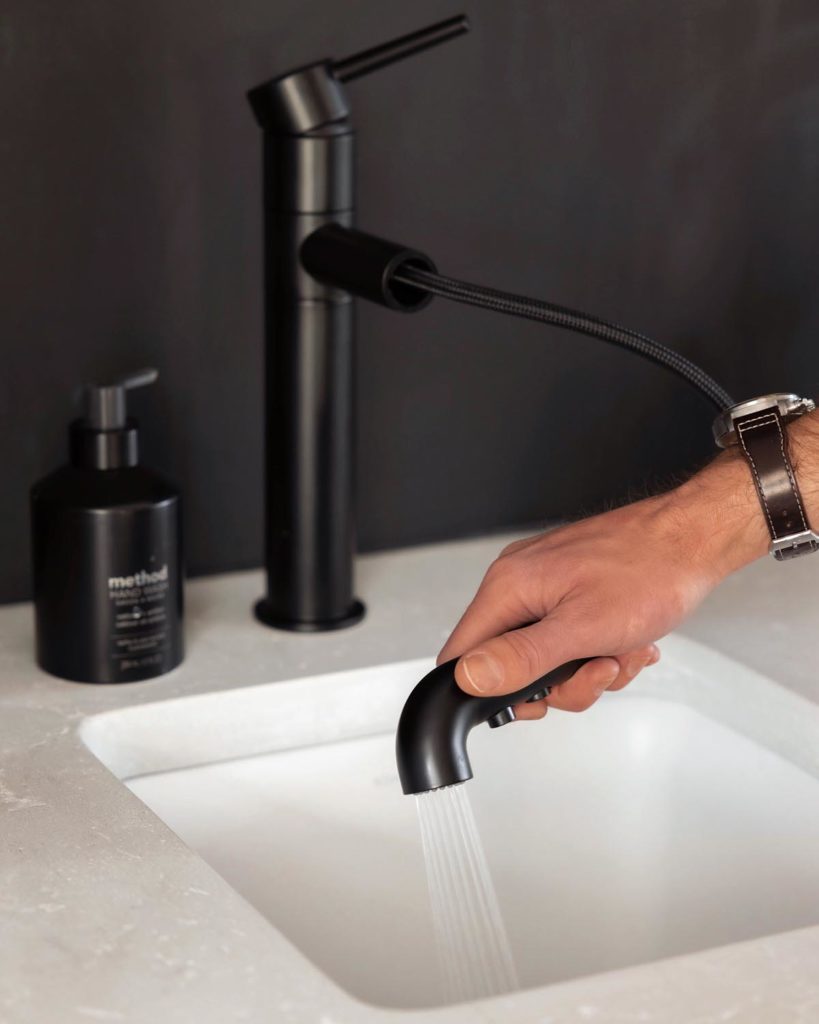
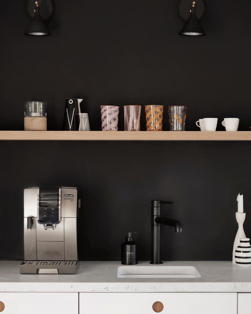
With this in mind, it was important that the functions of the wet bar seamlessly integrated into the look. That is why I chose the Delta Trinsic® Single Handed Pull Out Kitchen Faucet as it came in this beautiful matte black finish. I love how the faucet looks like it was custom made for the wet bar! I also didn’t have to compromise on any features – it pulls out so that I can spray and rinse the sink, glassware etc. The matte black has a really tactile finish. You can really feel the quality and weight of the faucet. Another super smart feature of this faucet is the spout. It rotates which is really useful when I’m filling a container or a large vase and it won’t quite fit into the sink.
I designed the wet bar to also house an under-counter refrigerator. As well as a full-sized dishwasher from Smeg. I had both of these appliances paneled so that they would fit seamlessly into the space. They look like a storage cabinet. I’m generally a big fan of paneled appliances as I think they make bars and kitchens look so much cleaner and chicer!
Texture
I’ve always loved black and white together and have been using them in my designs ever since the first space I designed years ago in London. However, a monochromatic palette can be quite stark so I always look to warm it up with texture. Here, the first introduction of texture was this custom-made concrete countertop. I commissioned it to be made by a local craftsperson. I love that I was able to choose the exact color, texture, and finish. I love how it contrasts with the matte black faucet and walls.
The second textural addition was in the form of the floating white oak shelf above the cabinets. This gives further warmth to the space. I also wanted a space to display and store some pieces that could add some personality to the space. This shelf does just that. For me, I love how the space is practical but also looks stunning. I love making my morning coffee there everyday. What do you think of our new wet bar?


