This year I was so happy to be one of the 12 designers for the second annual show house called Living by Design. I had the pleasure of designing the front entry and backyard. My goal was to create a calming, California-meets-Mediterranean retreat that encapsulated that easy-breezy, barefoot feeling of being on vacation but in your own private garden. I hope this gives you some California garden inspiration. Through my designs I blend the convenience and comfort of American design with the ease and charm of European styles, with lots of zones and cozy break out areas, such as the conversation corner and the relaxed outdoor living area, so that this big backyard still felt intimate.
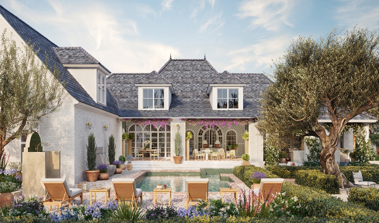
In case you are wondering what a virtual showhouse is, let me explain! A real house floor plan is picked and then designers, like me, all have a space to build out. In my spaces I picked out every detail from the stone, tiles, lighting, furniture, plants, layout and so on. Then, my design is brought to life by the talented yousee.studio, a 3D visualization studio and produced by Embello.
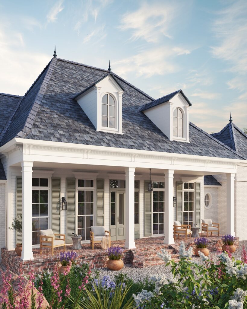
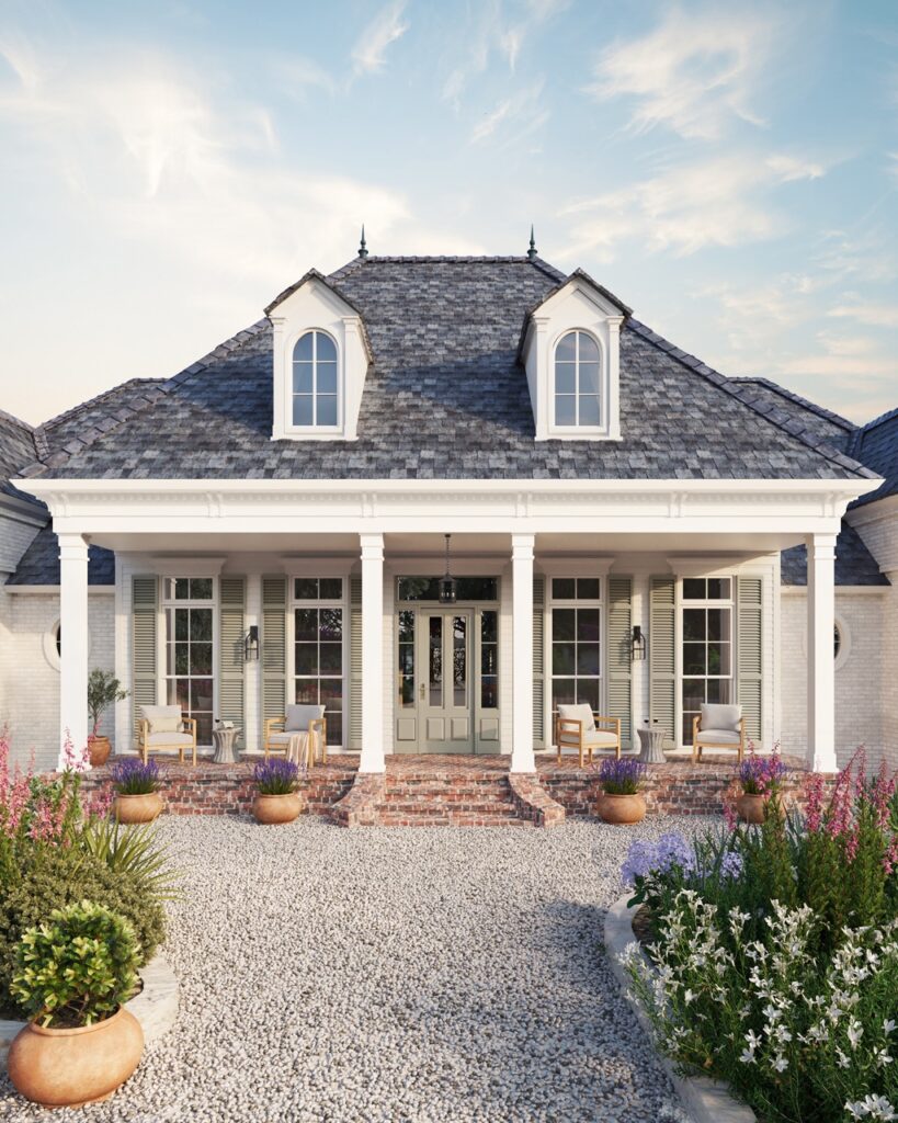
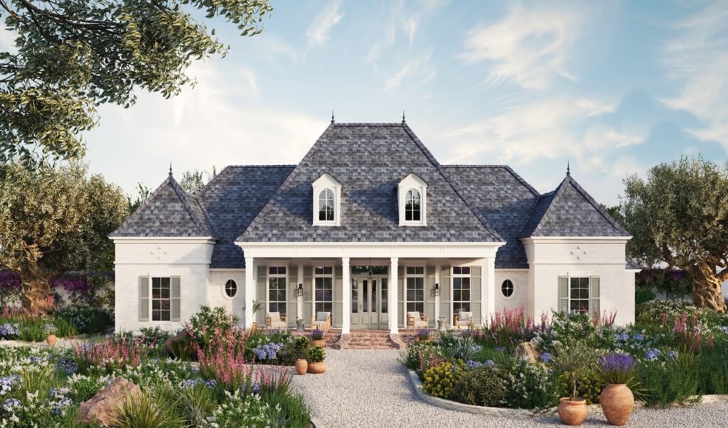
Let me take you on a tour, starting at the front entry. My aim for the show house front entry was to set the tone for the home by creating a space that felt aspirational but also accessible. I don’t think anyone feels at ease when a home is so perfect that it looks or feels like a museum where you’re scared to sit down or touch anything. So I always approach my designs from a tactile and sensory approach, introducing elements that make you want to reach out and touch them, and then ensure that the furniture items and layout in the space create a calm and relaxed atmosphere. So for the showhouse entry I did this by bringing in almost ASMR type elements through the pea gravel walkways — to me, the crunch of the gravel underfoot is so pleasing and is akin to that “feeling of home” but in a sound! The rustic and lived-in feel of the reclaimed brick porch helps create the relaxed vibe and it means guests and homeowners don’t need to be precious about it because its charm lives in its imperfections.
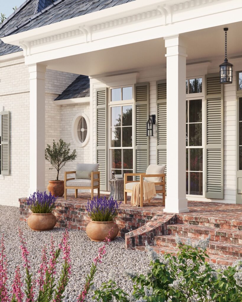
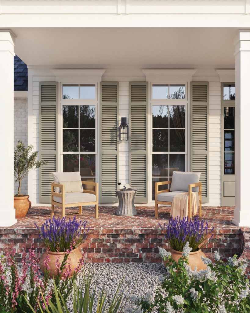
These elements worked perfectly with the outdoor furnishings I chose from Summer Classics. The teak Santa Barbara loungers lend a modern feel that contrasts nicely with the more traditional elements, such as the shutters and brick. Mixing the modern and traditional elements breathes life into the front entry and stops it feeling stuffy or staid, which in turn makes it feel more welcoming. While the Egret stool side tables were the perfect injection of more tactile texture which you know I love!
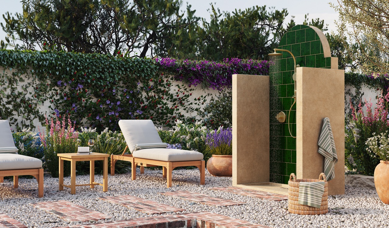
Let’s head to the backyard, where my favorite element was the outdoor shower I designed. For me, there’s nothing more luxurious than an outdoor shower so it was a real treat to design this one without any limitations at all! I was keen to reference the beautiful emerald green of the pool tile in this shower to give a sense of synergy between the two wet elements of the backyard. As you can see the outdoor shower has a rustic, Mediterranean-inspired form and finishes with the stucco walls and curved architectural details, so my aim was to contrast it with a more modern shower system. The HydroRail-R Occasion shower from Kohler was perfect for this because it has a stunning vibrant brushed modern brass finish but as it’s an exposed system it still has that old-timey heritage look to it, especially with that gorgeous gooseneck shower head, so by blending the two styles together it works seamlessly with the overall vibe.
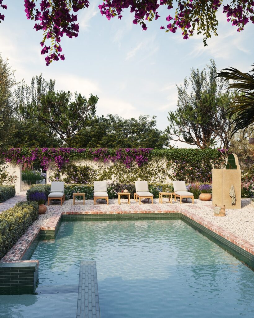
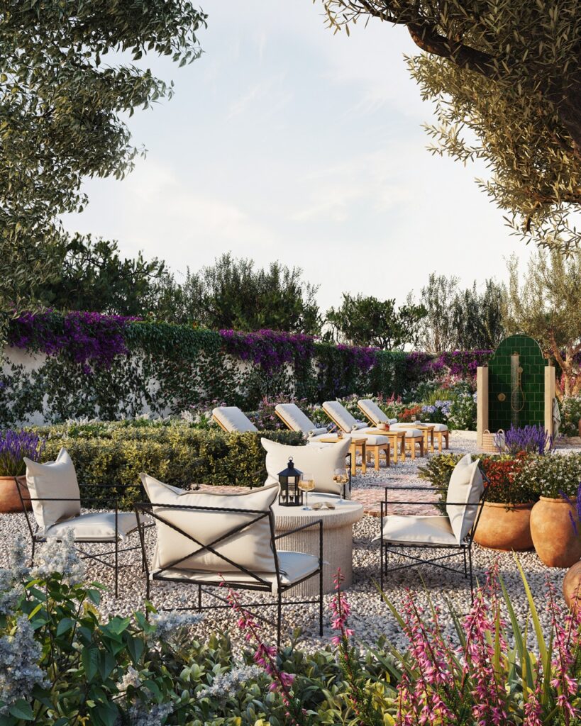
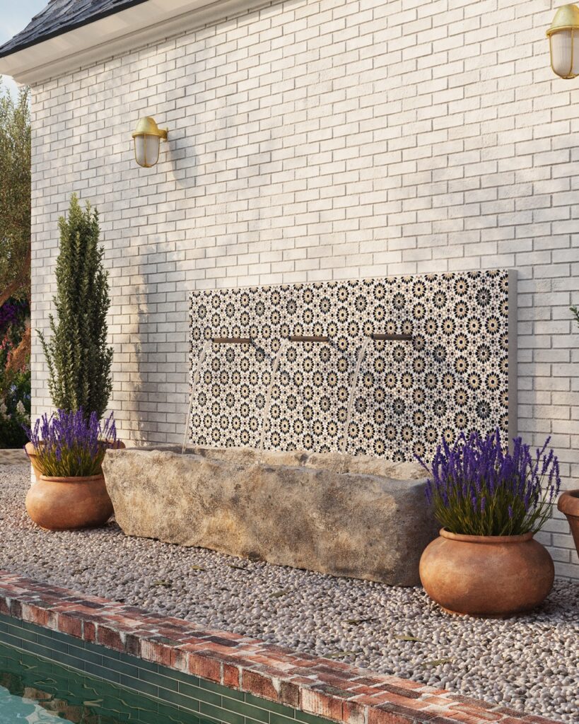
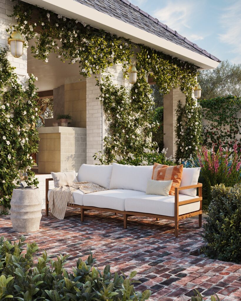
Next to the outdoor shower is a stunning pool with Ann Sacks tile at the water line. These beautiful emerald green tiles make the pool warm and inviting, as well as being interesting to look at. To bring in warmth, texture, and European charm I added a rustic limestone trough fountain to the side of the pool, which just has so much character. Here, I also used Ann Sacks tile on the wall to add visual interest and pattern. On the other side of the pool I create a casual conversation area with furniture from Summer Classic that invites you to sit down and relax. The climbing honeysuckle on the wall behind adds scent and softens the harder exterior surfaces, plus it contrasts perfectly with the reclaimed brick and the pea gravel surround.
So that’s the tour of the outside but please go check out the full 3D tour plus all the other spaces inside the house. They are available now at LivingbyDesignShowHouse.com.


12 Comments
Pingback: Weekend Studying 9.17.23 | Centsational Model - CIZAR CONSULT & GLOBAL INVESTMENT COMPANY LTD
Pingback: Weekend Reading 9.17.23 - Best Best Home Services
Pingback: Weekend Reading 9.17.23 | Centsational Style – Reno Mate Hub
Pingback: Weekend Reading 9.17.23 – Holly Home Decor
Pingback: Weekend Reading 9.17.23 | Centsational Style – My Buy Stuff
Pingback: Weekend Studying 9.17.23 | Centsational Type - zamonamart
Pingback: Weekend Studying 9.17.23 | Centsational Fashion - TOP10PRODUCTSREVIEW
Pingback: Weekend Studying 9.17.23 | Centsational Fashion - Infiniteshopguide. All rights reserved.
Pingback: Weekend Reading 9.17.23 | Centsational Style – Homebuyer Weekly
Pingback: Weekend Reading 9.17.23 | Centsational Style – Store FCK
Pingback: Weekend Studying 9.17.23 | Centsational Model – NET-CITY
Pingback: Weekend Studying 9.17.23 | Centsational Model – vendebuys.com